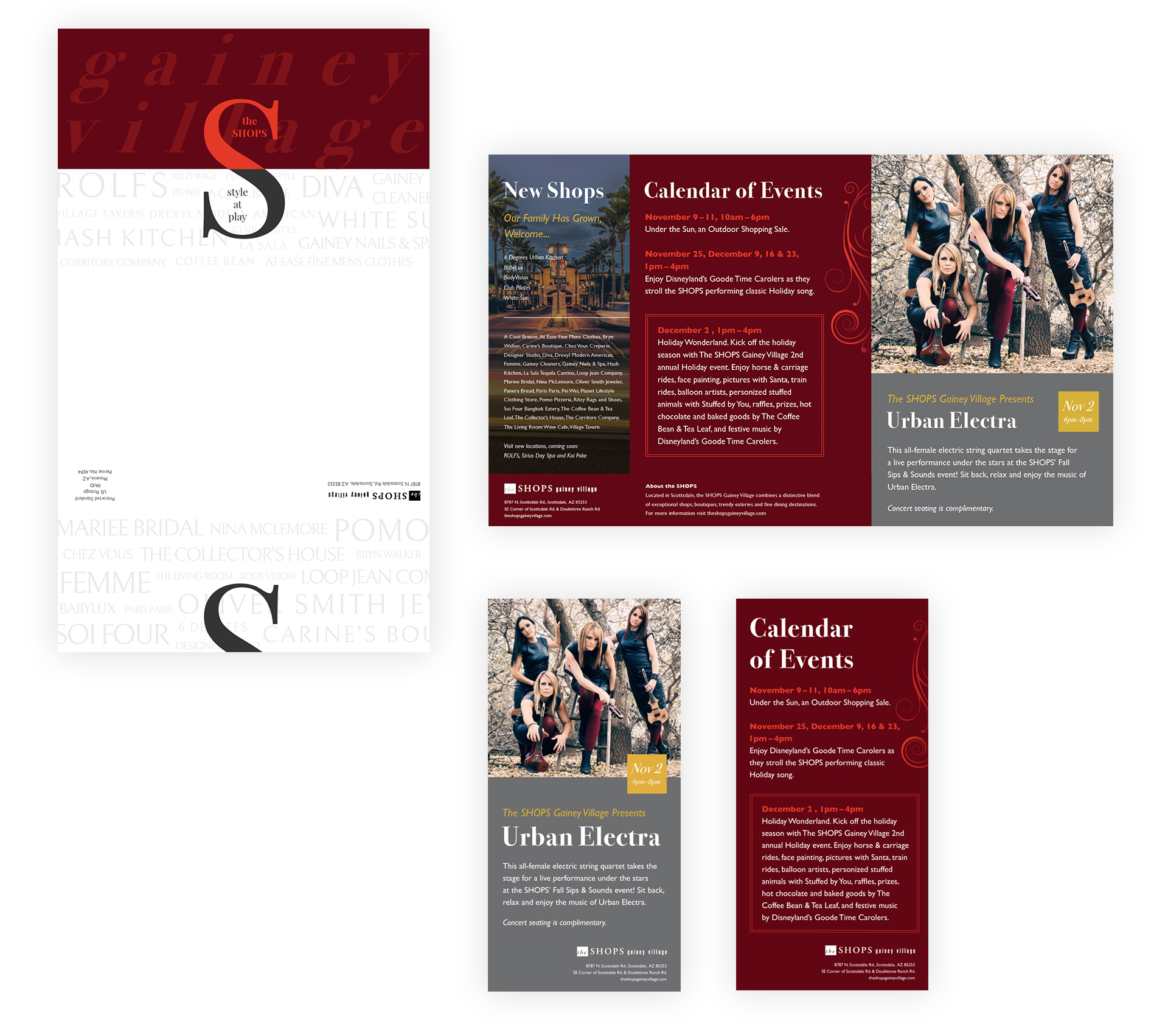
My work for The Collector's House was noticed by the marketing director of a nearby retail plaza in Scottsdale, The SHOPS Gainey Village. They were in need of a revamp of their fall/winter holiday brand package and hired me to design mail, signage, and other printed material for their events.
Prior, I always designed branding and logos for companies and other entities, but never really for specific, themed events. This was an exciting opportunity for me to branch out locally and have work on full display in a prominent shopping area.
2 Months, August - October 2017
My client wanted a completely fresh take on their seasonal "Holiday Wonderland" events. With newer shops opening and renovations coming to a close, a goal was to engage and attract local Scottsdale natives and tourists to the plaza's shops for fun, Christmas-themed events through November and December. Materials like mailers, brochures, ads, and signage were crucial to getting the word around.
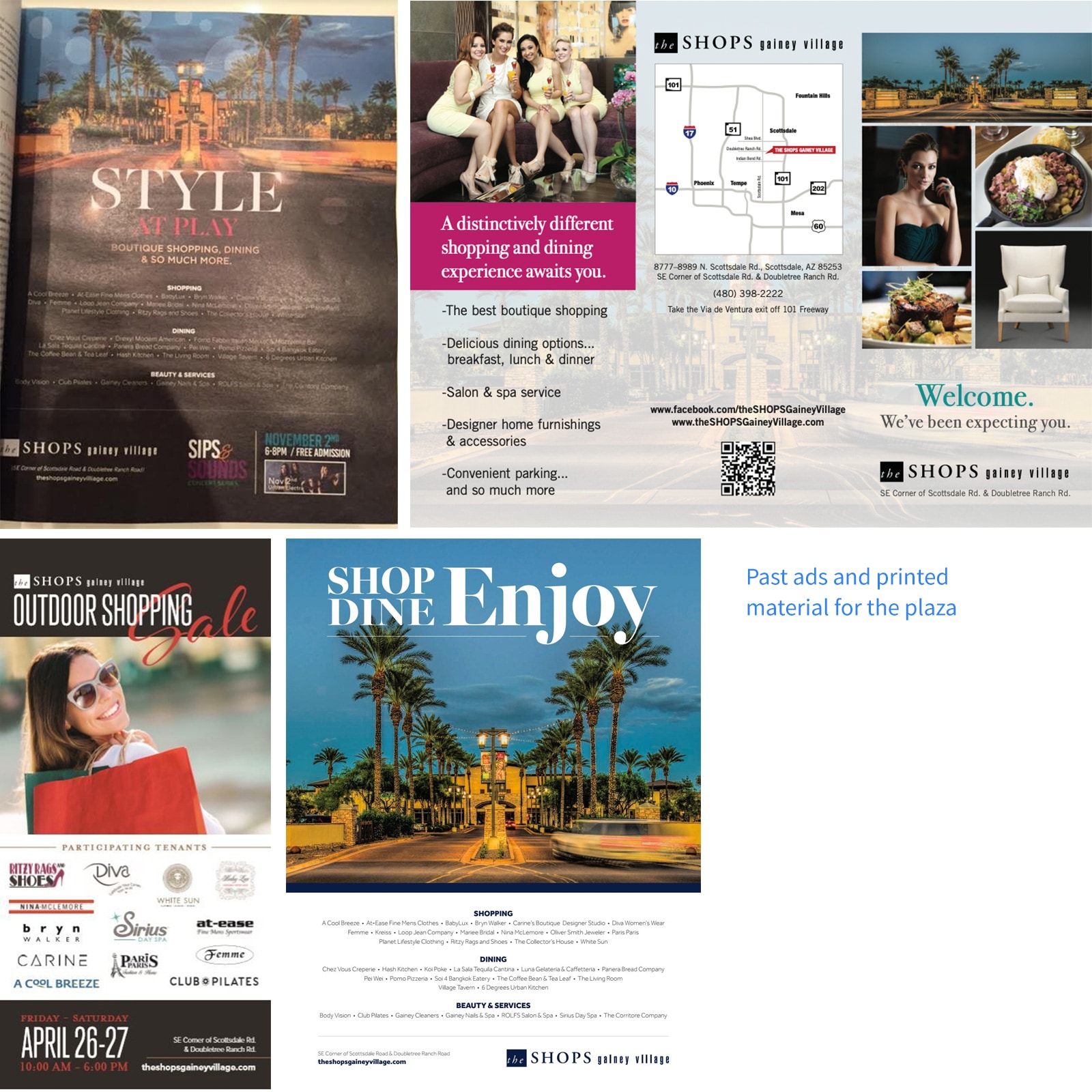
To start, I was handed past event materials to get a sense of the type of content needed for new designs. Contrary to past design decisions with this material, we wanted to go in a new direction: refined, real, reflective of the area, and focused.
From there, I started putting together the brand's theme, used to convey its meaning, feeling, and purpose. I love the desert landscape and its particularly special during the evening hours in winter, having incredible sunsets and stark silhouetted objects, so I drew inspriation and put together some high-level themes:
Using themes to drive design language decisions, I broke it down into building blocks:
My first task was to design their mailer and brochure, sent around Scottsdale for promotion and engagement. They were debuting a new larger size, with 2 even width and 1 narrower column. I took to InDesign and put together a simple 3-column grid for the content.
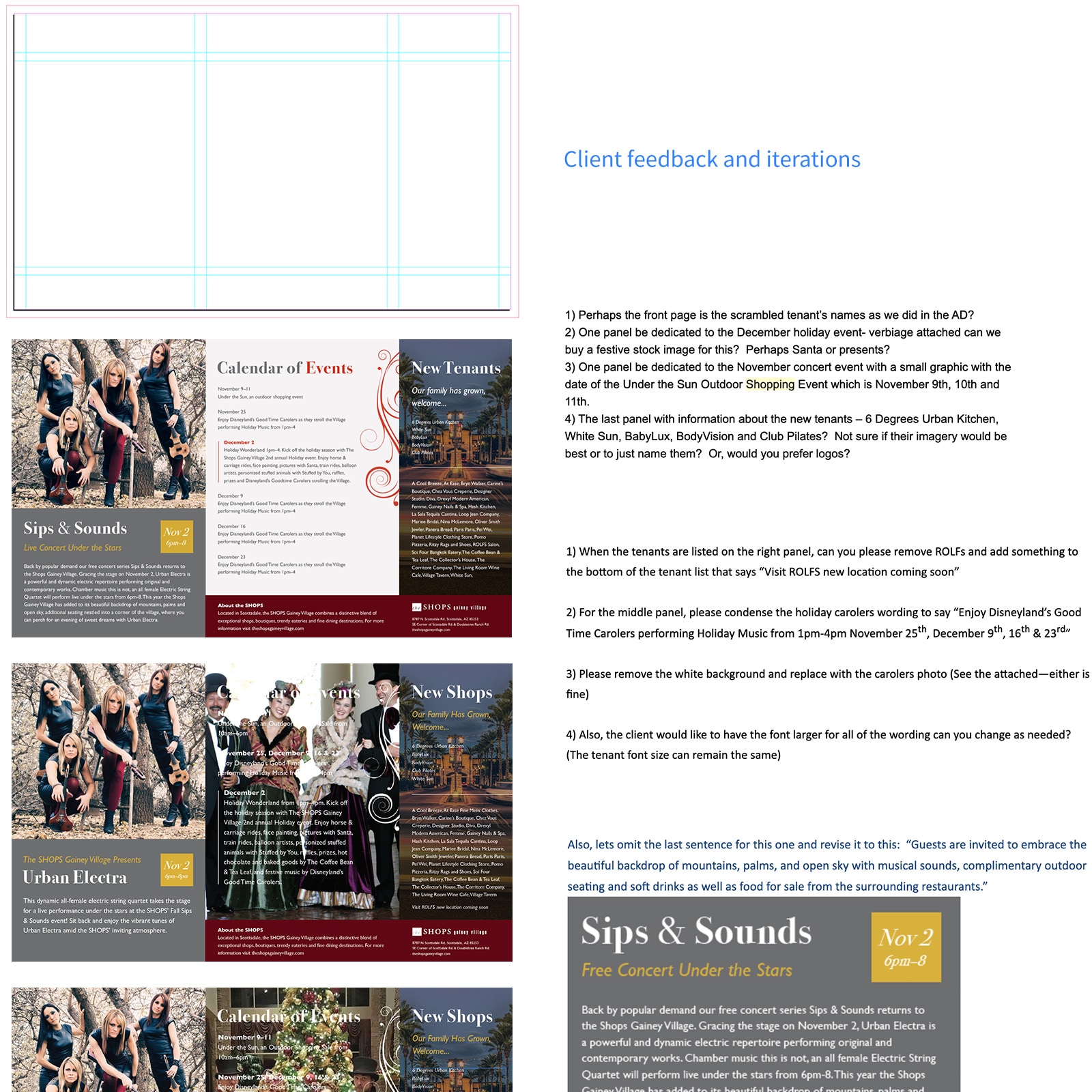
After getting the new content and imagery, I pasted into my InDesign template and applied our design language. My client and I went through a few iterations to emphasize specific areas of the content. Shortly after, we landed on our final.
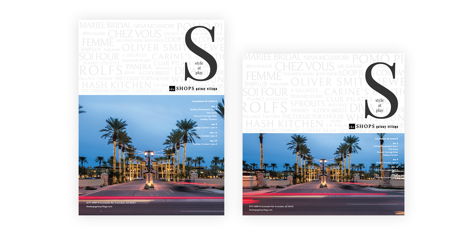
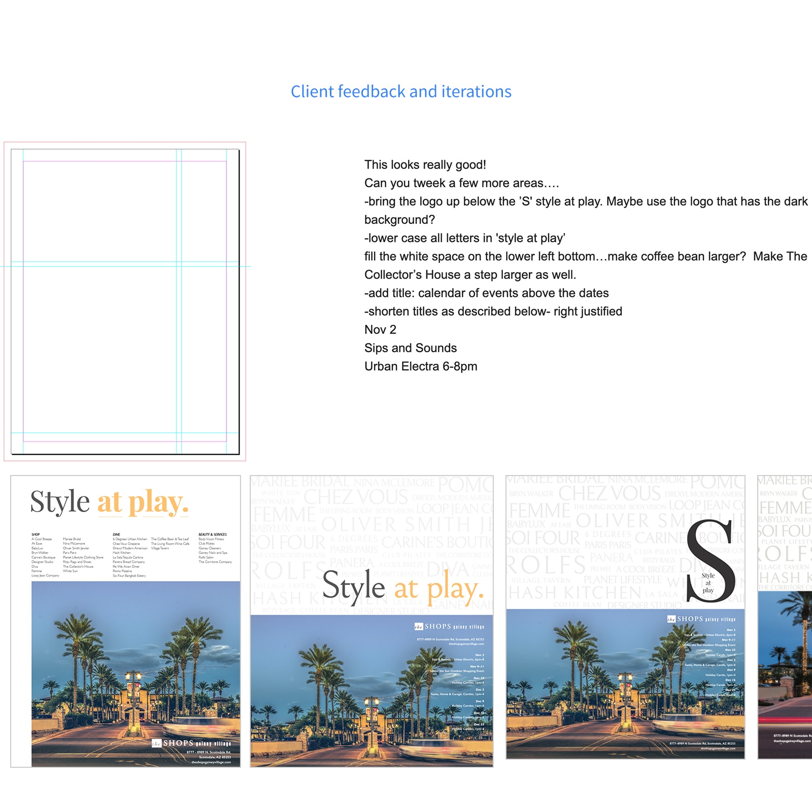
In parellel with the brochure and ads, we started coming up with concepts for the plaza's full page ad in Where Magazine, PV Lifestyle and Modern Luxury. Since this was a right hand read, I came up with a grid that helped lay content and event information out towards the right side.
For content direction, I was told to really hammer the "style at play" motto and sheer amount of shops home. The motto was the centerpiece, so I started with variations of that design while wrapping content and imagery around it. We went through several iterations and came up with a final that was clear and emphasized the quanitity of shops and their prominent location.
When it was all brought together, the result was a fresh new take on an ever-changing plaza's seasonal materials. The brand system was a success and visitors and patrons enjoyed it.