Role
As Product Design Manager for Golfshot, I led the redesign of their flagship iOS and Android apps.
Challenge
We inherited a legacy product with major usability and performance issues. Users reported poor GPS accuracy, confusing interfaces, and accessibility problems on the course—resulting in low ratings and high churn.
Process
We started by defining KPIs, auditing the existing experience, and running usability tests. Then we engaged directly with golfers to understand their needs, behaviors, and pain points. From there, I ran design sprints, brainstormed solutions, and iterated through prototypes tested with beta users. This led to a redesigned Golfshot experience with ongoing improvements post-launch.
Goals
User: Simplify the on-course experience. The legacy app was cluttered, hard to navigate, and drained battery,
frustrating users.
Business: Drive KPI growth, increase premium subscriptions, and boost monthly active usage.
| KPI's | 2014 | 2017 |
|---|---|---|
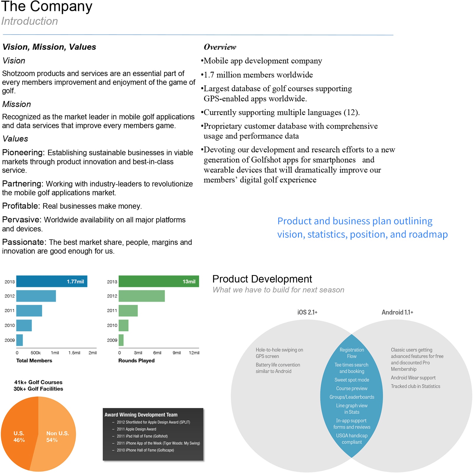
| User base | 1.7 mil | 4.6 mil |
| Store ratings | 4.4/5 | 4.8/5 |
| Net Promoter Score | 37.1 | 51.6 |
| Rounds played | 13 mil | 94 mil |
| Renewal rate | 69% | 80% |
| Monthly active users | 89,000 | 212,000 |
Timeline
4 Years, March 2013 - June 2017
"I never thought of using my mobile phone for golf until Golfshot came along. It helped me find distances, recommended shots, and immediately made a difference in my game. As an older golfer myself, it taught this old dog some new tricks!"
User review
Defining the Product and UX Roadmap
Business Alignment and Vision
We brought all teams together to align on Golfshot's future. By analyzing our legacy products and market position, we established a high-level vision, mission, and product values to guide our work.
KPI's
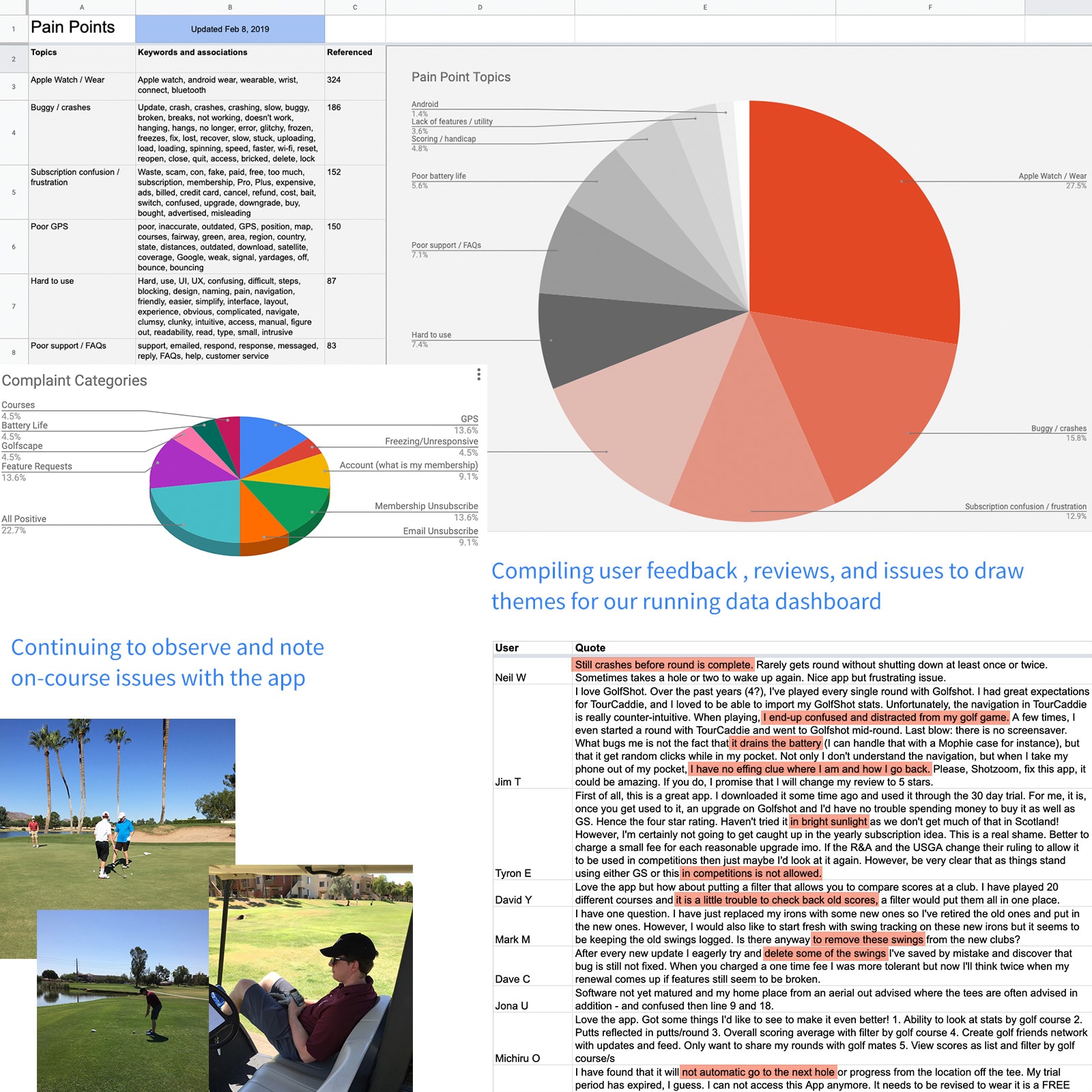
We audited the current app and analyzed user feedback to identify key issues:
- Cluttered interface with too many features
- Confusing navigation and deep menus
- Battery drain and performance issues
- Outdated visual design
Define Goals
User: Deliver an on-course golf GPS tool that enhances gameplay, encourages scoring and sharing, and
supports game improvement.
Business: Drive KPI growth, increase premium subscriptions, and boost monthly active usage.
Hypothesis
We believe we can improve golfers' on and off-course experiences by delivering real-time GPS distances, automated scoring, tee time booking, and performance tools that encourage play and enhance their game.
Auditing and Testing Existing Experiences
Visual and Functional Audit
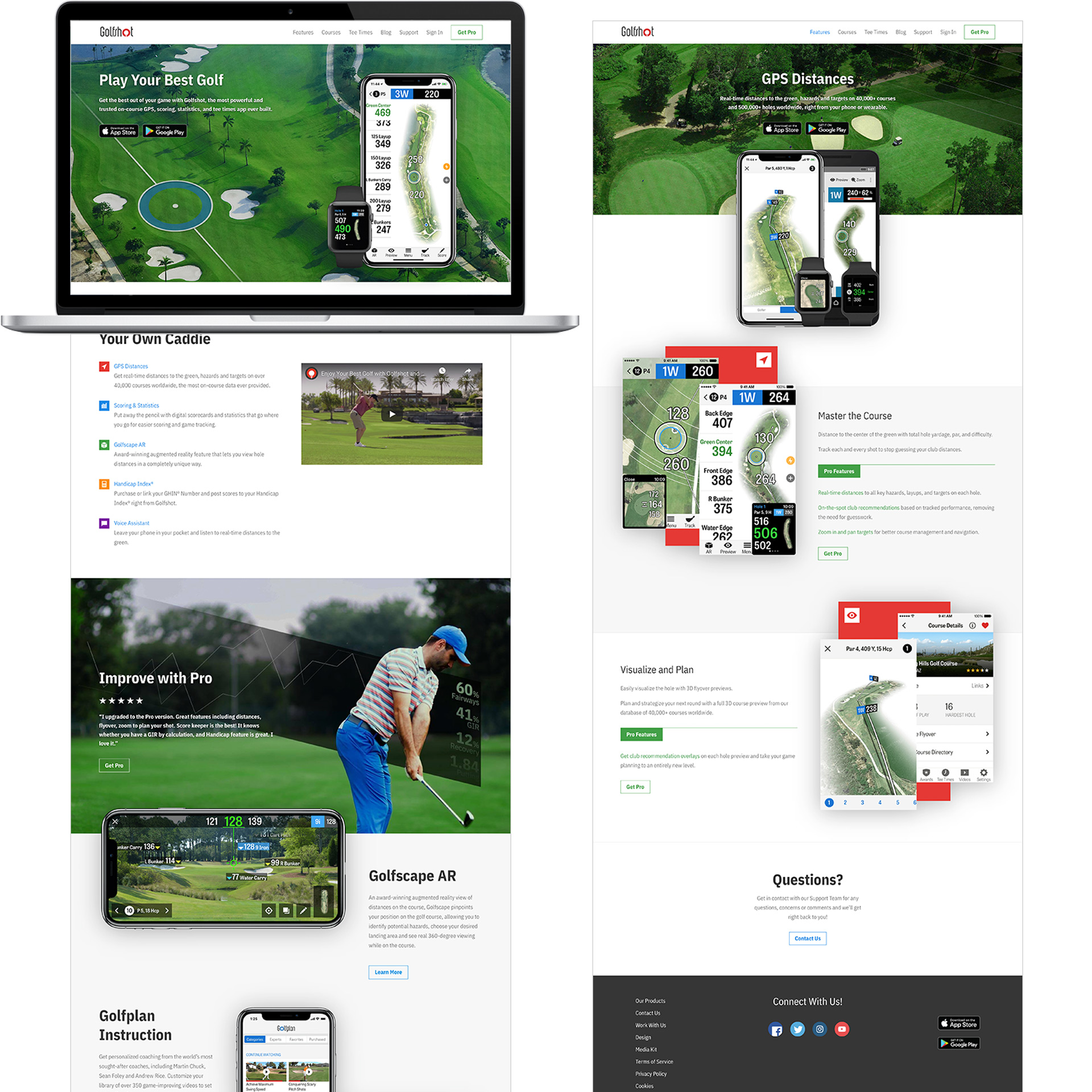
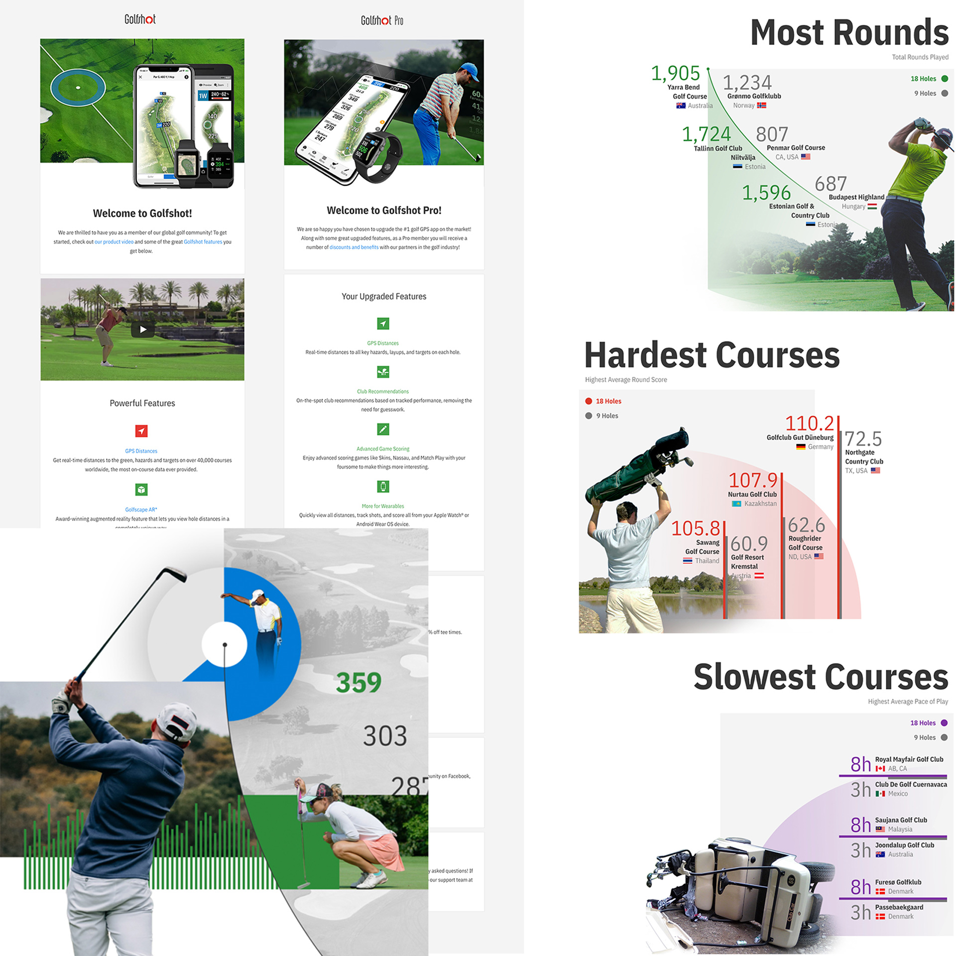
We began by auditing the current Golfshot mobile experience. I captured and mapped out every screen, identifying design inconsistencies, usability issues, and accessibility gaps.
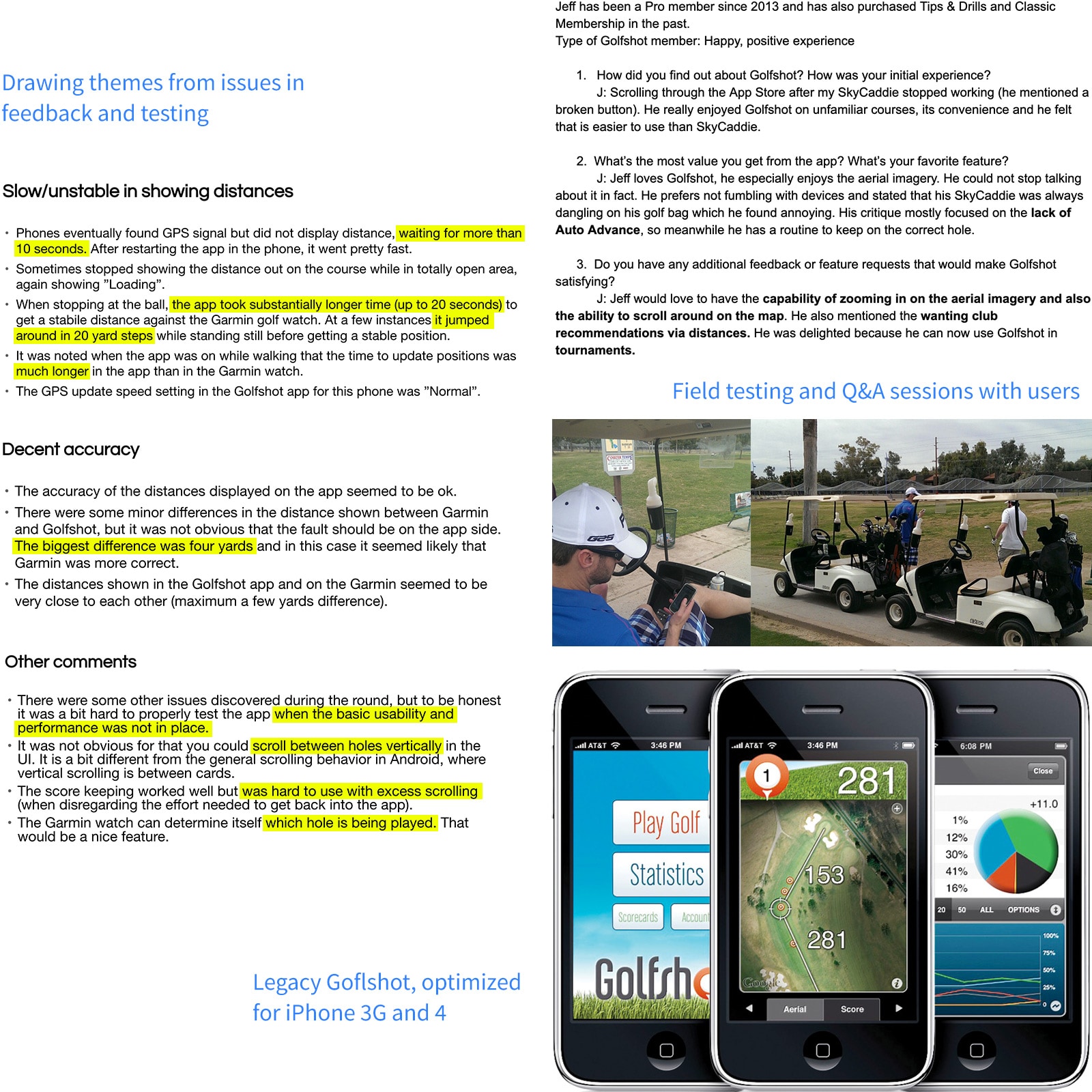
Field Testing and User Feedback
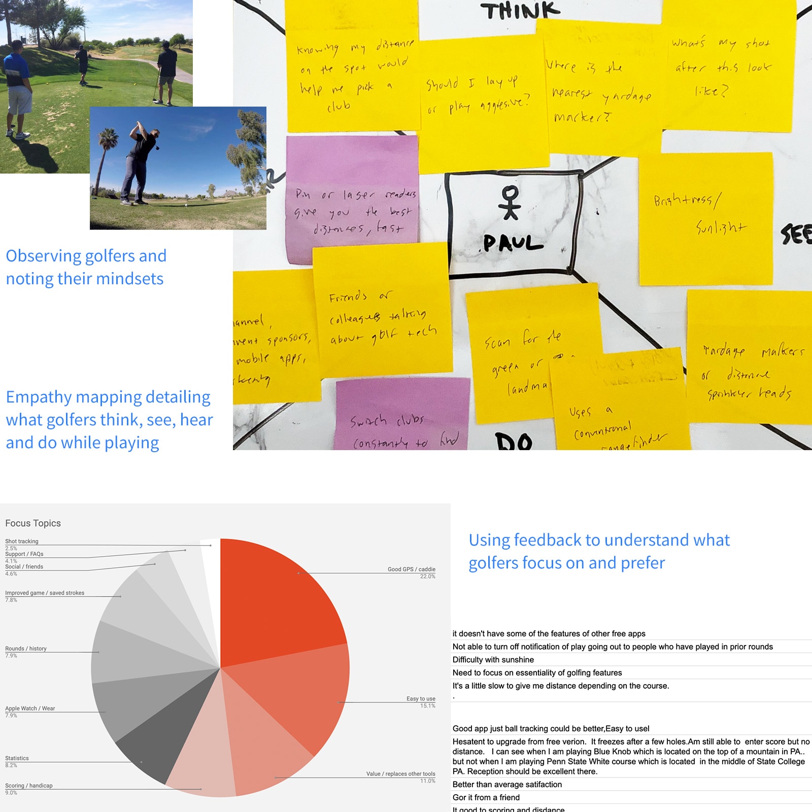
Next, I organized focus groups and on-course testing with local golfers. Their real-world feedback highlighted key pain points and opportunities:
- Round setup and scoring felt slow and tedious
- GPS distances lagged while moving between shots
- Aerial course imagery often failed to load or glitched
- Sun glare made screens hard to read
- Golfers wanted smart club recommendations based on distance
- Auto-advancing to the next hole would improve flow and reduce taps
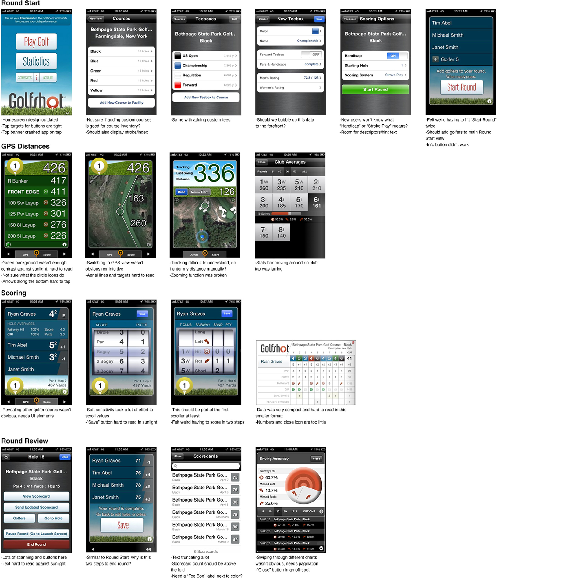
First visual audit of Golfshot app by section/flow, noting suggestions, features and functionality.
Learning from Golfers
Empathy Mapping
After direct engagement with golfers, I created empathy maps to better understand their mindset, goals, and pain points. This helped clarify exactly who we were designing for and informed more user-centered decisions.
User Persona
I created personas based on user data and interviews:
Demographic
- Age 25-55
- Tech-savvy golfers
- Play 2-4 times a month
Core Needs
- Reliable distance measurement
- Help with visualizing shot distances (vs. relying on intuition)
- Automation of manual tasks (e.g., scoring, hole advancement)
Behaviors
User: Simplify the experience to help golfers focus on their game.
Business: Modernize the platform to support future growth and partnerships.
Persona
Paul is a casual golfer who plays 1-2 times a month with business partners and friends. He's looking to improve several key aspects of his golf game, mainly driving accuracy, course and distance management, and putting to stay somewhat competitve in local tournaments/scrambles. He's always thinking about his next shot and how he can become more consistent with his swing rhythm.
Defining Golfer Pain Points
Key Problems and Insights
We synthesized negative feedback, behavioral themes, and support data to surface the most common issues:
- Cumbersome Round Setup: Golfers had to navigate through 6+ screens just to start a round, creating friction right from the start.
- Unreliable GPS: Distance readings were often inaccurate and laggy, especially when users moved quickly in golf carts, causing distances to jump around.
- Battery Drain: Devices like the iPhone 4/5 couldn't sustain GPS for a full round, leading to dead batteries before finishing 18 holes.
- Missing Key Features: Users frequently requested club recommendations, tee time booking, advanced stats, and auto-advancing between holes.
- Poor Visibility in Sunlight: The app's dark UI made it hard to read outdoors, especially under direct sunlight, common in golf environments.
- Unclear Interactions: Many UI elements lacked clear affordance. Golfers often asked how to change views or enter scores, leading to confusion and frustration.
Problem statement
Golfers face many obstacles trying to navigate GPS distances and keeping score. Our app is inhibiting these key moments of their journey to improving their game, resulting in lost brand/product trust and churn.
Exploring Solutions
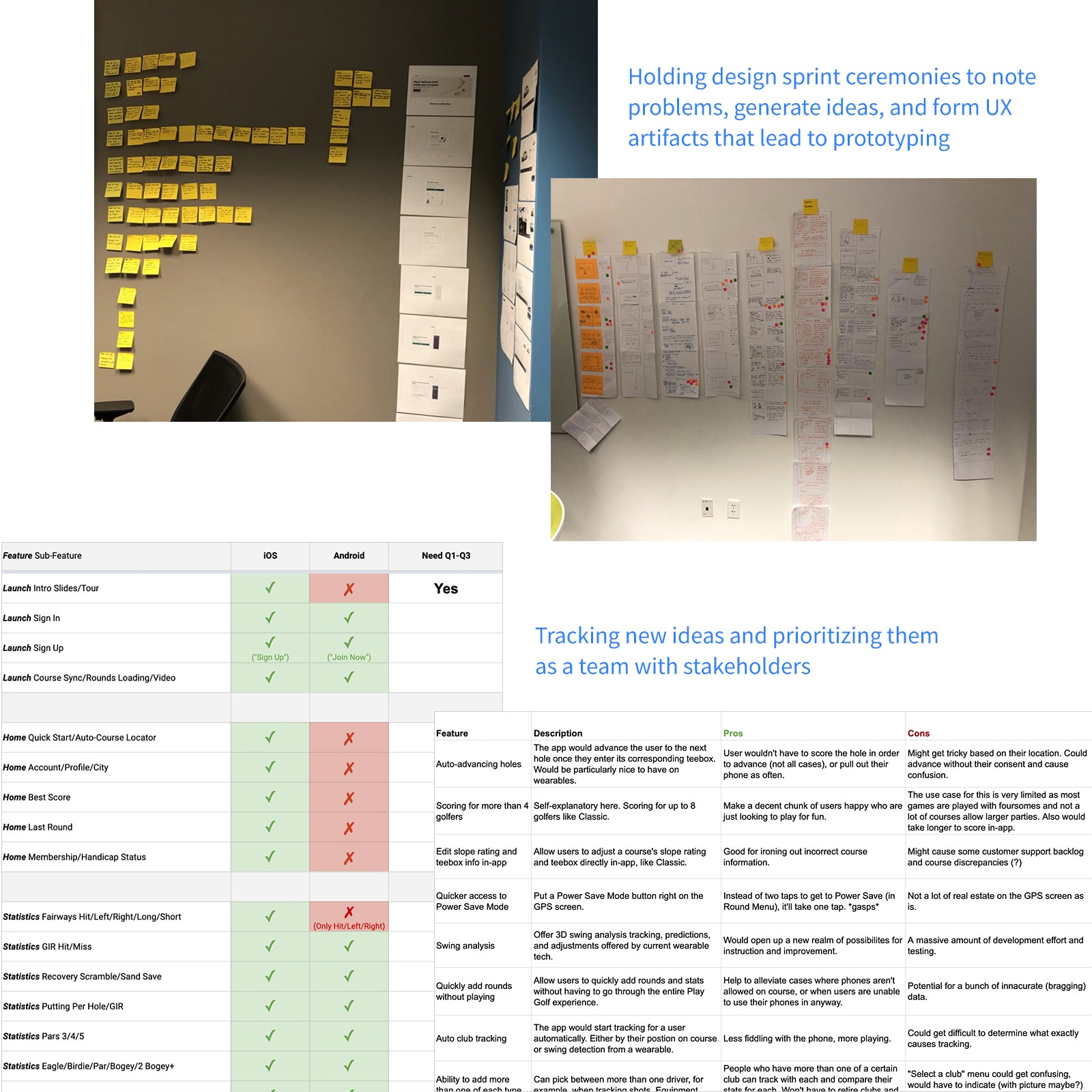
Team Brainstorms and Design Sprints
With clear problems in hand, we ran collaborative design sprints, storyboarding sessions, and brainstorming workshops. This helped us generate ideas grounded in real user needs and feedback.
Key Solutions
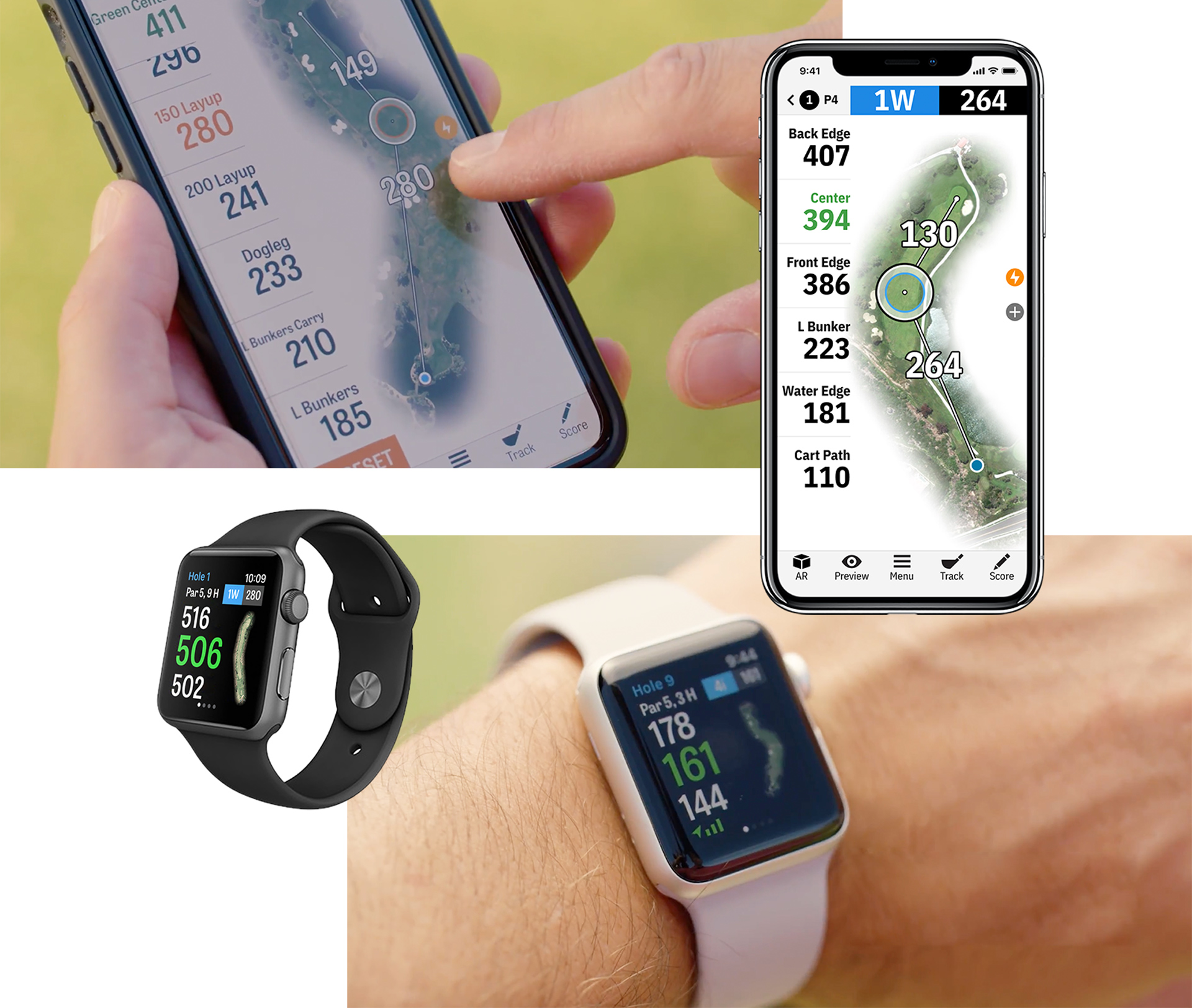
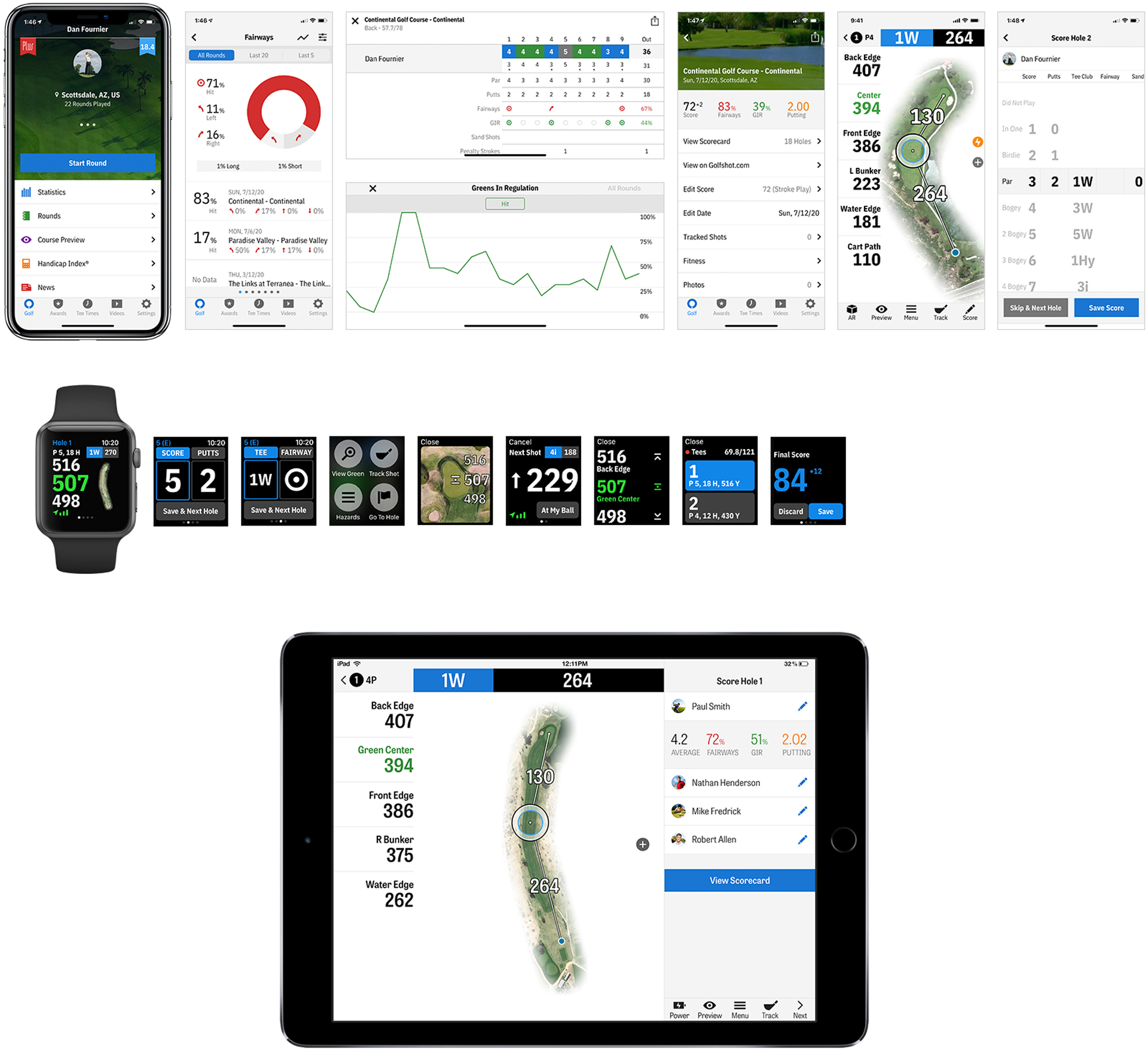
- Redesigned GPS View: Introduced familiar UI patterns, clearer interaction points, and a simplified layout for quick access to key data.
- Streamlined Round Setup: Cut unnecessary steps. Only required essential inputs to get golfers into a round faster.
- Improved Scoring Access: Made scoring more discoverable and intuitive by surfacing it in key moments during play.
- Auto-Hole Advancement: Enabled hands-free progression to the next hole—a top-requested feature for smoother flow.
- End-of-Round Sharing: Integrated sharing prompts into the round completion flow to encourage golfers to share their scores.
- Revamped Rounds and Stats Views: Surfaced important data sooner and introduced interactivity to better support game improvement.
- Tee Time Booking Integration: Partnered with GolfNow to create a quick, intuitive tee time booking flow.
- Course Discovery Experience: Built a dedicated section for exploring courses, allowing golfers to learn about layouts and conditions before play.
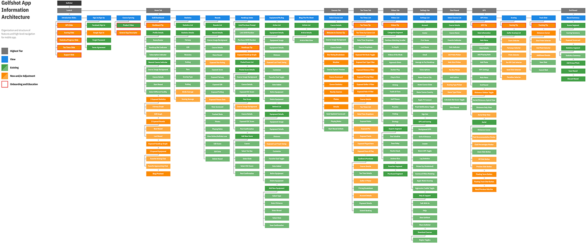
Using information architecture to showcase app hierarchy and noting legacy features to be replaced with new, tested ones
Prototyping and Building the Design System
Information Architecture and Wireframes
We audited the app, gathered feedback, and defined goals. I researched user needs, prototyped solutions, tested with golfers, and iterated for launch.
Design System
In parallel, I began building a modular design system. The goal was to break down UI into reusable components for consistent, scalable design. I documented each element's purpose and usage to support both design and development teams.
View Design System SpecI created high-fidelity prototypes to test key flows like starting a round, scoring, and viewing stats.
We optimized performance and refined the visual design for better outdoor visibility.
View Mobile Prototype Example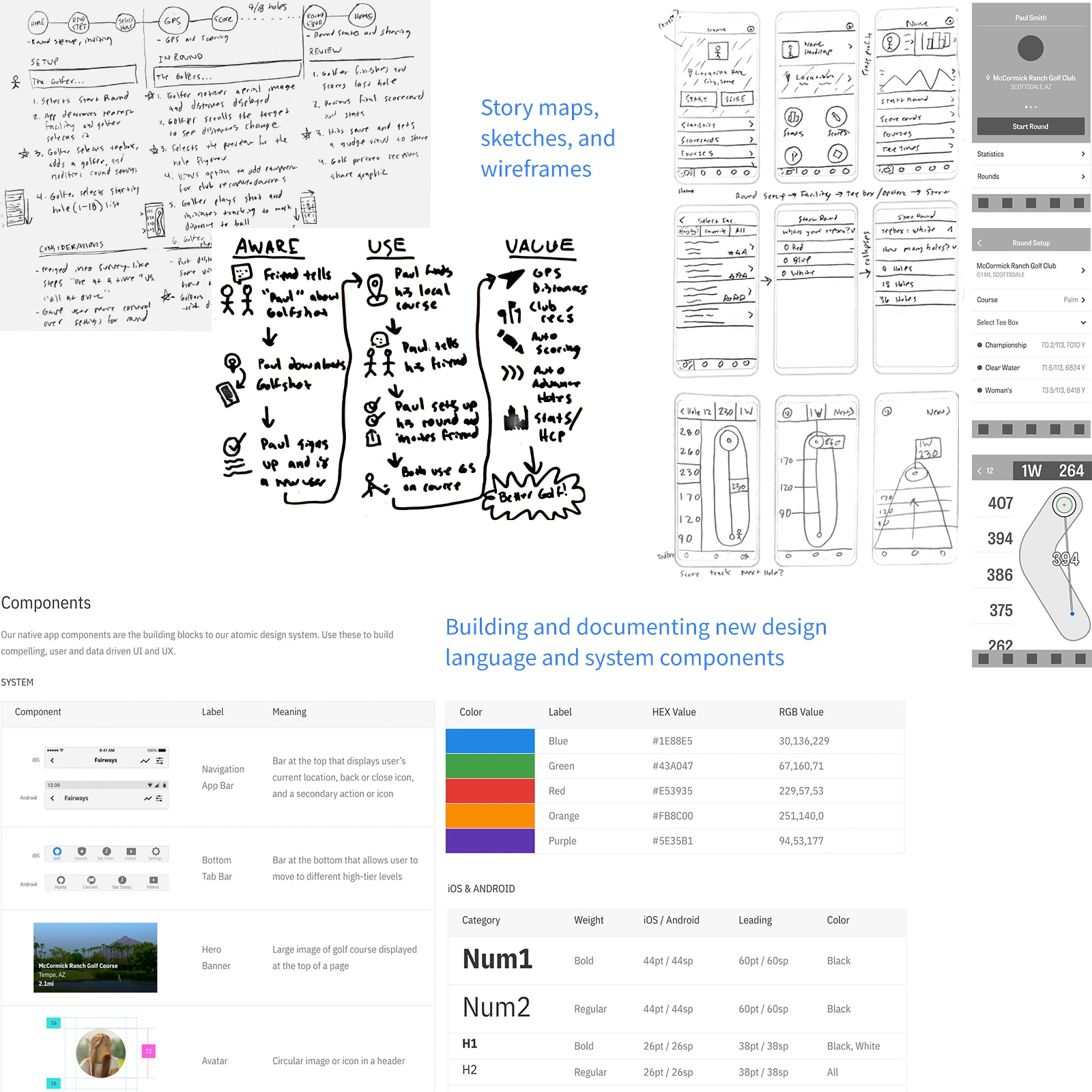
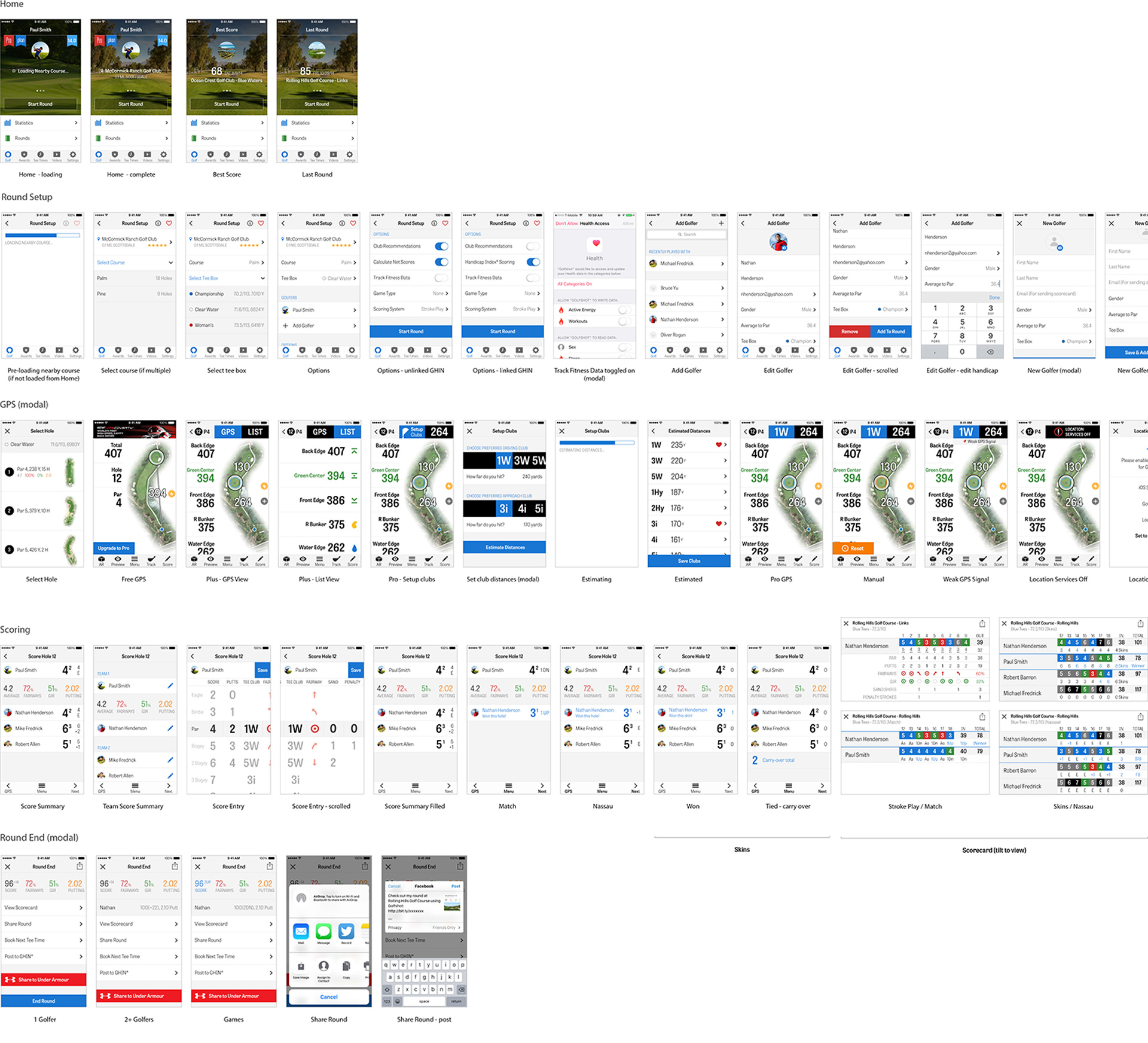
Version 1 of iOS primary flows.
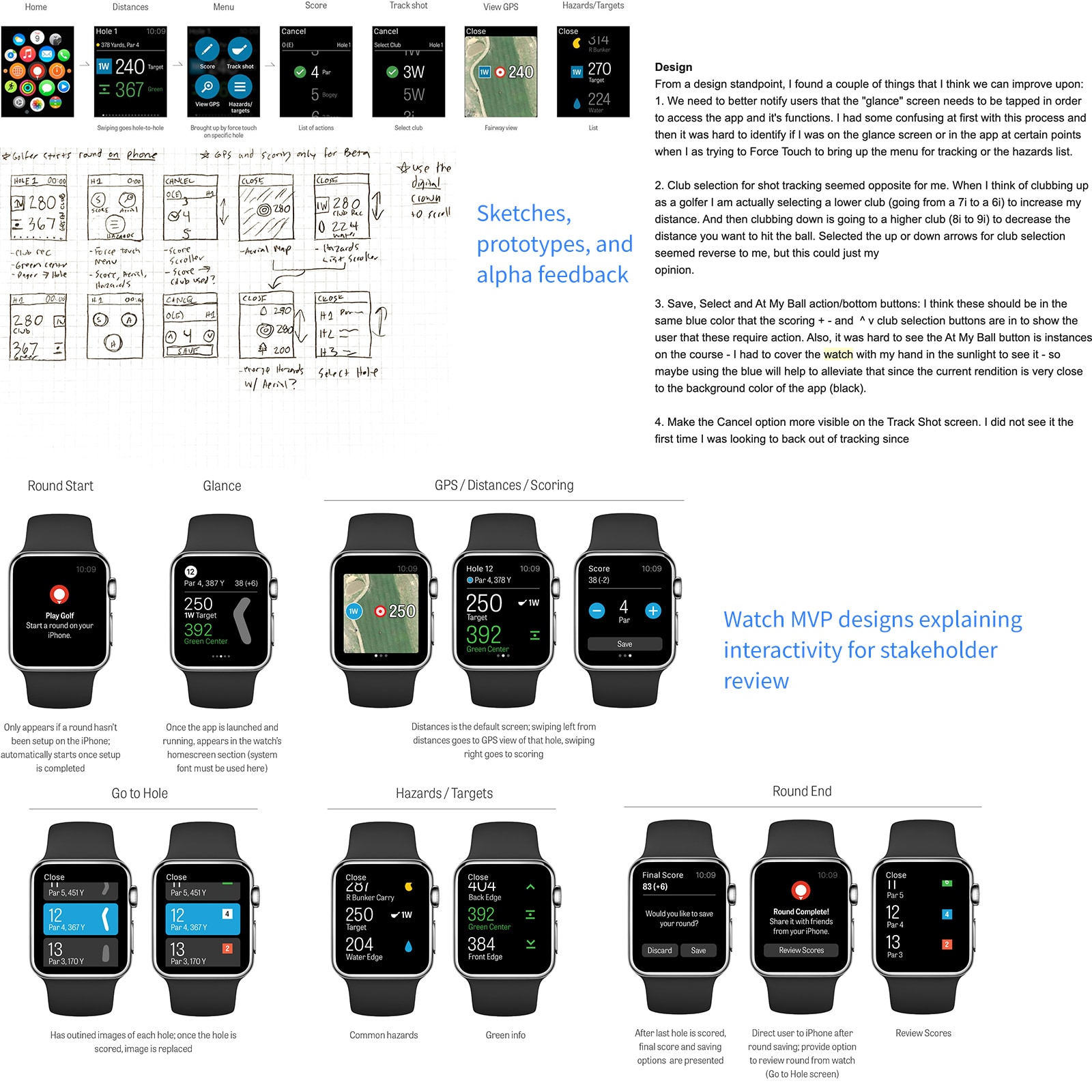
Apple Watch and Wearables Integration
Discovery and Objectives
In 2015, a colleague and I were invited to Apple's HQ for a confidential preview of their upcoming
product, the Apple Watch. Given that many golfers already relied on third-party GPS watches, we saw a
clear opportunity to bring Golfshot to wearables.
At Apple HQ, we explored the device hands-on, brainstormed concepts, and left with test units and a plan
of action:
- Understand technical limitations of watchOS 1
- Run a focused design sprint
- Prototype and build an alpha version for testing
Design, Coding, and Testing
After our sprint, we began building and testing an early alpha. Key considerations included:
- Tethered Functionality: The Watch relied on the iPhone for GPS data, so we needed clear messaging to keep the phone nearby for accurate distances.
- Platform Guidelines: Apple's design requirements were strict—we followed them closely to ensure compliance and performance.
- Accessibility for Older Golfers: Given our core demographic (ages 35-65), we prioritized large text, high-contrast buttons, and simple tap interactions.
After multiple design reviews and iterations, we launched our alpha for field testing. Results validated our assumptions and helped us quickly refine the app for beta release.
User Testing and Iterations
Beta Testing and Feedback Loops
Golfshot for Apple Watch became a top-rated golf app, driving significant premium subscription growth.
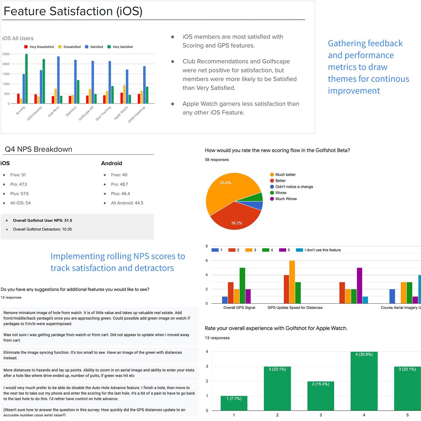
Rolling NPS and Satisfaction Scores
To track satisfaction over time, we implemented rolling NPS and feature-level surveys. As we iterated, we saw consistent improvements across user sentiment and KPIs.
Continuous Improvement
Each beta cycle helped us refine the experience. By the final beta, we had a polished product and were ready for full release.
Rolling survey results
89%
found the new experience better
+14.5
increase in Net Promoter Score
+11%
increase in subscription renewal rate
The Outcome
Summary
Golfshot relaunched in Summer 2016 on iOS and Android, available in 12 languages worldwide. The response
was overwhelmingly positive—high adoption, strong ratings, and glowing user feedback. One review stood
out: “It taught an old dog new tricks.”
We continued to iterate based on user input, rolling out key improvements ahead of peak golf season and
fine-tuning during the off-season. Before leaving the company in 2019, I created a lean product
brief to ensure a smooth handoff and continued success.
| KPI's | 2014 | 2017 |
|---|---|---|
| User base | 1.7 mil | 4.6 mil |
| Store ratings | 4.4/5 | 4.8/5 |
| Net Promoter Score | 37.1 | 51.6 |
| Rounds played | 13 mil | 94 mil |
| Renewal rate | 69% | 80% |
| Monthly active users | 89,000 | 212,000 |
View on App Store
View on Google Play
Changes and New Direction
Discovery
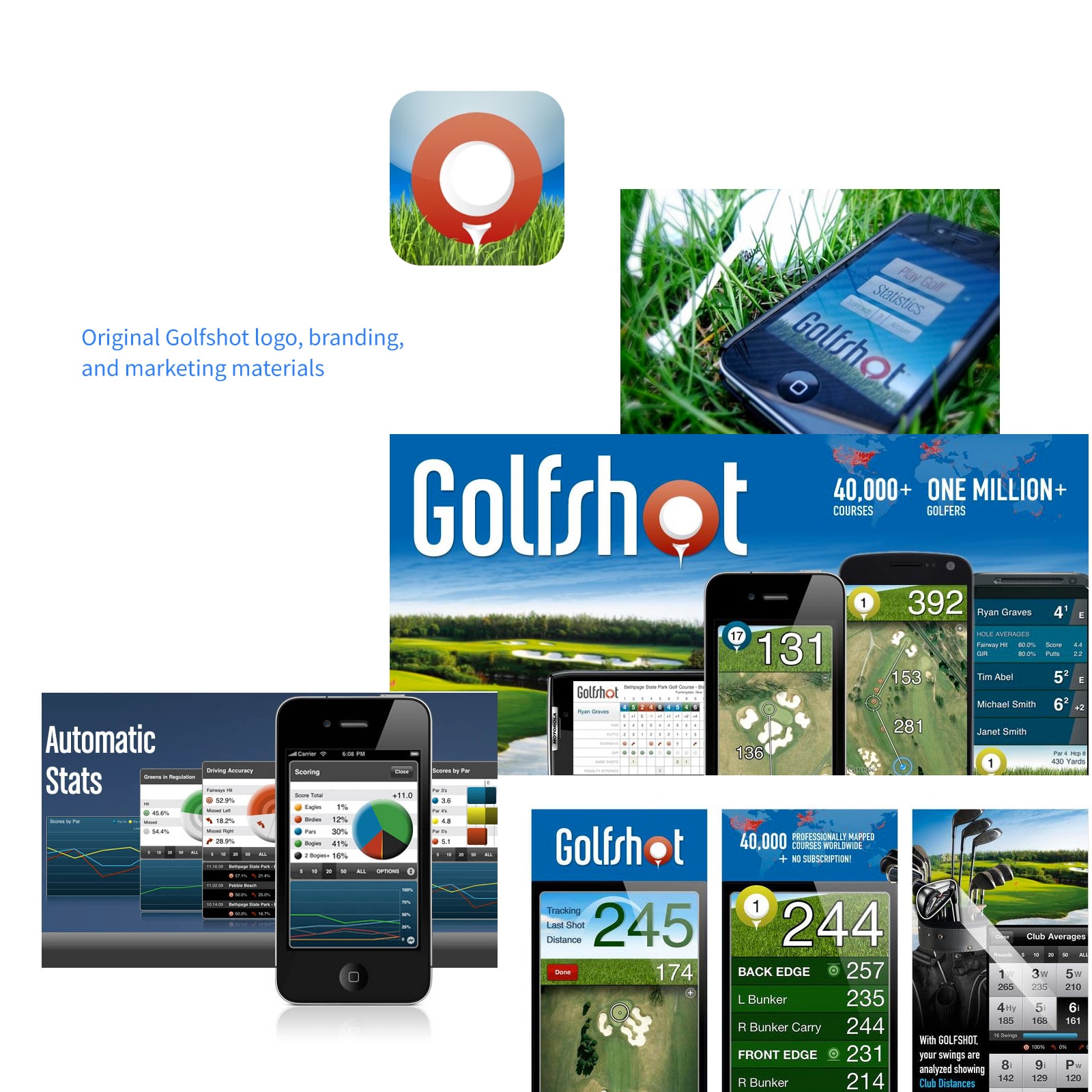
I began by examining Golfshot's original branding, rooted in the skeuomorphic trends of 2013: deep hues, heavy shadows, gradients, and Helvetica, common in tech design at the time.
Industry Shift
But skeuomorphism was on the way out. With the release of iOS 7 and Google’s Material Design, the industry rapidly shifted toward flat design, minimalism, and clarity. Companies quickly overhauled their visual identity to keep up.
New Direction
By 2014, Golfshot was falling behind. With a clean slate, I set out to modernize the brand:
- Redesigned the logo
- Refreshed data visualization and golfer stat presentation
- Revamped the overall design language
- Created a flexible, cohesive branding system
Defining the Design Language
Color Palette
I developed a brighter, more accessible color system optimized for modern interfaces and created two variations of the palette:
- Mobile apps: Brighter tints for visibility in sunlight and better accessibility
- Web and email: Muted tones for the profile site, marketing pages, and campaigns
Typography
Choosing a typeface was critical, especially for our older user base. After research and testing, I landed on IBM Plex Sans, a modern, readable, and flexible typeface with just enough personality. It balanced clarity with character.
Iconography
Unable to find a fitting icon set, I built a custom family from scratch. Designed for both in-app use and marketing, the icons became a key piece of our evolving design system—clean, consistent, and purpose-built.
View Design System Spec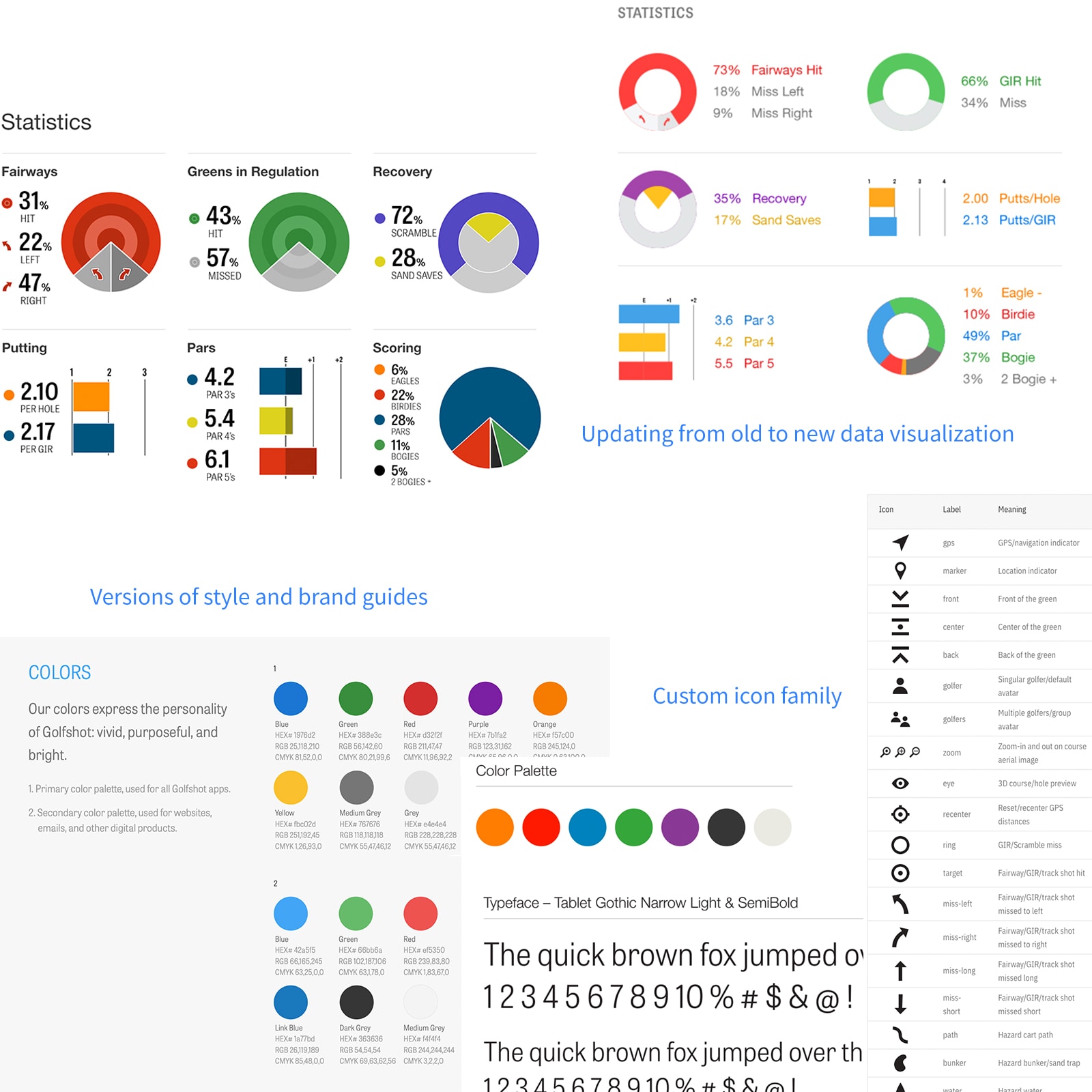
Refining the Logo and Mark
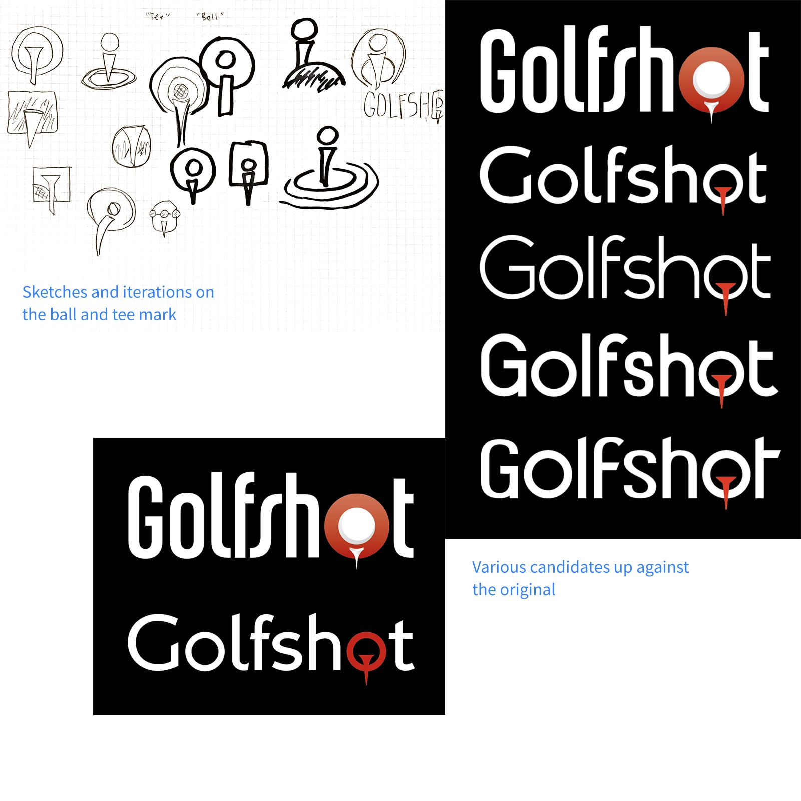
Approach
The original Golfshot logo had strong brand recognition, so we took a conservative approach—modernize it without losing its identity.
User Feedback
Initial concepts strayed too far from the original. But through feedback, we discovered users were emotionally tied to the legacy logo and they just wanted it "cleaned up."
Redesign
We refined the UI based on feedback, improving contrast and touch targets.
Outcome
The final logo struck the right balance: fresh and modern, yet familiar. It resonated well both internally and with loyal users.
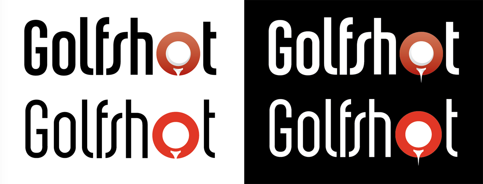
Final logo up against the original.
Evolving into a Brand System
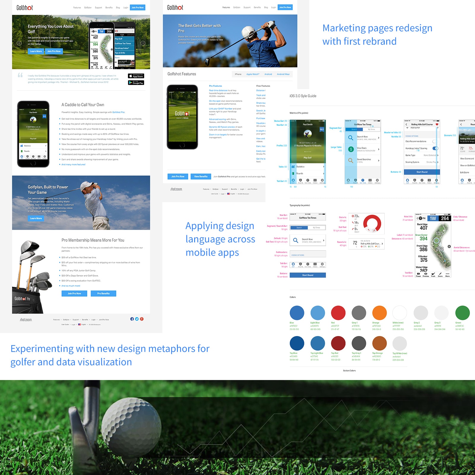
Brand Application and Guidelines
With the updated logo and design language in place, I created a brand usage guide and began applying it across all touchpoints—mobile apps, websites, emails, ads, swag, and social media. Everything got a cohesive visual refresh.
View Original Brand GuideSystematizing the Brand
As we prepared for a major product revamp in 2016, I evolved the brand into a full system. By breaking down our visuals into modular components, we ensured consistency and efficiency across all user-facing products.
View Design System SpecDesign Language and Metaphors
We introduced subtle shifts in style to keep the brand feeling modern, clean, and a bit bold—aligned with our golfer persona. I also created a set of visual metaphors (e.g., data visualized in physical space, overlay techniques) to connect our branding more directly with how golfers track performance and progress.
The Outcome
The redesigned Golfshot app launched to positive reviews, with increased engagement and higher app store ratings.
View SiteView Brand Guide
View Design System Spec