Role
As Lead UI/UX Designer, I researched, redesigned, and improved CoachNow's remote coaching app.
Challenge
The legacy app's poor onboarding, confusing navigation, and outdated support caused frustration, low engagement, and high abandonment.
Process
We audited the product, gathered feedback, and interviewed coaches to identify pain points. We then ideated, prototyped, tested, and rebranded the app for continuous improvement.
Goals
User: Simplify remote coaching to foster effective learning moments for athletes.
Business: Boost KPIs, increase premium subscriptions, and drive engagement.
| KPI's | 2017 | 2019 |
|---|---|---|
| User base | 150,000 | 310,000 |
| Net Promoter Score | 40 | 51.8 |
| Posts per month | 20 | 52 |
| Renewal rate | 73% | 90% |
| YoY revenue growth | 10% | 33% |
Timeline
2 Years, June 2017 - April 2019
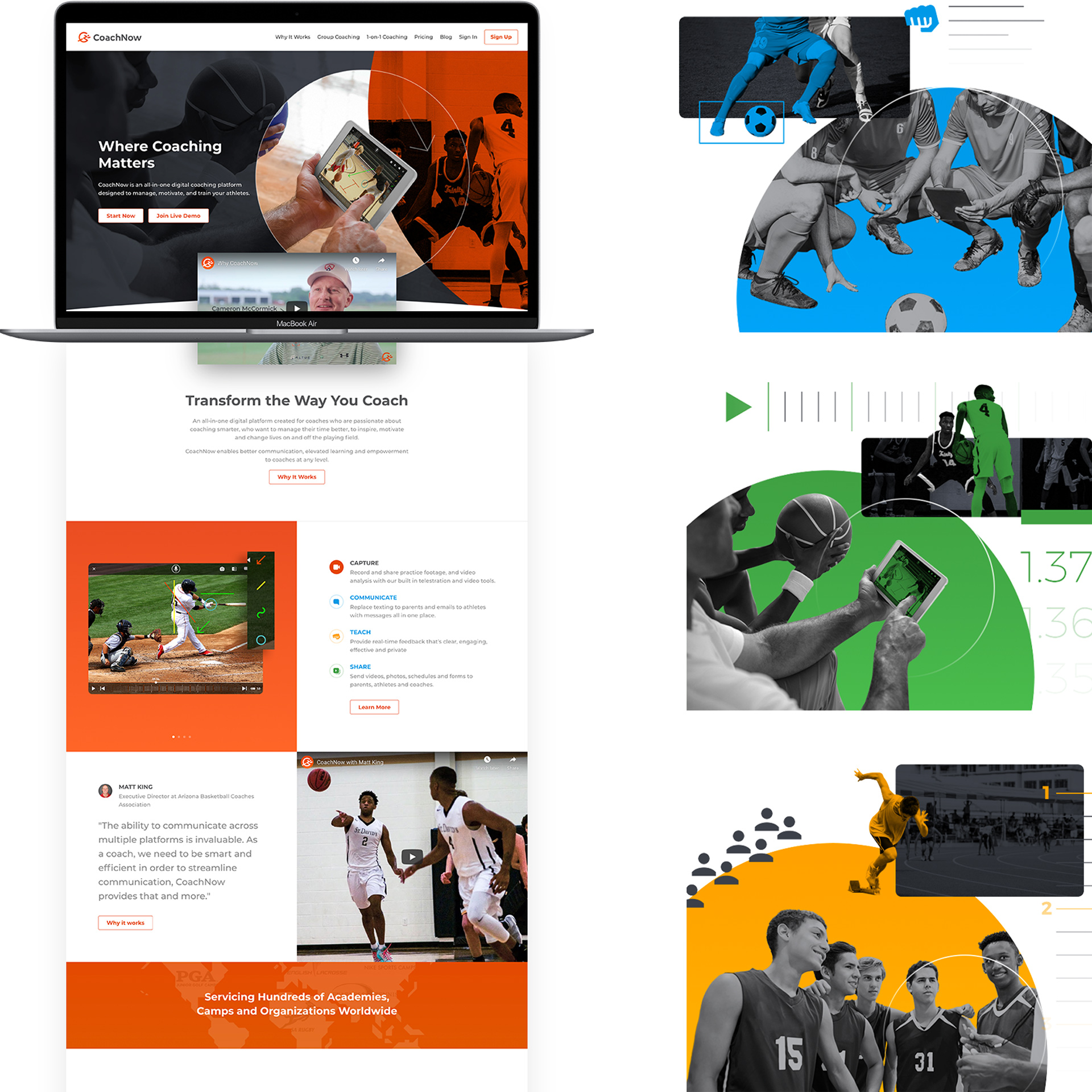
"The ability to communicate across multiple platforms is invaluable. As a coach, we need to be smart and efficient in order to streamline communication, and CoachNow provides that and more."
Matt King, Executive Director at Arizona Basketball Coaches Association
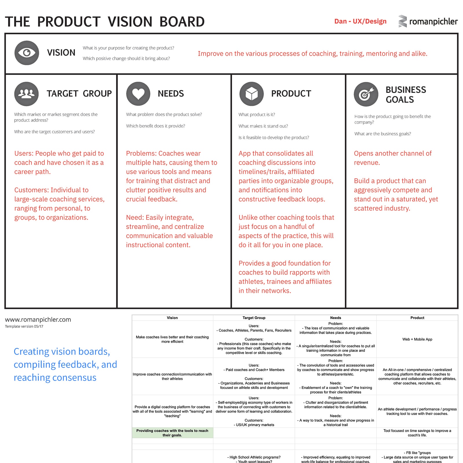
Define Roadmap and Vision
Vision and KPIs
We aligned teams with vision boards and clear KPIs:
- User base growth
- Net Promoter Score (NPS)
- Posts per coach per month
- Renewal rate
- YoY revenue growth
Goals
User: Simplify remote coaching to foster effective learning moments for athletes.
Business: Drive growth, engagement, and subscription revenue.
Hypothesis
Empowering coaches with tools to teach and centralize content will improve communication, learning outcomes, and retention.
Auditing and Testing Existing Experience
Audits and Surveys
We audited existing apps and surveyed users for feedback. I mapped iOS and Android flows to identify inconsistencies and gaps.
Insights and Action Items
Research surfaced key insights, helping us narrow scope:
- Simplify: One feature can solve multiple use cases
- Rethink navigation and IA for clarity
- Implement tracking for data-informed decisions
- Prioritize long-term UX over quick fixes
- Streamline media upload and analysis workflows
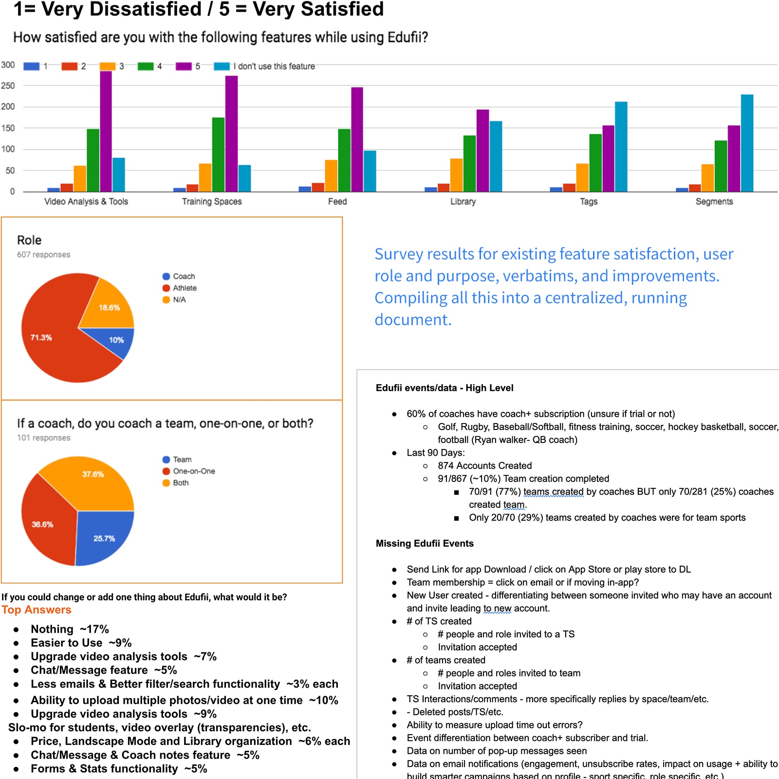
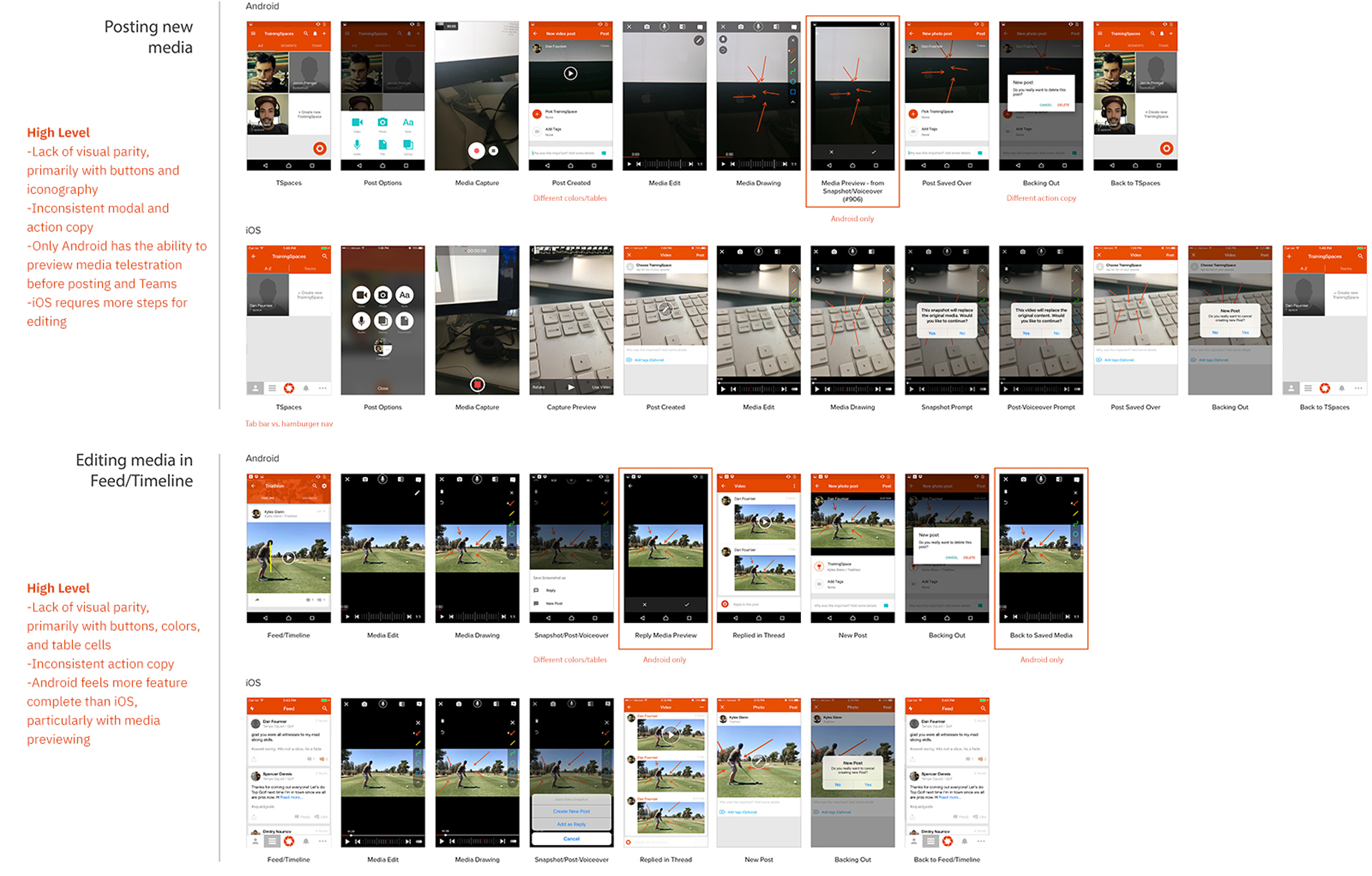
Visual audit by section/flow, noting current inconsistencies, features and functionality.
Learning and Understanding from Coaches
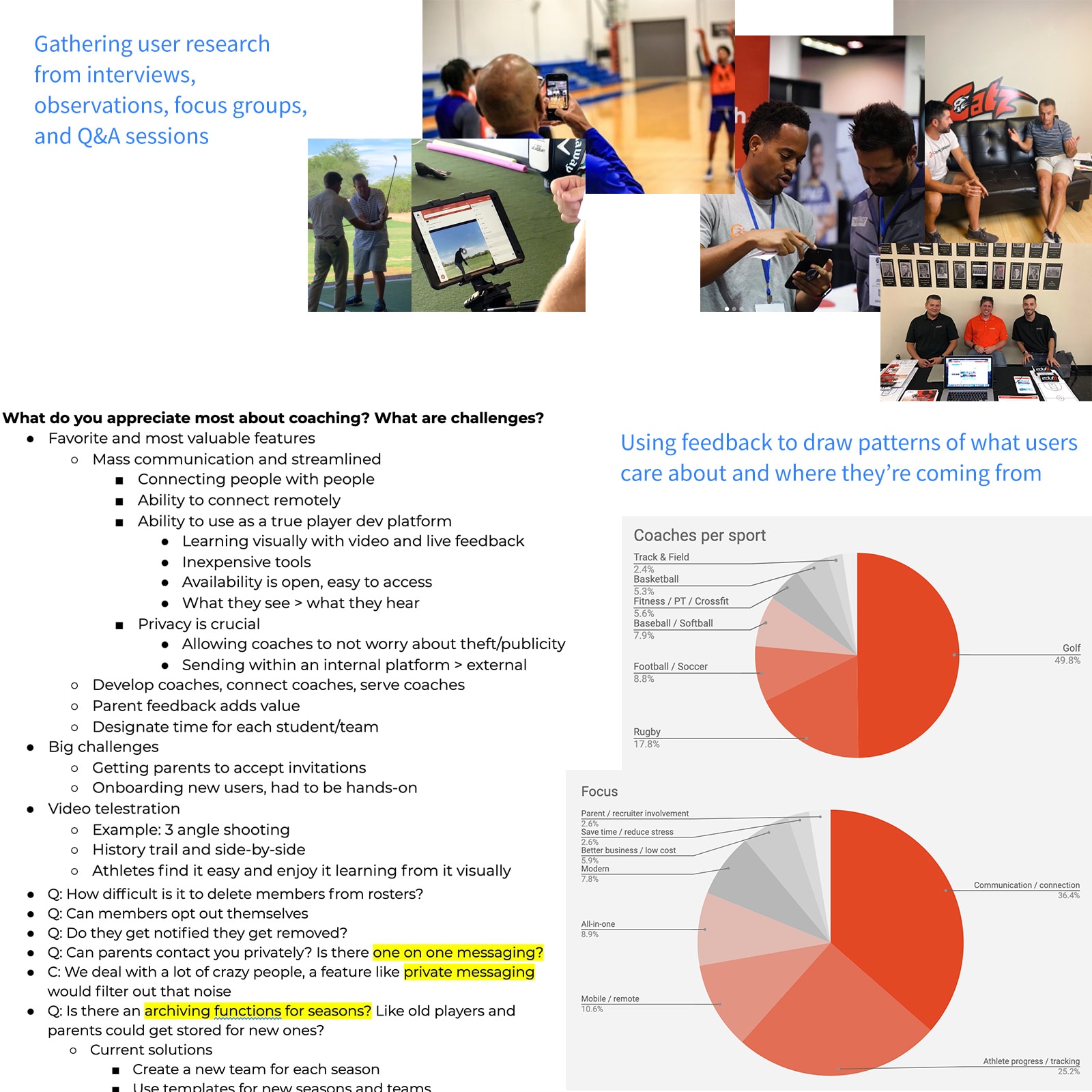
Research and Empathy Mapping
I explored the coaching process through interviews, focus groups, and observations. Empathy maps surfaced key mindsets and pain points.
Persona
Demographic
- Career coaches (1-on-1 or teams)
- Juggle multiple roles (e.g., admin)
Needs
- Better work/life balance
- Efficient communication and workflows
- Stronger athlete retention and feedback
- Simple parent involvement
Behaviors
- Use multiple tools to share content
- Rely on texting/calling for follow-ups
- Need hands-free onboarding
- Balance in-person and remote coaching
Persona
George, a high school football head coach, juggles multiple roles and budget constraints. He needs efficient communication tools to manage his team and keep parents informed without taking time away from coaching.
Defining Key Pain Points
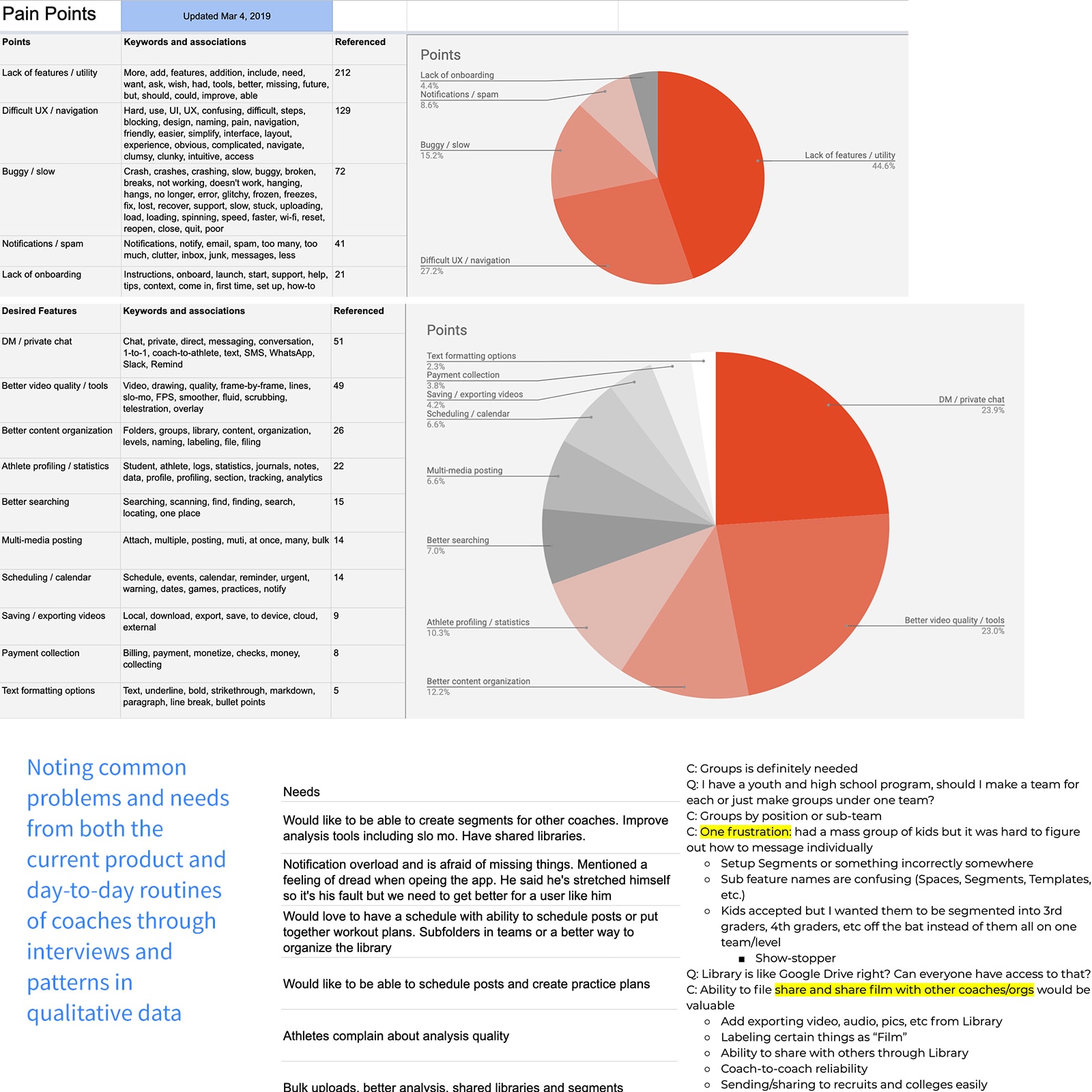
Themes
Centralizing feedback revealed clear patterns:
- Redundant information cluttered the interface
- Coaches needed fewer, centralized tools
- Confusing features caused frustration
- App was hard to learn and clunky
- Irrelevant notifications distracted users
- Media upload issues caused quality loss and crashes
Problem statement
Coaches face clunky, buggy experiences that block critical tasks. The app is bogged down with redundant features, making remote communication difficult.
Exploring Solutions
Focus and Clarity
We realized the app tried to do too much. Coaches primarily needed to capture and share media efficiently.
Key Solutions
- Simplify UI for capturing and sharing media
- Improve upload quality and eliminate crashes
- Streamline posting, liking, and sharing
- Merge redundant features into intuitive workflows
- Redesign onboarding for quick athlete invites
Prototyping and Design System
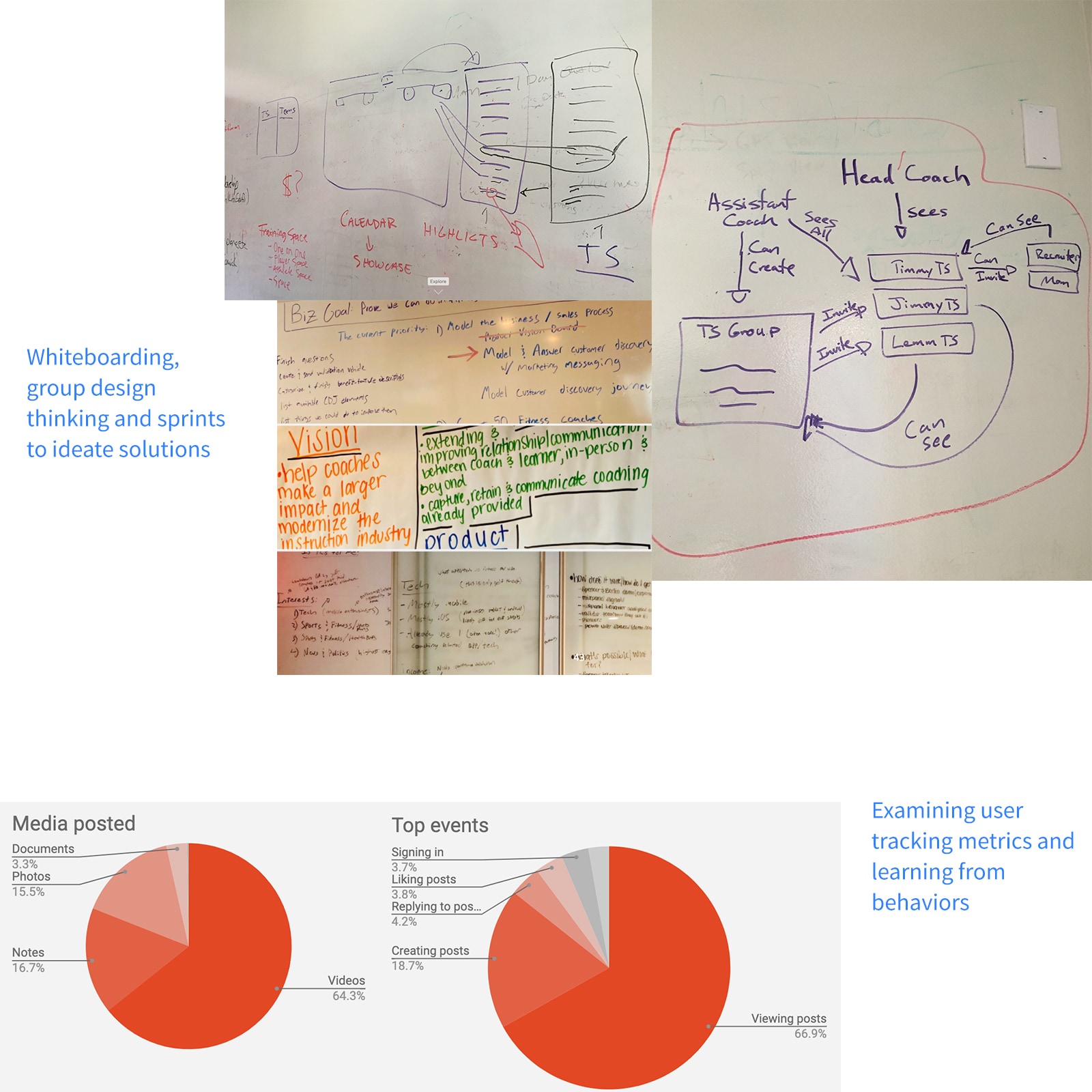
Approach
I mapped a UX strategy starting with capture/posting, then expanded to onboarding and app flow using our design system.
View Initial Strategy DocInformation Architecture and Wireframes
I built a clear IA to facilitate sketching and wireframing key flows.
Design System
I created a flexible design system with reusable components, documenting everything as we scaled.
View Design System SpecPrototypes
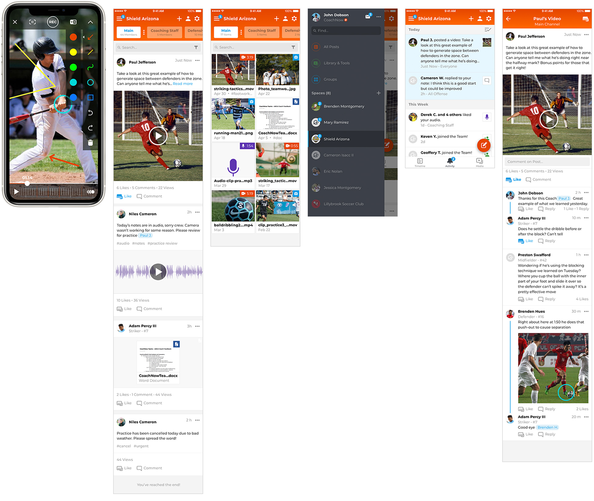
Using Adobe XD, I built high-fidelity prototypes, continuously testing and refining with users and stakeholders.
View Mobile Prototype Example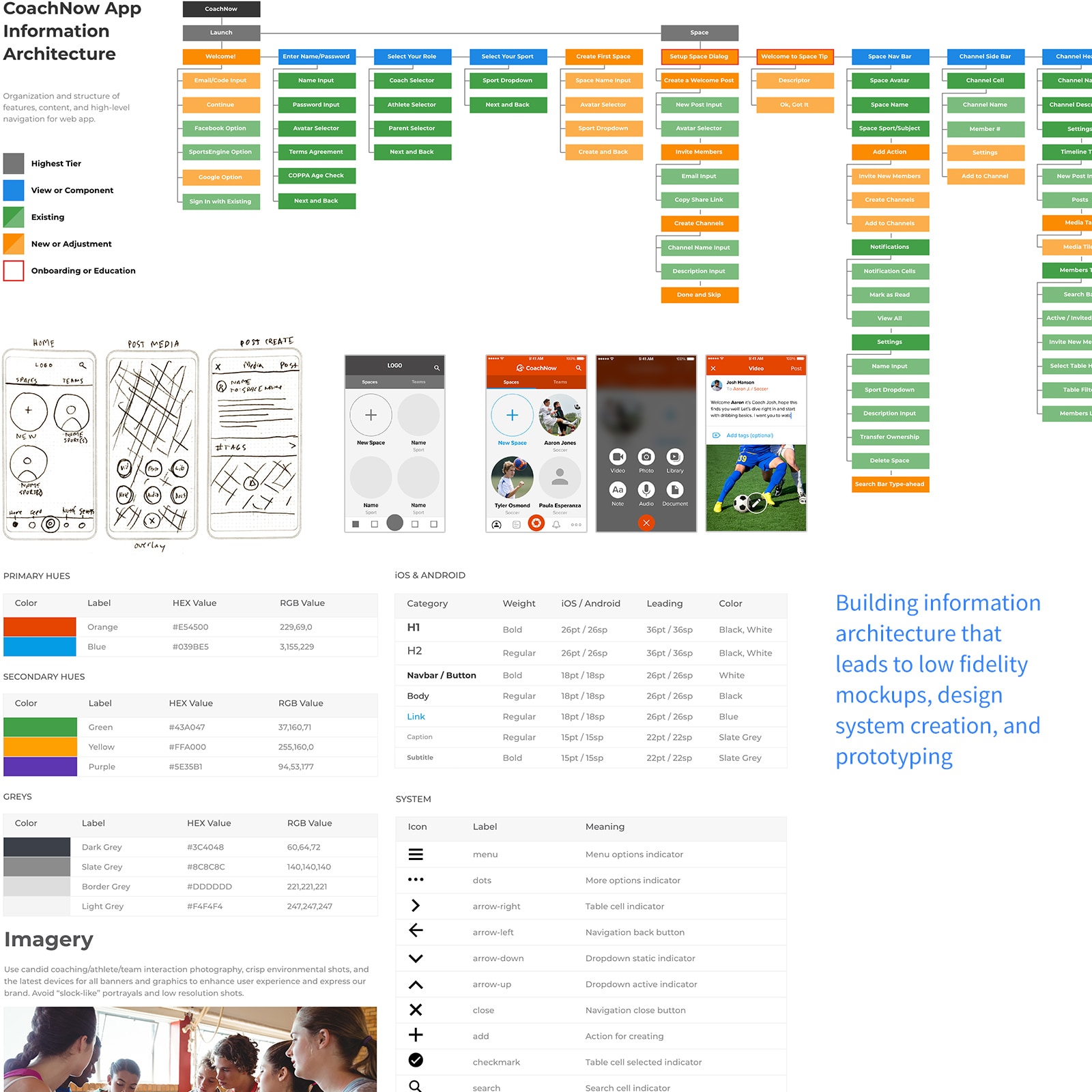
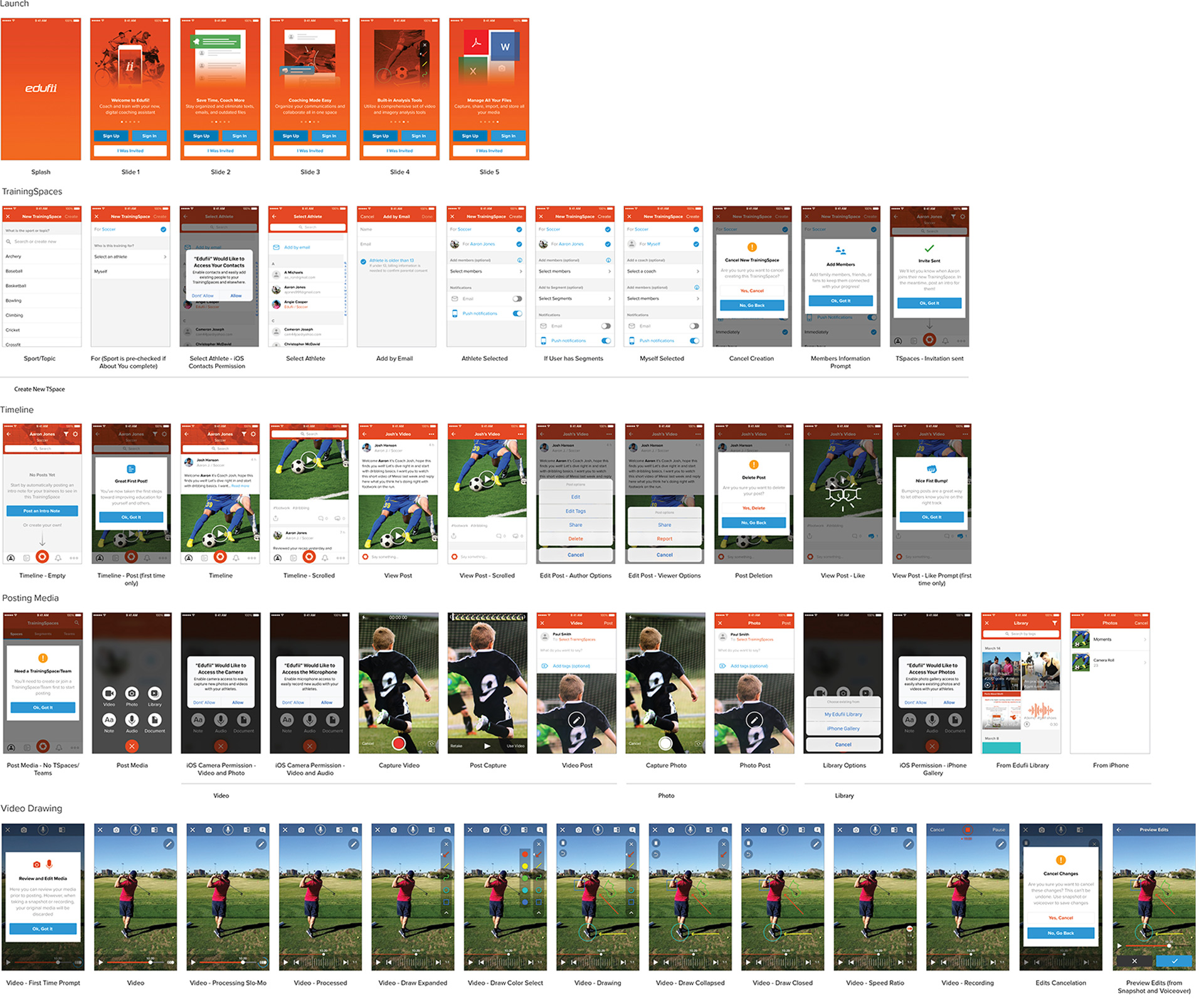
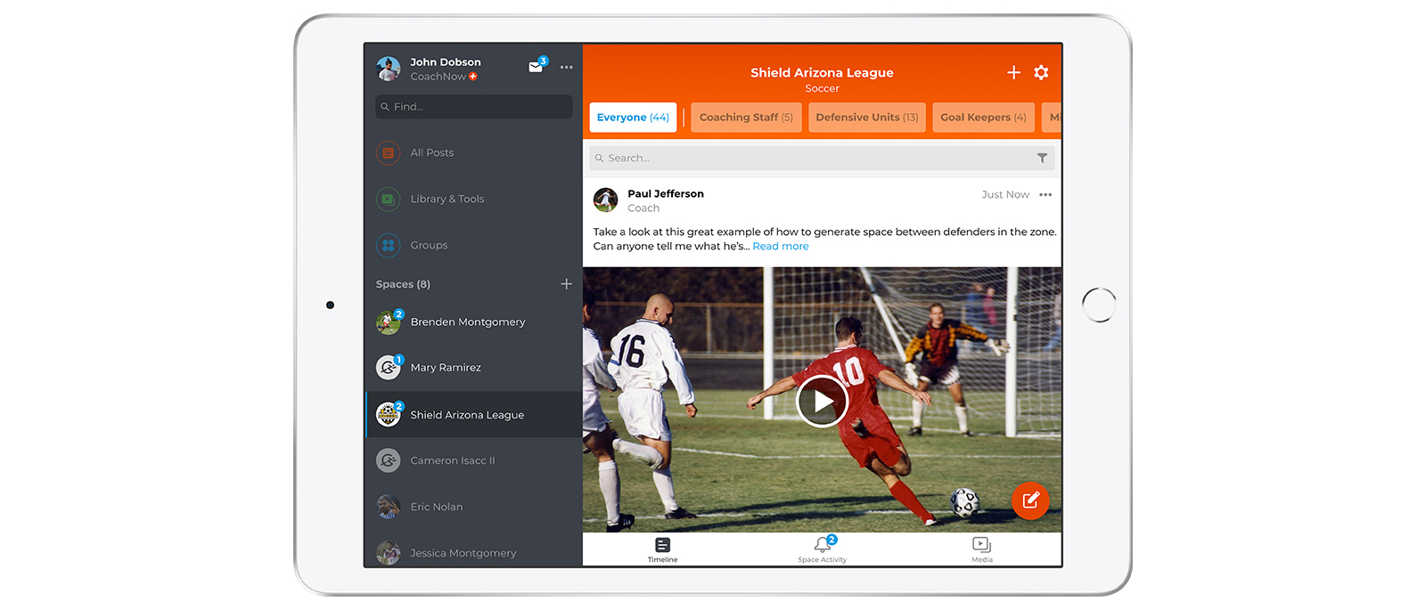
Version 1 of iOS primary flows.
User Testing and Iterations
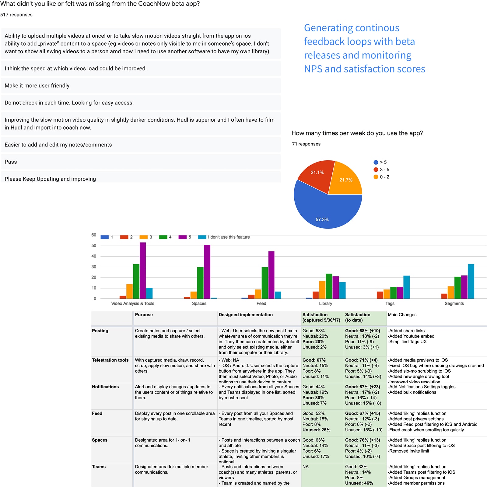
Beta Releases and Feedback
I led weekly feedback sessions, iterating on prototypes during beta testing. Key takeaways:
- Capture/posting was more intuitive
- High demand for bulk upload and scheduling
- Some features needed simplification
- Batching notifications preferred over real-time
- "CoachNow" branding resonated with users
Rolling NPS and Continuous Improvement
We implemented rolling NPS. Over 8 months, UX improved and KPIs trended upward. Tight feedback loops sped up delivery.
KPIs and app metrics
+29%
>5 times/week app usage
+13%
Core features CSAT rate
+23%
YoY revenue growth
The Outcome
CoachNow launched in Spring 2018 to strong reviews. Before departing in 2019, I delivered a high-fidelity prototype and a lean product brief for handoff.
| KPI's | 2017 | 2019 |
|---|---|---|
| User base | 150,000 | 310,000 |
| Net Promoter Score | 40 | 51.8 |
| Posts per month | 20 | 52 |
| Renewal rate | 73% | 90% |
| YoY revenue growth | 10% | 33% |
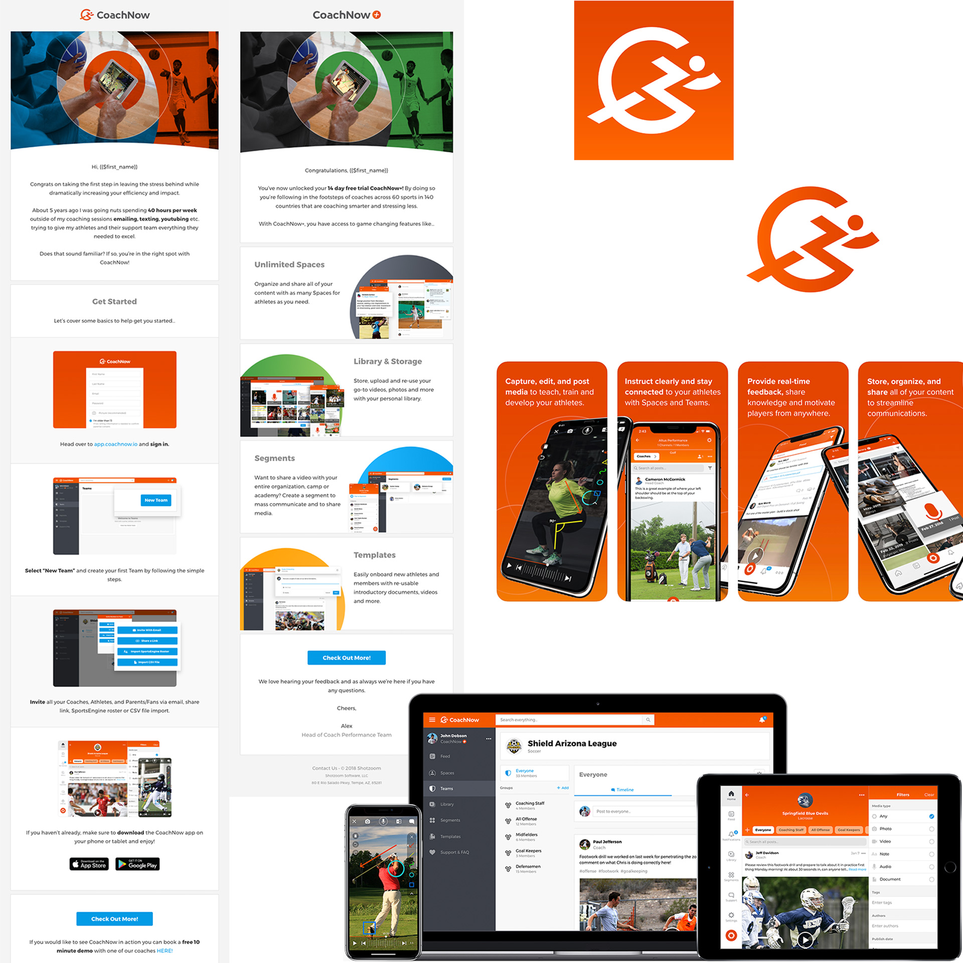
View on App Store
View on Google Play
Discovery and Roadmap
Kick Off
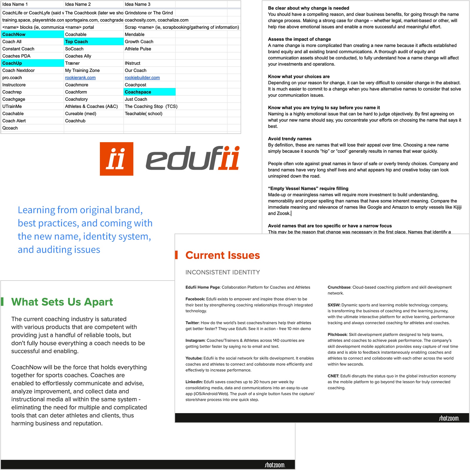
We kicked things off by exploring the original branding. “Edufii” combined education and edification, symbolizing coach/athlete collaboration with its double “i.” The goal was to make it a verb, like “Google it,” for sharing and improvement.
Brand Roadmap
Once we aligned on rebranding to CoachNow, we shaped a roadmap rooted in core ideas:
- Coach in the moment: now, not later
- Use familiar tools for better coaching outcomes
- Help athletes reach milestones
- Reinforce that coaching matters
Identity Doc and Auditing
I then created a brand identity doc that captured this philosophy, backed it with user data, and audited the existing system to guide early design and strategy.
View Identity System DocDefining Design Language
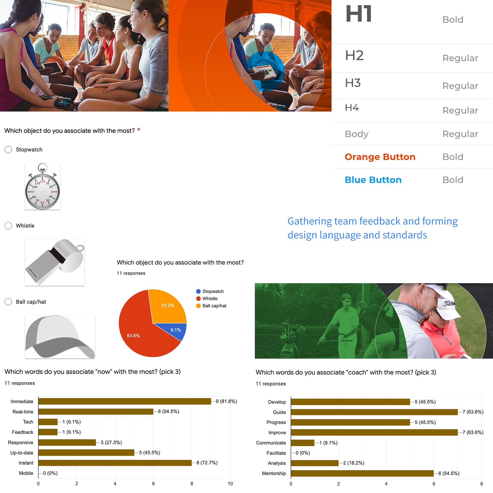
Themes
To guide the new logo and visual identity, we explored brand themes tied to coaching:
- Symbols of coaching
- Athlete progress and momentum
- Responsiveness and multitasking
Research and Direction
We surveyed stakeholders on what "coaching" meant to them. Their insights helped validate our themes and shaped a clearer brand direction.
Visual Building Blocks
We translated those themes into core design elements:
- Primary colors: Bright orange gradient and blue meaning progress and new beginnings
- Secondary colors: Green, purple, yellow meaning coaching tools and diversity
- Shapes: Circular meaning focus, inclusion, and privacy
- Typography: Bold and modern sans-serif
- Iconography: Simple, rounded, and coaching-relevant
- Imagery: Real, candid, coach/athlete moments
Defining Logo and Mark
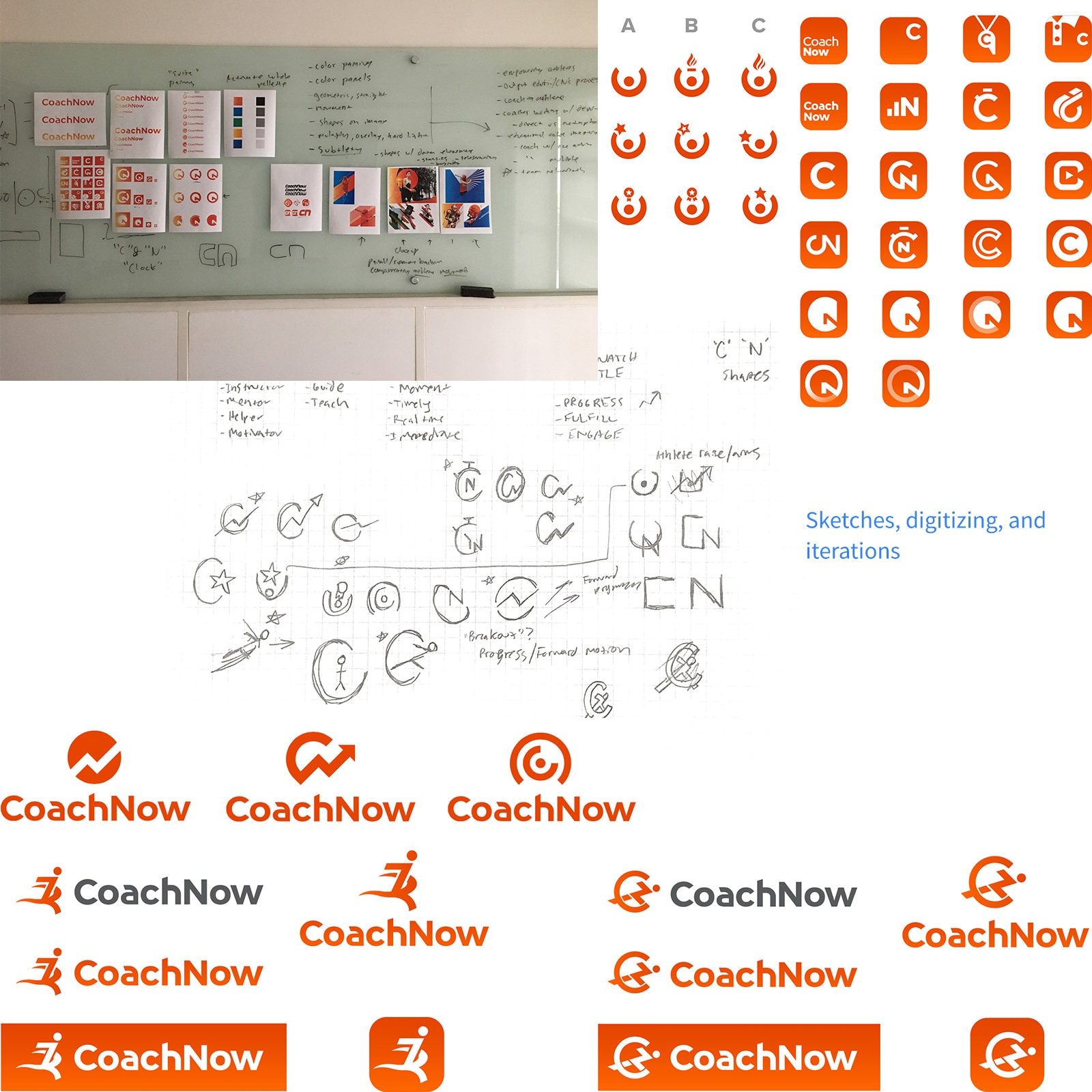
Direction
We began by exploring literal symbols of coaching (tools, materials), but through research and repeated themes, we pivoted toward metaphor—specifically athlete progress and forward movement.
Sketches and Exploration
Through extensive sketching and brainstorming—on grid paper, whiteboards, and digital tools—we explored metaphors like medals, finish lines, and personal milestones.
Finalized Candidates
After several iterations, we narrowed it down to three strong logo concepts that visually represented progress, fulfillment, and the impact of great coaching.
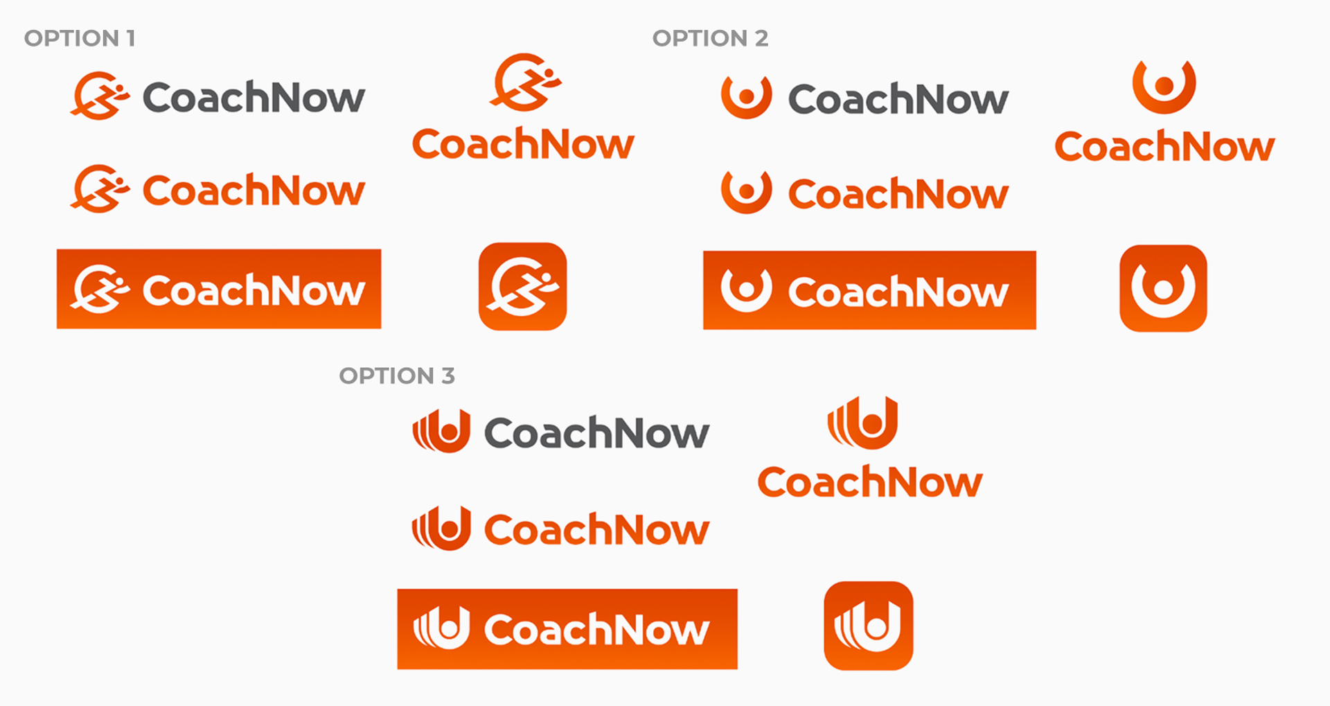
Three final candidates.
Pressure Testing
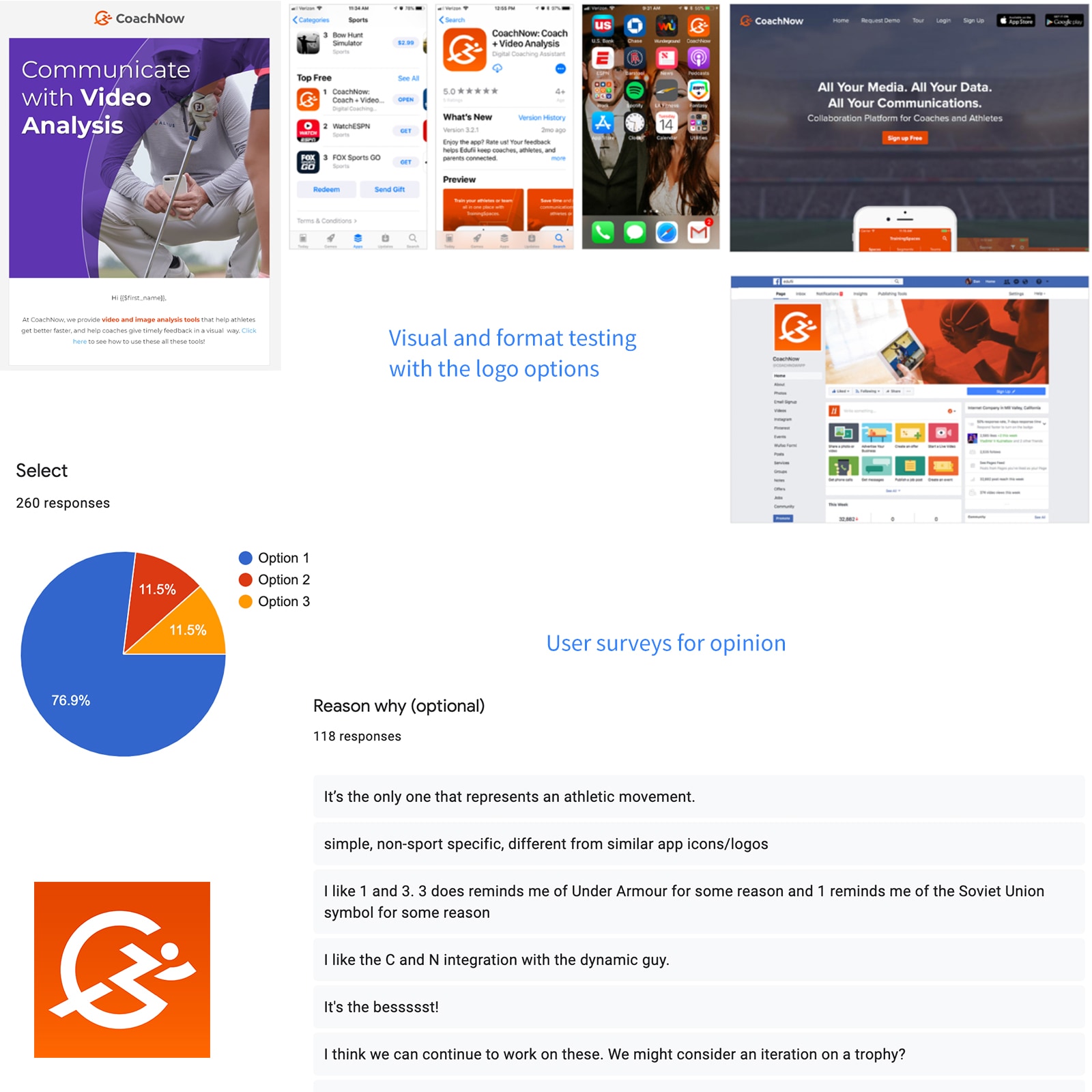
Scaling and Visual Testing
We tested our final logo candidates across various formats—app icons, web, print—to ensure adaptability and clarity at all sizes.
Stakeholder and User Feedback
After visual checks, we surveyed stakeholders and a small user group. Results showed a clear winner:
- Option 1 featuring the "running man" and subtle C/N form was the favorite
- It conveyed athlete motion best and even evoked a stopwatch/time metaphor
- All options aligned well with the overall design language and typography
The Outcome
The rebrand evolved into a design-by-committee effort, a common challenge in business rebranding efforts. Despite that, the process of exploration, definition, and iteration led to a strong, cohesive brand brought to life across digital, print, and marketing touchpoints.
View SiteView Brand Guide
View Design System Spec