Role
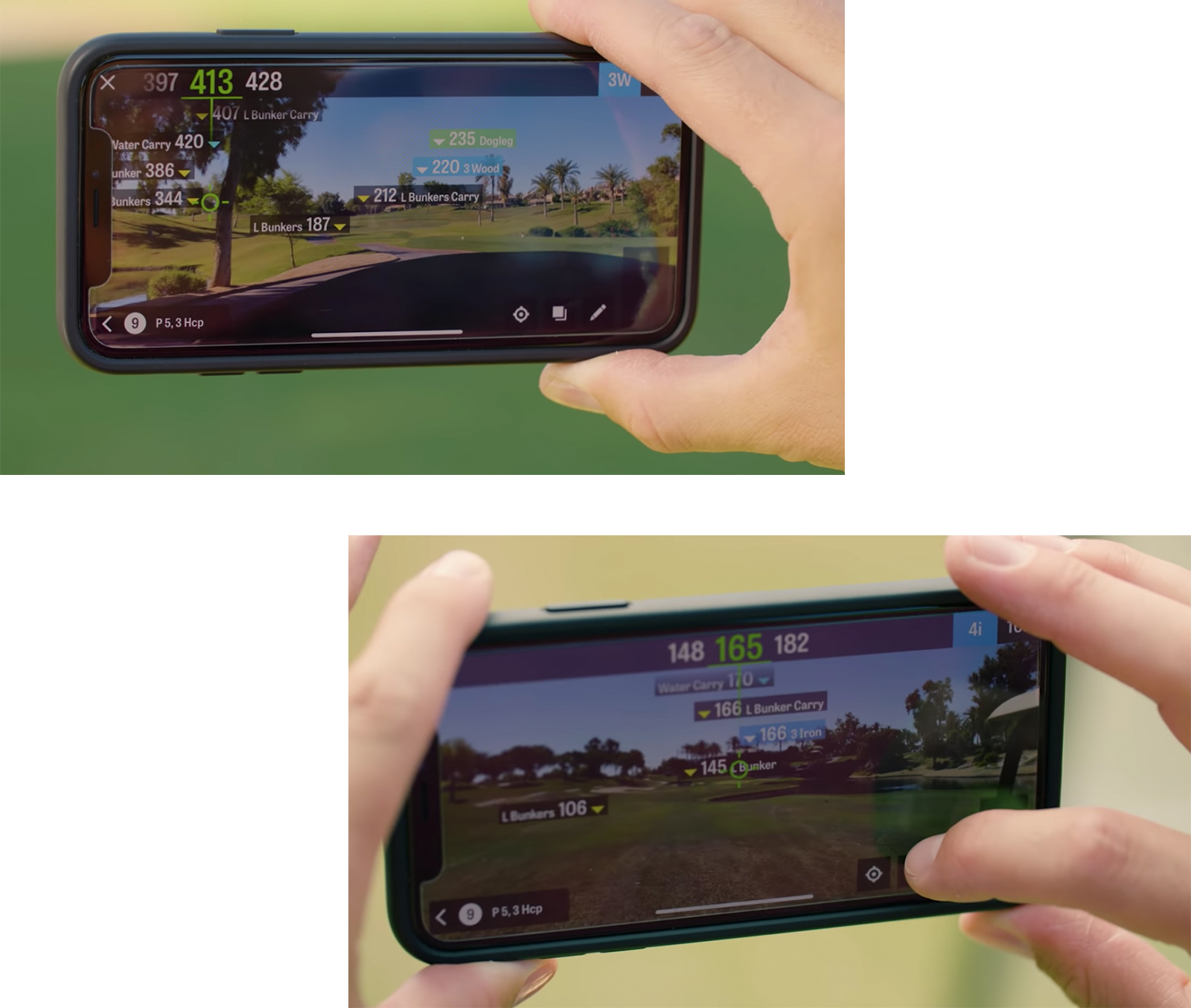
As Product Design Manager for Golfshot, I led the initiative to leverage Apple's new ARKit, enabling all iPhones for native augmented reality development. We aimed to build an AR product helping golfers find distances in a familiar, intuitive way.
Challenge
Adopting beta ARKit technology presented unique technical and usability challenges. While the use case aligned with golfers' habits of using rangefinders, designing for this new form factor required pushing design ideation to the limit.
Process
We defined KPIs, a lean canvas, and a hypothesis, then measured interest through feedback loops. I interviewed golfers to understand their needs and behaviors. We ran technical sessions, ideated via design sprints, prototyped, tested with beta groups, and launched Golfscape for continual improvement.
Goals
User: Develop a familiar AR GPS solution providing glanceable, useful information to improve the game.
Business: Achieve KPIs, grow adoption, and generate high monthly usage.
| KPI's | ||
|---|---|---|
| User satisfaction score | 8.7/10 | |
| AR viewed per round | 16.8 times | |
| AR session duration | 9.1 seconds | |
| Monthly active users | 22,000 |
Timeline
6 Months, November 2017 – April 2018
"Imagine golfing, or doing pretty much anything, while using this! You'll have more information than everybody you're playing with. Love this new tool!"
User review
Product and UX Roadmap
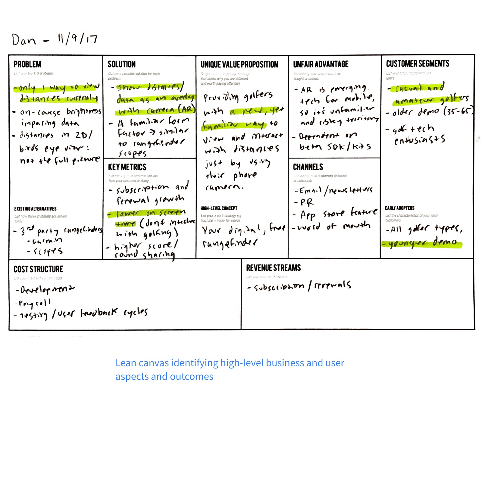
Lean Canvas
We utilized lean canvases to identify business and user outcomes and KPIs:
- User satisfaction score: 8+/10
- AR viewed per round: 18 times (at least once per hole)
- AR session duration: Under 10 seconds
- Monthly active users: 15,000+
Goals
User: Develop a familiar AR GPS solution providing glanceable, useful information to improve the game.
Business: Achieve KPIs, grow adoption, and generate high monthly usage.
Hypothesis
We believe providing a familiar rangefinding method for viewing distances will increase app engagement and improve course management.
Discovery
Gather Feedback
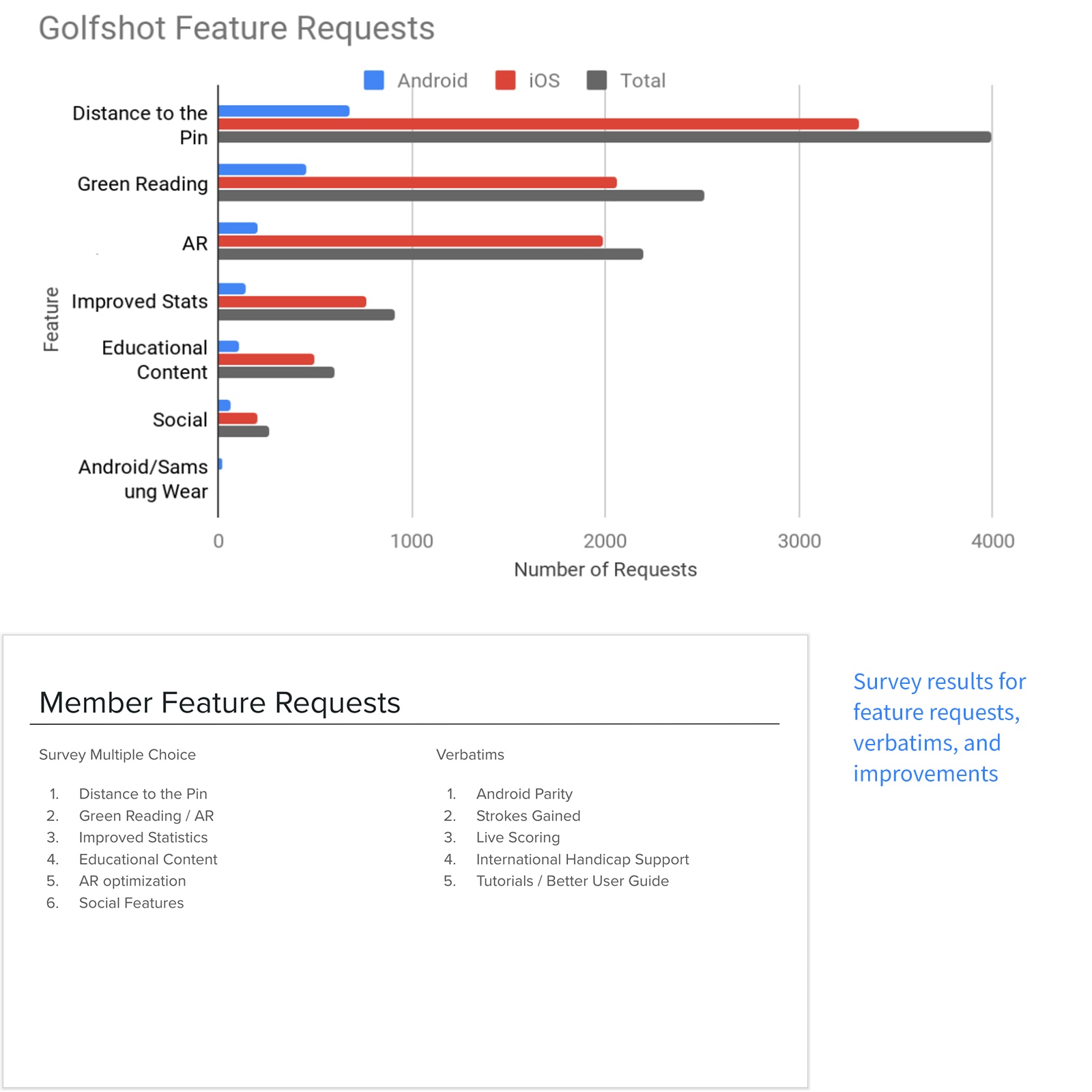
To validate our hypothesis, we surveyed and interviewed golfers. We discovered frequent requests for AR, pin, and green reading, confirming the need for Golfscape. Findings:
- Distance to Pin and AR green reading were top feature suggestions
- Over 1,500 users requested enhanced statistics and data visualization
- High general interest in AR technology
Compile Brief
Using feedback and our lean canvas, we created a brief outlining goals, needs, and tech specs to guide strategy, iteration, and development.
View Working BriefProblem statement
Golfers currently have limited ways to view distances in Golfshot. They need familiar rangefinding options to maximize usage and improve retention.
Learn and Understand from Golfers
Persona
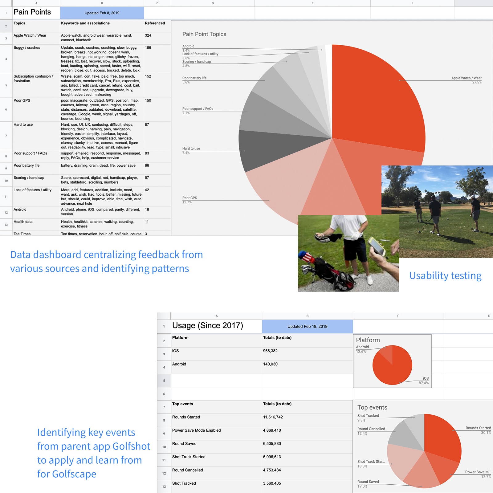
To understand golfer behavior, I analyzed quantitative and qualitative feedback from Golfshot to define our persona:
Demographic
- Age 35-65
- 84% male, 16% female
- Social/casual (1-4 rounds/month)
- Amateurs/competitors (5+ rounds/month)
Needs
- GPS displaying distances
- Eliminates guesswork for distances
- Automates tasks to save time and maintain flow
Behaviors
- Looking to improve game aspects
- Constantly surveying for ideal distance/target
- Think 2 shots ahead
- High battery drain
Needs
I interviewed golfers about AR to identify potential pain points:
- AR less familiar than conventional rangefinders
- Overlays difficult to see in bright sunlight
- Distance overlays hard to view in field
- Concern about data overload
Goal
Overlaying course data onto the real world provides golfers an intuitive, glanceable way to understand the hole ahead.
Technical Onboarding and Ideation
Key Aspects
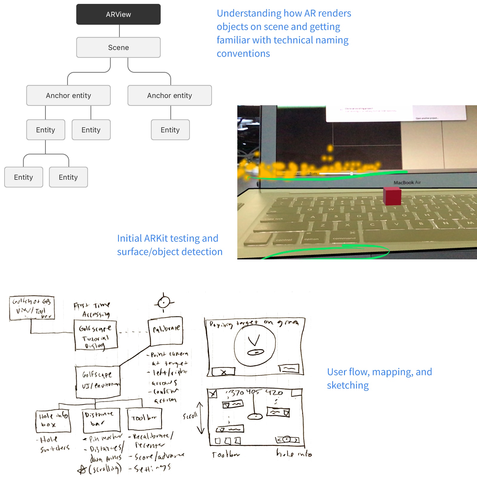
I derived themes from Apple's ARKit guidelines and user feedback:
- Users must calibrate iPhone before activation (ARKit requirement)
- Engaging AR experiences increase time-in-app and premium upgrades
- Tutorial required for new interaction set
- AR features must be quick to access and dismiss to avoid slowing play
- Data overlays must be high-contrast for clarity
- Display relevant info quickly to maintain flow
Ideas
- First-use dialog explaining calibration and features
- One-click calibration
- HUD with course aerials and targets
- Scrollable foreground data overlays
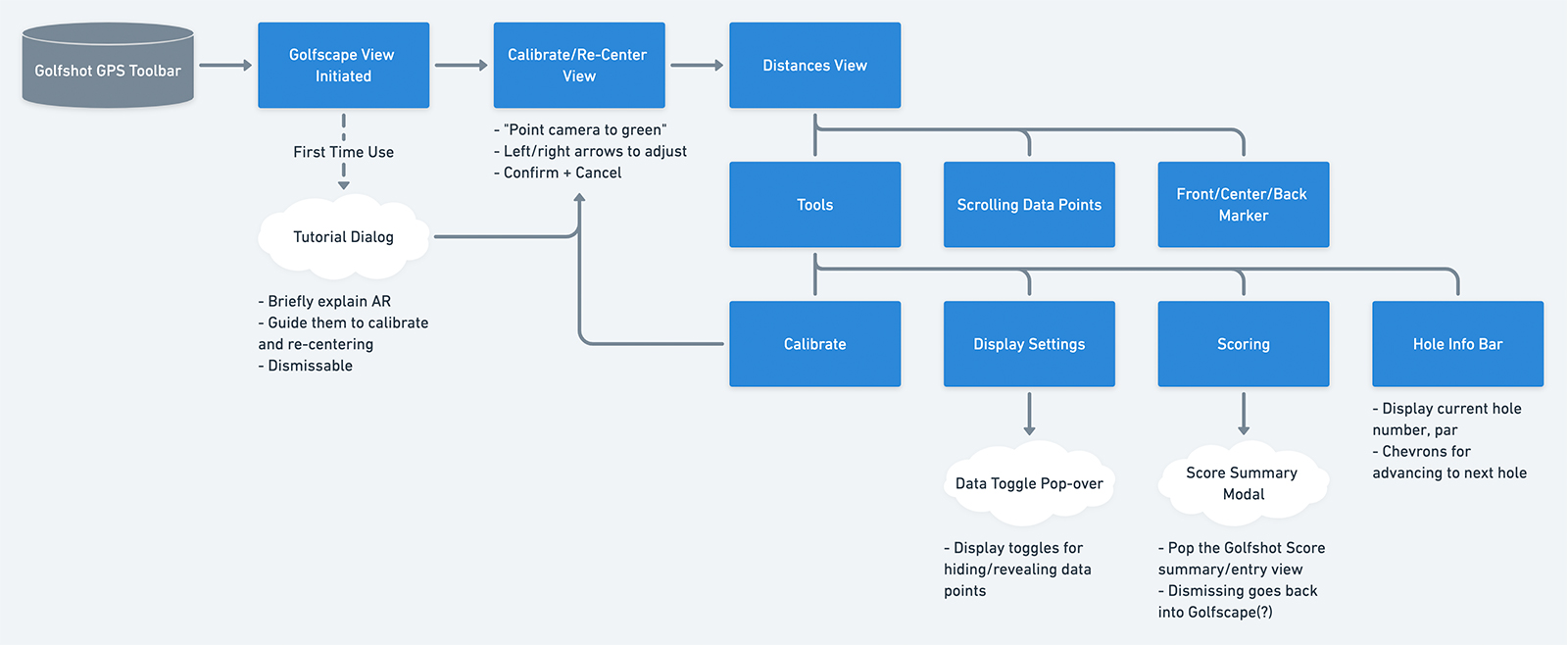
High-level map and user flow of Golfscape.
Prototyping
Sketches and Wireframes
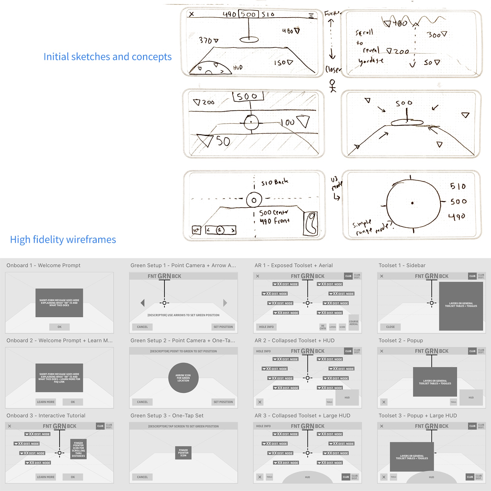
I sketched UI concepts and diagrams. AR presented challenges in data visualization, depth of field, device orientation, and panning sensitivity. After stakeholder and user reviews, I refined mocks into wireframes.
View WireframesHigh Fidelity Prototypes and Flows
I created high-fidelity Adobe XD prototypes. We conducted internal demos and feedback loops with local golfers, resulting in a solid prototype for beta development and testing.
View Prototype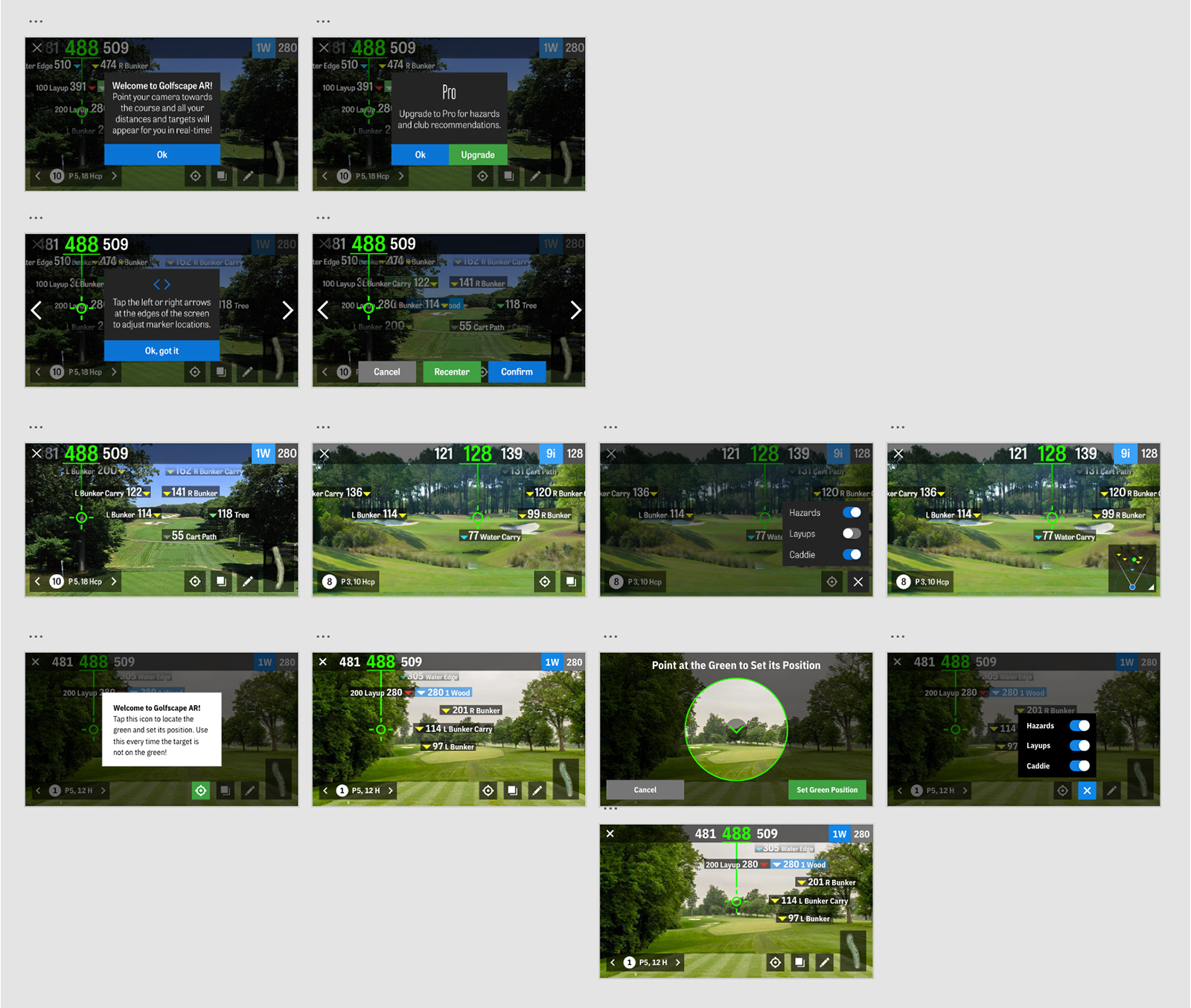
High fidelity prototypes and versions.
User Testing and Iterations
Beta Testing
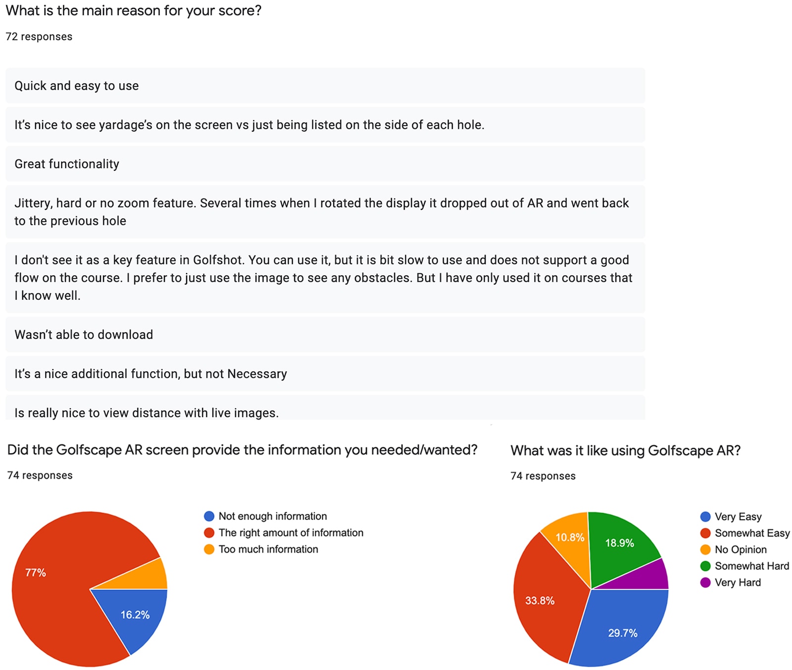
We distributed a beta version for field testing. Findings:
- Calibration buttons slow and difficult to use
- Scoring needed better visibility
- Data overlay was "inventive" but hard to read
- Golfers felt overwhelmed by information overload
Hypothesis Statement
We focused on improving calibration UX and data overlays. I iterated on designs, moved to development, and shipped a new beta for testing. Findings:
- Calibration easier with point-to-click method
- Scoring clear with exposed button
- GPS data more accurate, legible, and unobtrusive
- Scrolling distances kept interface clean and simple
Beta testing results
6.2/10
first round CSAT score
8.7/10
last round CSAT score
The Outcome
We launched Golfscape ahead of the season, continually improving it. It saw great adoption within Golfshot and was positioned as the industry's first golf AR product.
| KPI's | ||
|---|---|---|
| User satisfaction score | 8.7/10 | |
| AR viewed per round | 16.8 times | |
| AR session duration | 9.1 seconds | |
| Monthly active users | 22,000 |
View on App Store
