Role
As a Senior Product Designer at UserTesting, I led design and research efforts to make remote UX testing simple and seamless for researchers, designers, and businesses.
Challenge
Our team, the Customer Group, focused on improving the core moderated and unmoderated testing products. These tools, used by research and product teams across startups to enterprises, were burdened with clunky UX, design debt, and technical limitations that caused confusion and blocked progress at critical moments in their research workflow.
Process
Partnering closely with research, engineering, data, and design systems teams, we prioritized high-impact platform issues. I contributed across the full design lifecycle: onboarding and discovery, research analysis, design sprints, usability testing, and QA. Bit by bit, we resolved complex problems and steadily improved the user experience.
Goal
Streamline mobile usability testing for researchers so that they can gather, analyze, and share critical user insights faster.
KPI's
- Mobile testing: increased
- Moderated audience participation: increased
- Participant NDA signing and adoption: increased
Timeline
6 months, April - October 2021
"Dan has really brought an incredible level of expertise and understanding of the customer to our team. Design thinking methodologies are always first in his mind when tackling any project. He is always ensuring that we are advocates for our customers."
Director, Product Design
Roadmapping and Discovery
Identifying a Key Issue
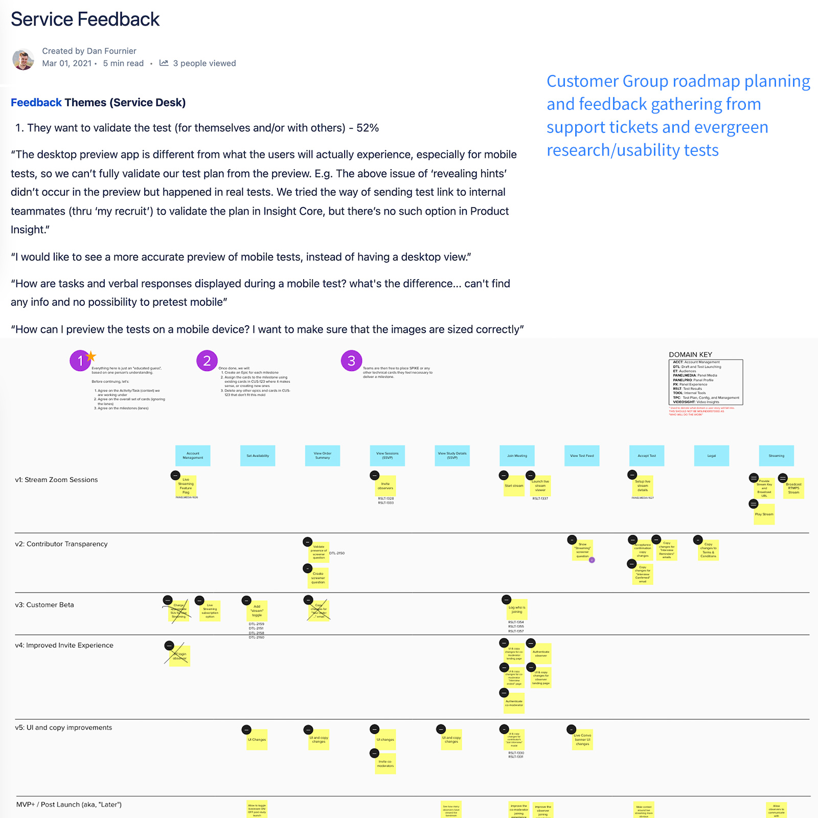
During H2 2021 planning, the Customer Group, user research, and data teams reviewed customer feedback.
A clear problem surfaced: users couldn't preview or simulate tests on mobile devices.
“How can I preview the tests on a mobile device? I want to make sure that the images are sized
correctly.”
“After building my screener questions, there is no way to preview them from the participant's
perspective on a mobile device."
“The desktop preview app is different from what the users will actually experience, especially for
mobile tests, so we can't fully validate our test plan from the preview."
Problem statement
Customers on our desktop-centric platform struggled to simulate how their tests would look and function on mobile. This made it difficult to catch and fix any issues early for mobile, leading to inaccurate tests, wasted time, and rework.
Isolating Pain Points and Aligning Teams
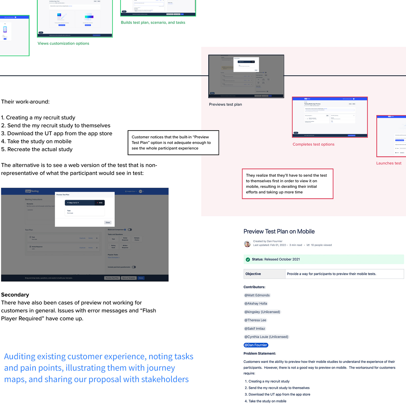
Journey Mapping
After briefing with teams, I stepped into our customers’ workflow to understand how they create mobile
tests. I mapped out key steps and frustrations along the way.
When unable to preview mobile tests, customers resorted to a workaround: creating separate tests,
sending them to themselves, and opening them on a mobile browser. This made a simple task feel clunky
and frustrating.
Team Alignment
I shared the journey map and insights with my PM and key stakeholders to drive focus and alignment. We agreed on:
- Focus Areas: Test Builder, Preview feature, and mobile app
- Scope: Mobile and tablet test previews only
- Timeline: 3-month project, aiming for a Q3 beta and Fall Release

Journey map
Workshopping and Ideation
Team Workshops
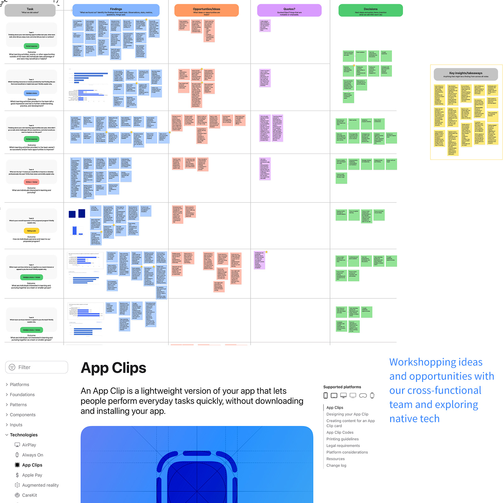
With alignment in place, I led a remote workshop to generate ideas and gather cross-functional input. Designers, engineers, PMs, and researchers collaborated to explore solutions.
Key Concept
A standout idea came from our mobile engineers: using native tech to preview mobile tests via QR codes.
This would allow customers to simulate tests directly on their devices.
The concept leveraged cutting-edge tools, iOS App Clips and Android Instant Apps, which let users access
native app experiences instantly, without downloading.
Hypothesis
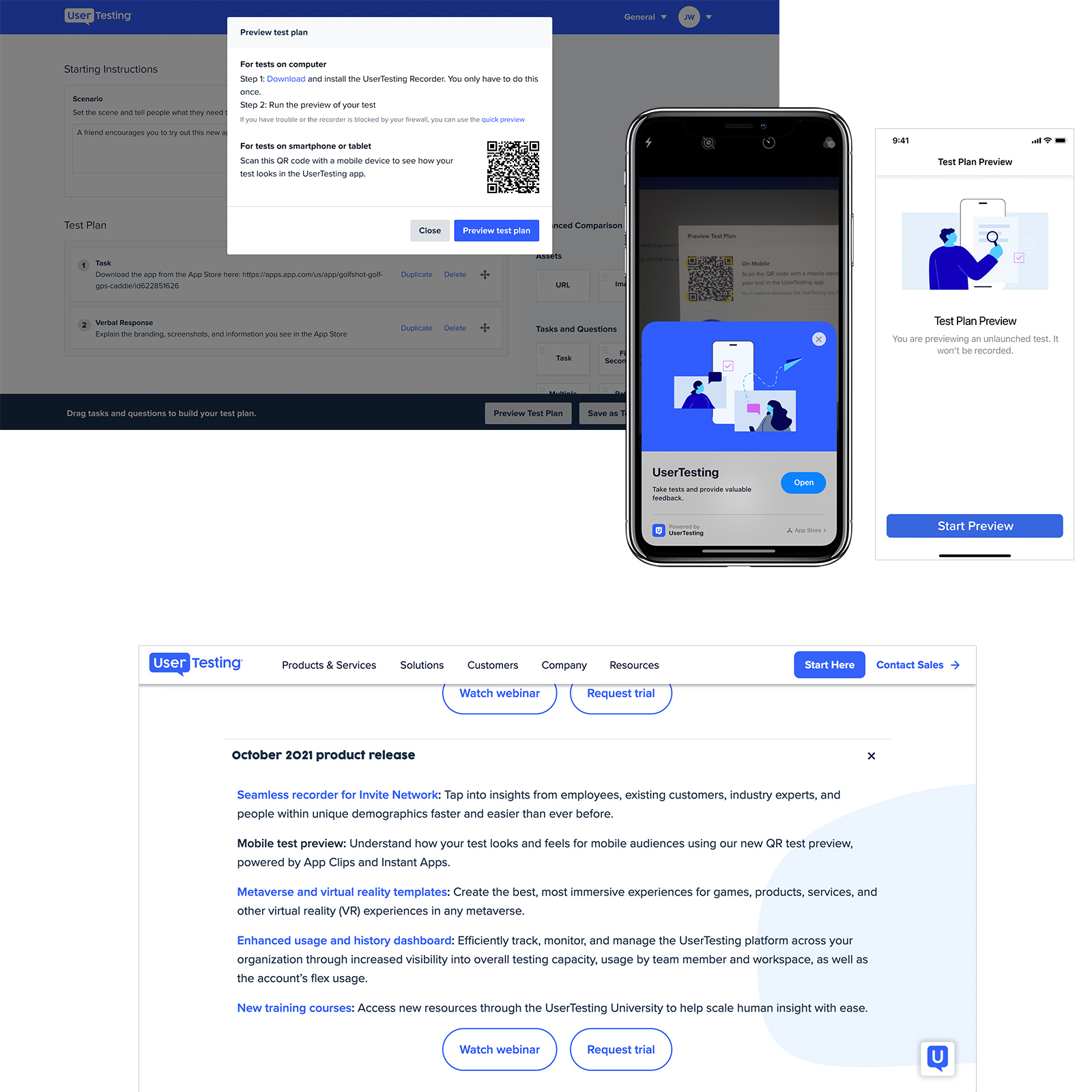
By scanning a QR code, customers can launch a lightweight test preview on their mobile device, allowing them to quickly identify and fix any issues before launching, saving time and resources.
Deciding on a Solution
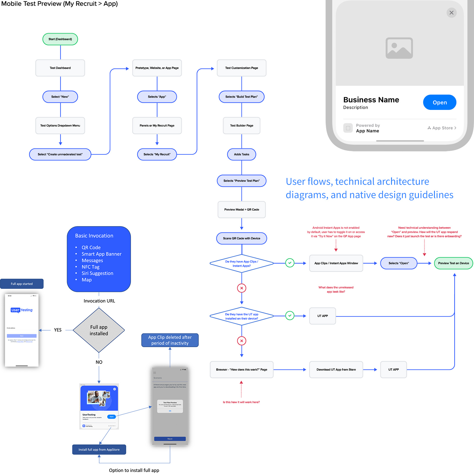
Exploring Flows
I partnered closely with our mobile engineers to map how this native tech could integrate into our current platform and user journey. Together, we explored key touchpoints across the customer testing flow.
Technical Discovery
In parallel, engineers evaluated the feasibility of App Clips (iOS) and Instant Apps (Android), diving into architecture, capabilities, and implementation requirements.
Decision and Direction
With stakeholder input and technical validation, we aligned on using native tech as the best solution, feasible to build and well-suited to our roadmap. The next step: test for user desirability.
Designs and User Testing
Design Exploration
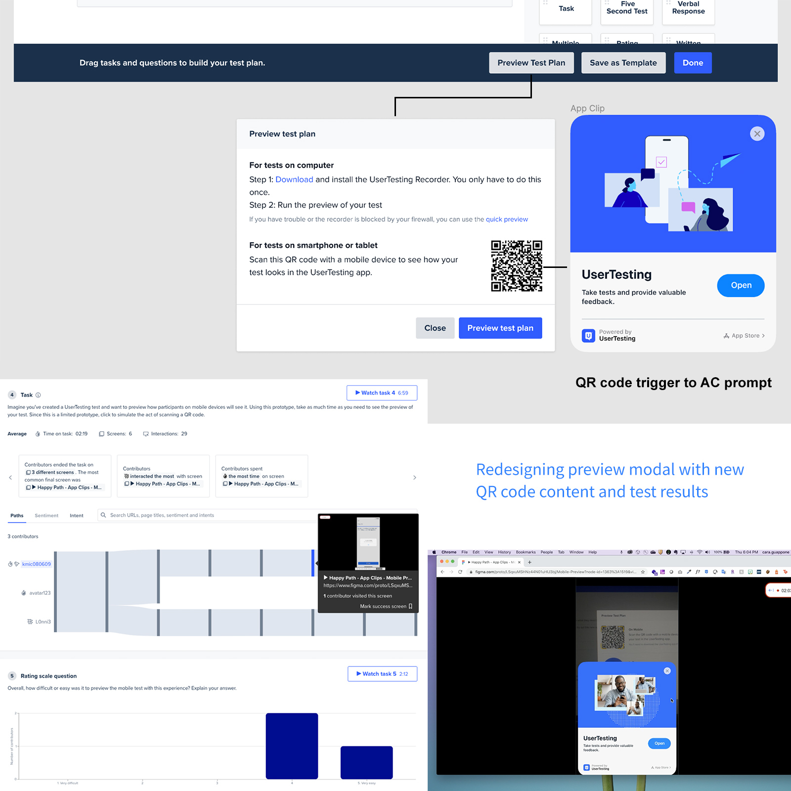
Adopting a third-party solution meant carefully integrating it into our existing Preview feature
without expanding scope. Since App Clips and Instant Apps are triggered via QR codes, I designed the
experience to surface within our Preview modal, accessed from the main Test Builder. The flow would
guide users to scan a QR code and continue their test on a mobile device.
After multiple internal reviews, I finalized a prototype to validate with customers.
User Testing
Collaborating with our UX researcher, we developed a test plan focused on three objectives:
- Measure discoverability
- Evaluate perceived value
- Assess overall usability
We tested with 5 customer participants and the results were clear...
Usability test results
5/5
found it valuable
4/5
very likely to use it
5/5
found it easy to use
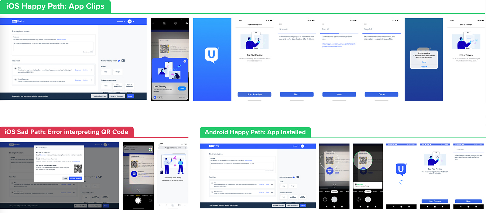
Crafting design happy and sad paths of using native tech vs. app installed.
Final Specs and Handoff
Design Specs
With feasibility, viability, and desirability confirmed, I collaborated with my PM and engineers to break the solution into clear, actionable specs. I provided detailed annotations, UI documentation, and click-through prototypes to illustrate the full desktop-to-mobile flow, making it easy for engineers to translate design into code.
View Mobile Prototype ExampleImplementation and Beta Rollout
After a month of development and QA, we launched a gradual beta rollout of the mobile preview feature.
This allowed us to monitor adoption and ensure stability without disrupting the existing platform.
Within 3 weeks, the feature was running smoothly and performing as intended.
The Outcome
Summary
The mobile testing preview launched successfully as part of our Fall Release and was met with strong
customer adoption and positive feedback. Users appreciated how easy and intuitive it was to create tests
on desktop and instantly preview them on mobile.
The project was even recognized during our company-wide All Hands as a standout effort, highlighted for
solving a key customer need on an ambitious timeline.
| KPI's | Outcomes |
|---|---|
| Mobile tests launched and recorded | +11% |
| Mobile preview QR code trigger | 2.3 per session |
| CSAT | 91% |
| Time-on-task to preview > launch | 7.8 minutes (-43%) |
