Role
The Collector's House hired me to design and build their website and brand.
Challenge
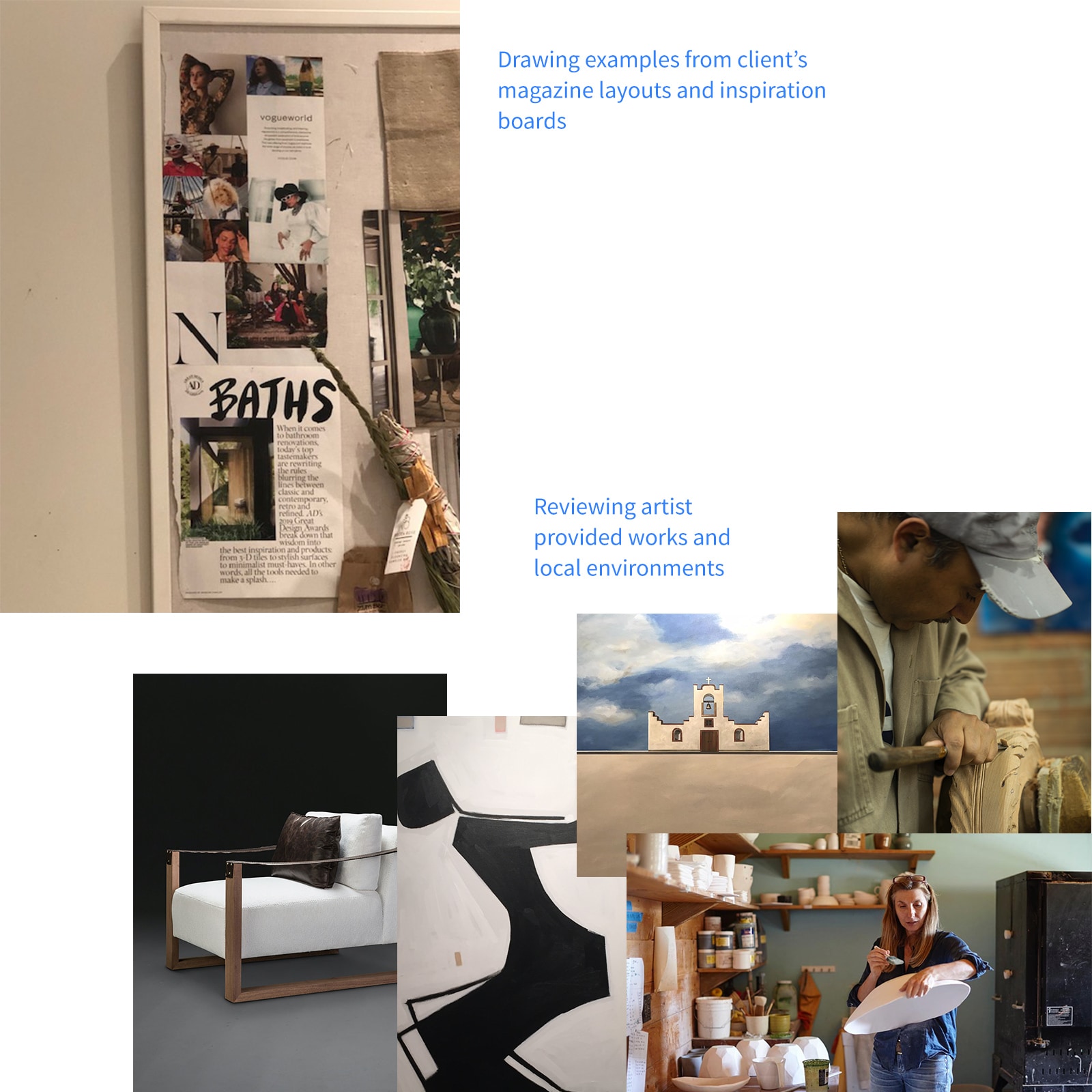
To succeed in a competitive market, they needed a niche focus. I researched local users to refine a unique brand and web presence.
Process
I collaborated with owners on vision, conducted research, and launched the brand and website. I later improved discoverability.
Goals
User: Create an engaging, elegant site reflecting the company's vision.Business: Increase web traffic, referrals, and store visits.
| KPI's | 2016 | 2019 |
|---|---|---|
| Site visits per year | 6,607 | 12,410 |
| Site searches per quarter | 823 | 5,130 |
| Store calls per quarter | 7.1 | 38.9 |
Timeline
October 2015 - Present
"Very high loving and spirited. By far one of the most unique stores in the valley and a beautiful website. The designers have an amazing eye for exclusive design. 10/10 will continue to come for more pieces!"
Customer review
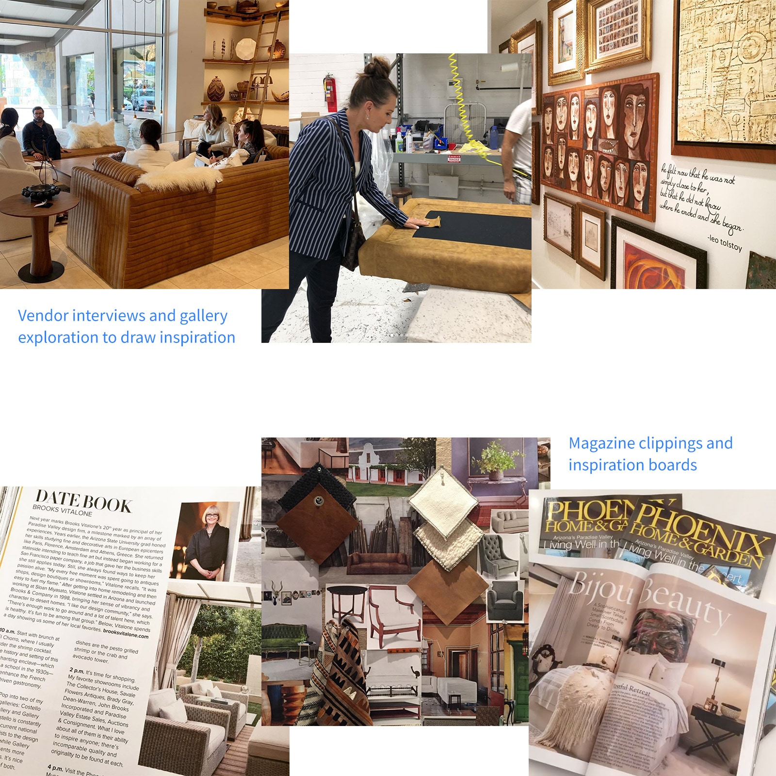
Discovery
Vision and Themes
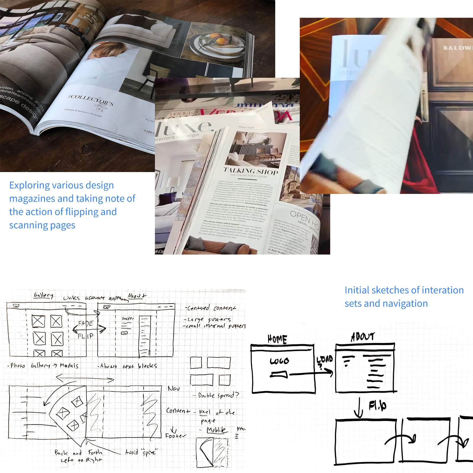
The client envisioned a traditional, analog feel. Themes emerged:
- Magazine or flipbook look and feel
- "Pencil-on-paper", elegant writing
- White space and open
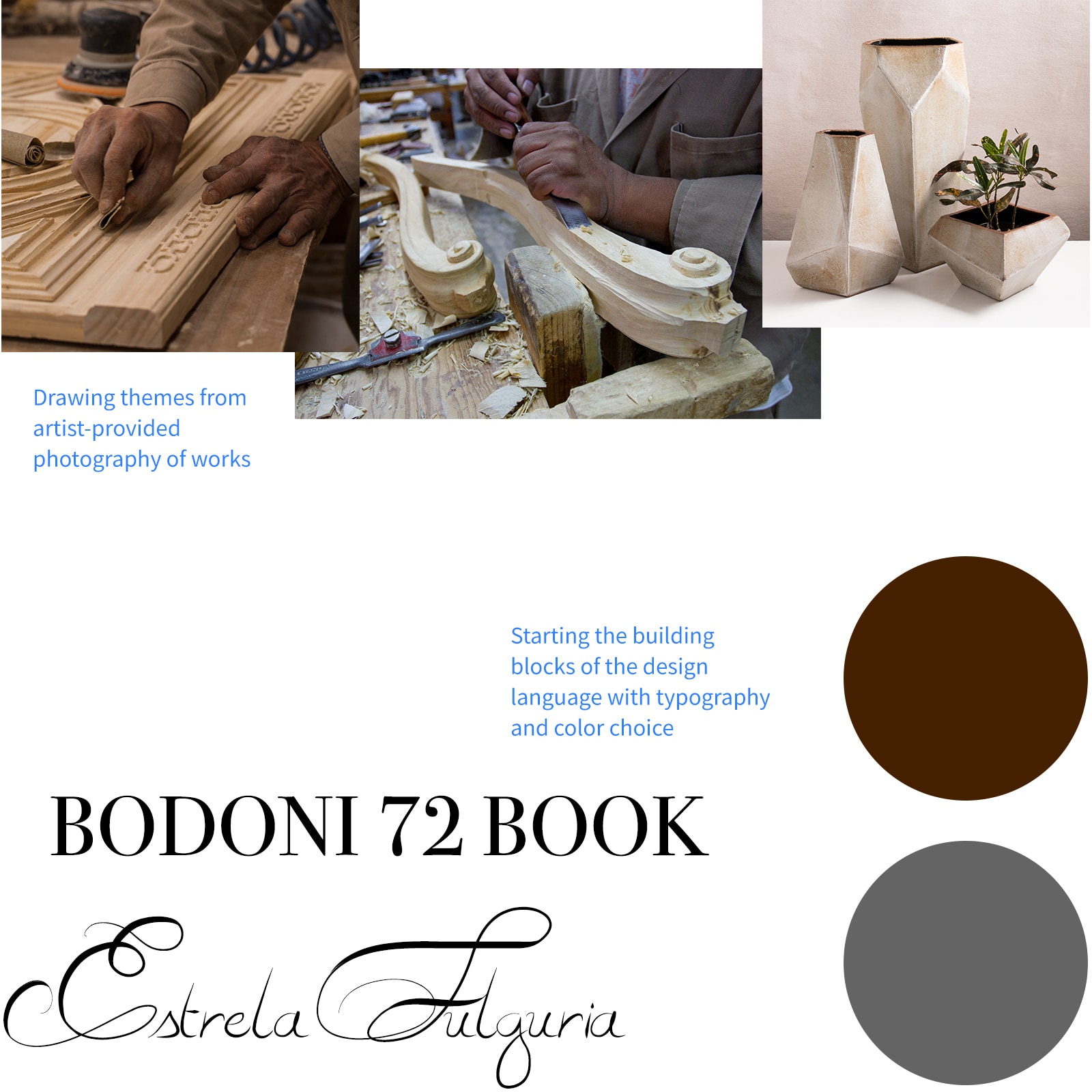
- Celebrate the artist and their craft
- Showcase deliberate and beautiful photography
Goals
User: Create an engaging, elegant site reflecting the company's vision.Business: Increase web traffic, referrals, and store visits.
KPI's
I tracked progress with these KPIs:
- Site visits per year
- Site searches per quarter
- Store calls per quarter
Form Hypothesis
Hypothesis: A clean, revealing brand and web presence will grow recognition and engagement.Understand Customers and Their Needs
Persona
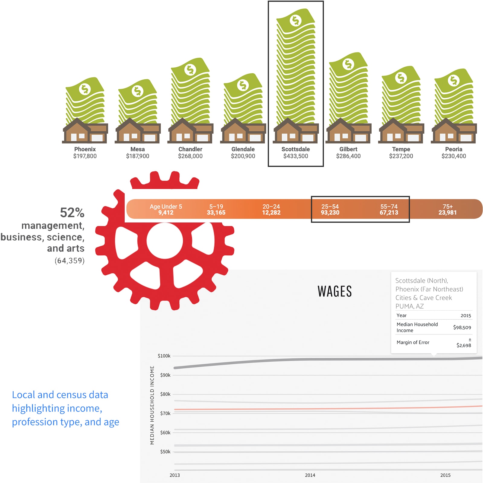
Client insights and census data helped me define the persona:
Demographic
- Majority are older (54+ years old)
- Scottsdale resident or seasonal
- High income
Needs
- Interior design consultation
- Rare or one-off home furniture and decor
Behaviors
- High spenders
- Local and community influenced
- Collects art and/or enthusiasts
- Seek small, luxury-focused plazas
Come Up with Solutions
Direction
I focused on clear location access, photography, and scannable information.
Visual Design
We chose a "magazine/flipbook" direction to mimic browsing a luxury catalog.
Ideas
- Have pages animate on select; avoid static loading
- Draw visitor's attention through the center of the page
- Photography up front, supporting text backgrounded
- Decorative titles coupled with a clean, universal sans-serif
- Multiple columns vs. singular
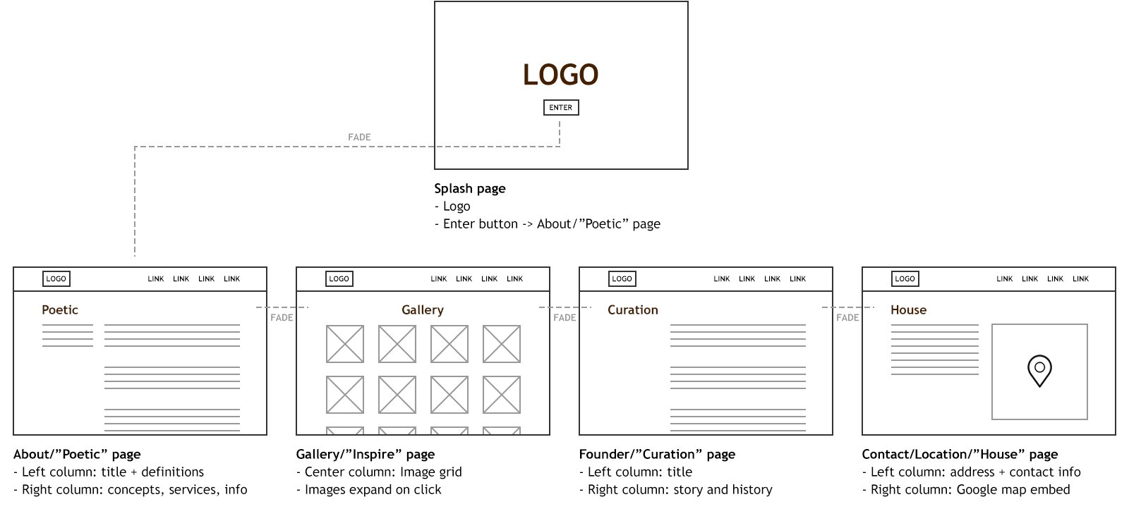
Early wireframes of site layout and interaction sets.
Develop the Site
Approach
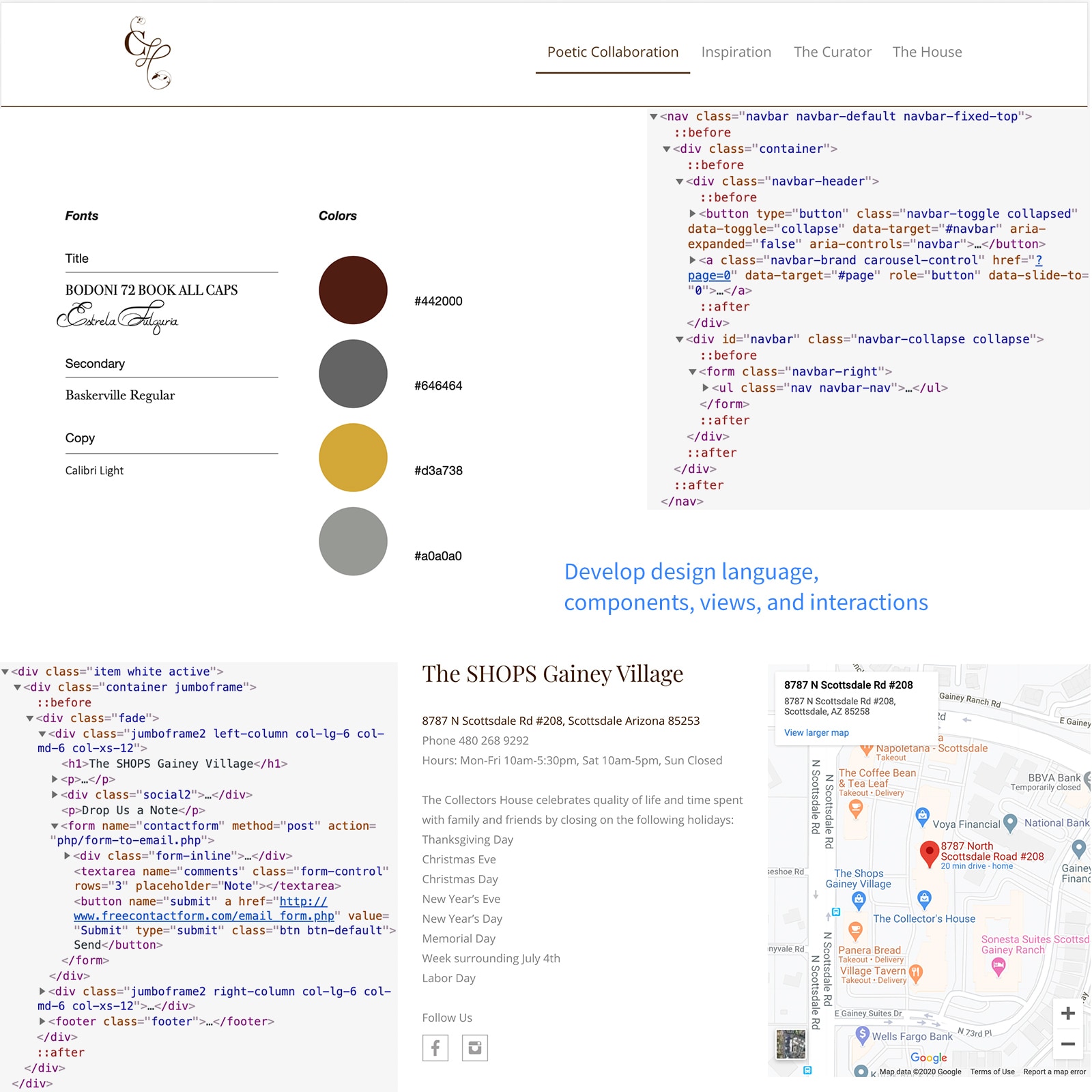
I used Bootstrap 3 to develop the site, focusing on:
- Always exposed and accessible navigation
- Show animation on each page transition
- Keep each page simple and avoid excessive scrolling
Build Elements
I broke views into element clusters:
- Open and airy layout
- Text blocks
- Image blocks
- Google Map embed and location API
- Form fields and buttons
- Lightbox modal
Coming to Life
I built consistent components and added Javascript animations for a lively feel.
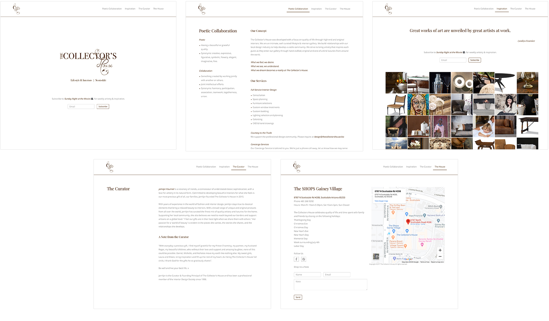
Version 1 of the site.
Launch, Feedback, and Iterate
Launch
We launched in Dec 2015. Traffic grew via local advertising and seasonality.
Gather Feedback
After two years, user feedback prompted an update:
- The page animation is slow and breaks occasionally
- Some customers found it cumbersome to navigate on mobile
- Bounce rates occured from the "Contact us" form taking too long to submit
- Hours of operation and holidays were difficult to locate
Iteration
I improved UX and functionality based on feedback:
- Depart from the page animations and stick with conventional page loading and navigation patterns
- Use simpler, more direct naming conventions for page names and CTA's
- Since most of these customers are visiting from a mobile device, focus on enhancing their experience as much as possible
The Outcome
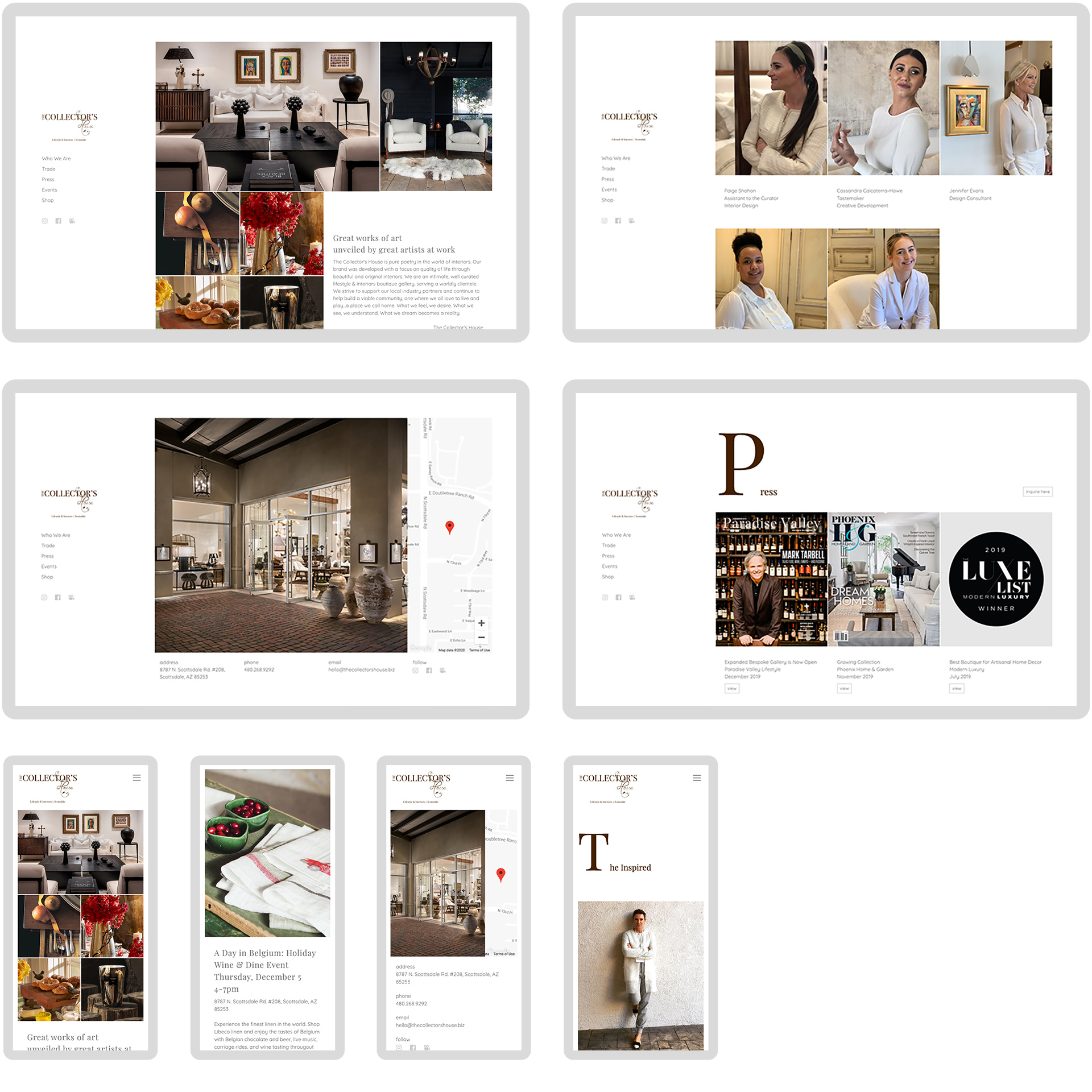
Relaunching in Sept 2019 boosted traffic, store visits, and brand interest.
| KPI's | 2016 | 2019 |
|---|---|---|
| Site visits per year | 6,607 | 12,410 |
| Site searches per quarter | 823 | 5,130 |
| Store calls per quarter | 7.1 | 38.9 |
Define Design Language
Theme
I defined the brand theme:
- Natural, hand-crafted, and raw
- Light, air-y, and clean
- Organized, tidy, and purposeful
Building Blocks
I defined the design building blocks:
- Color palette: Chocolate, wicker, and white
- Shapes: Square and hard edges
- Typography: Traditional serif for titles, simple sans-serif for body
- Metaphors: Natural, organized, and refined
Define Logo and Mark
Ideas
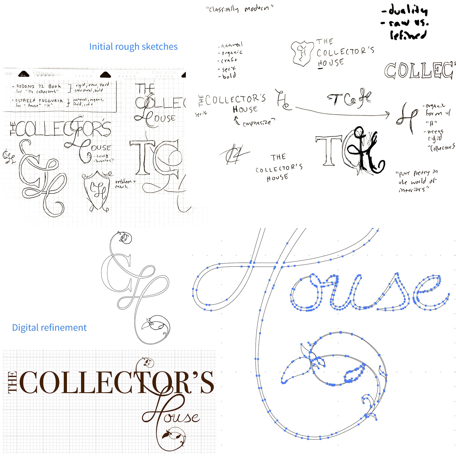
We wanted a serif typeface with "natural" metaphors. Ideas:
- Tie the identity with artist's works; hand-made, rough, and wooden
- Duality of rigid, structure met with natural, soft
- "Classically modern"
Sketches
I sketched elements representing "CH", duality, and nature.
Digitize and Refine
I refined candidates in Illustrator to design the final logo.
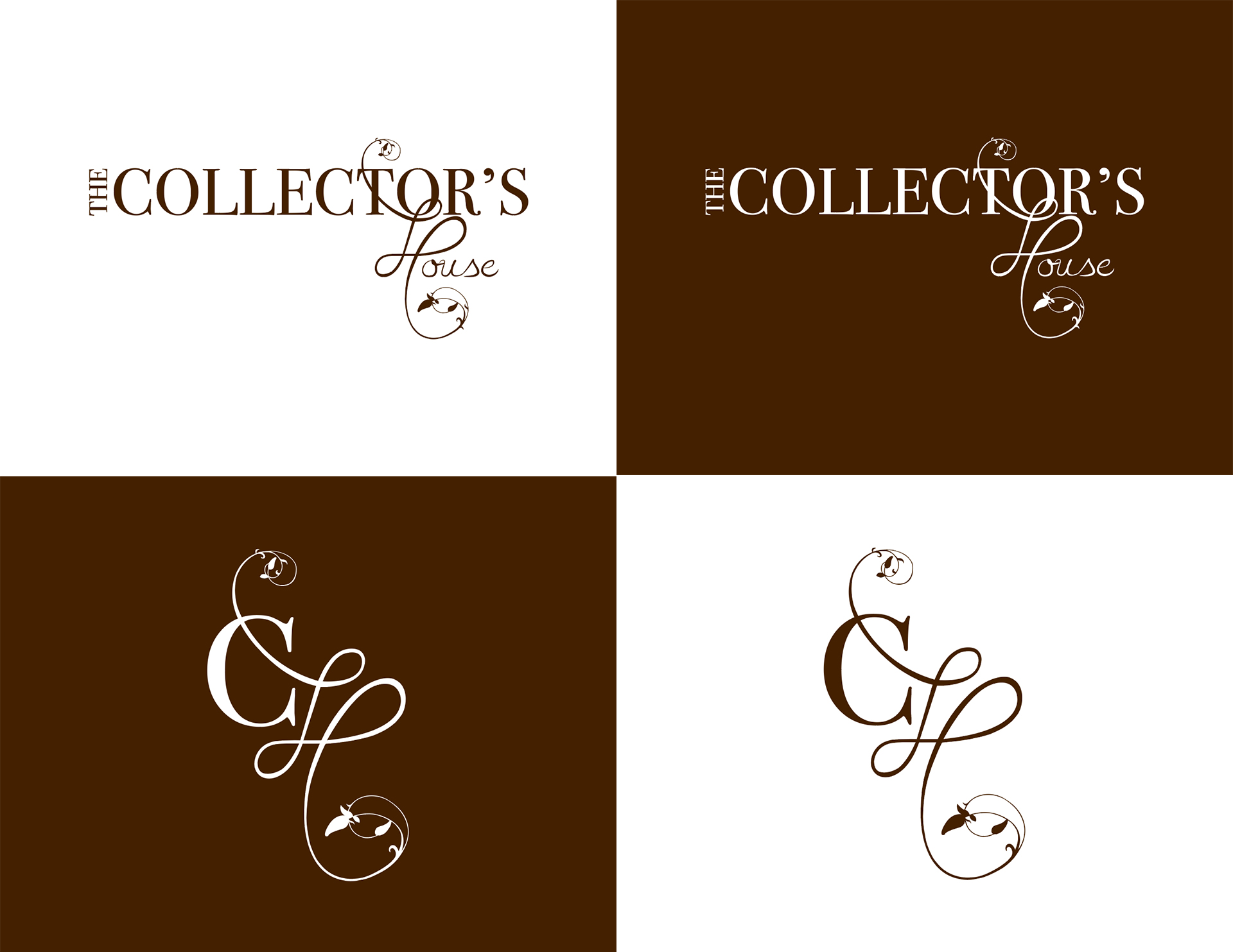
Final logo and mark variations.
The Outcome
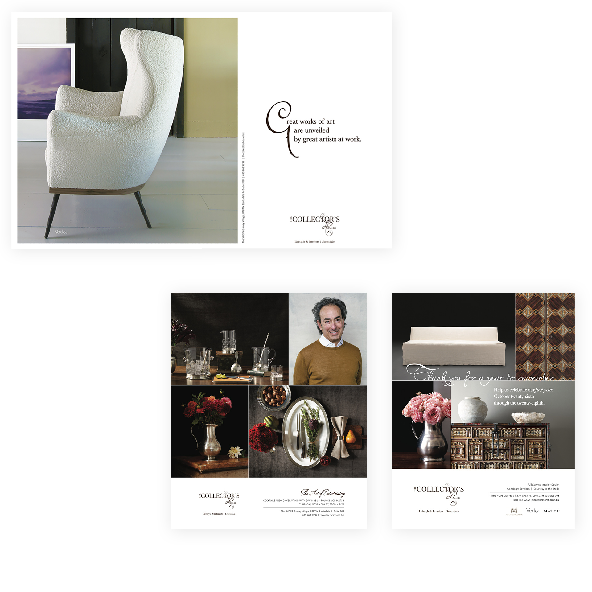
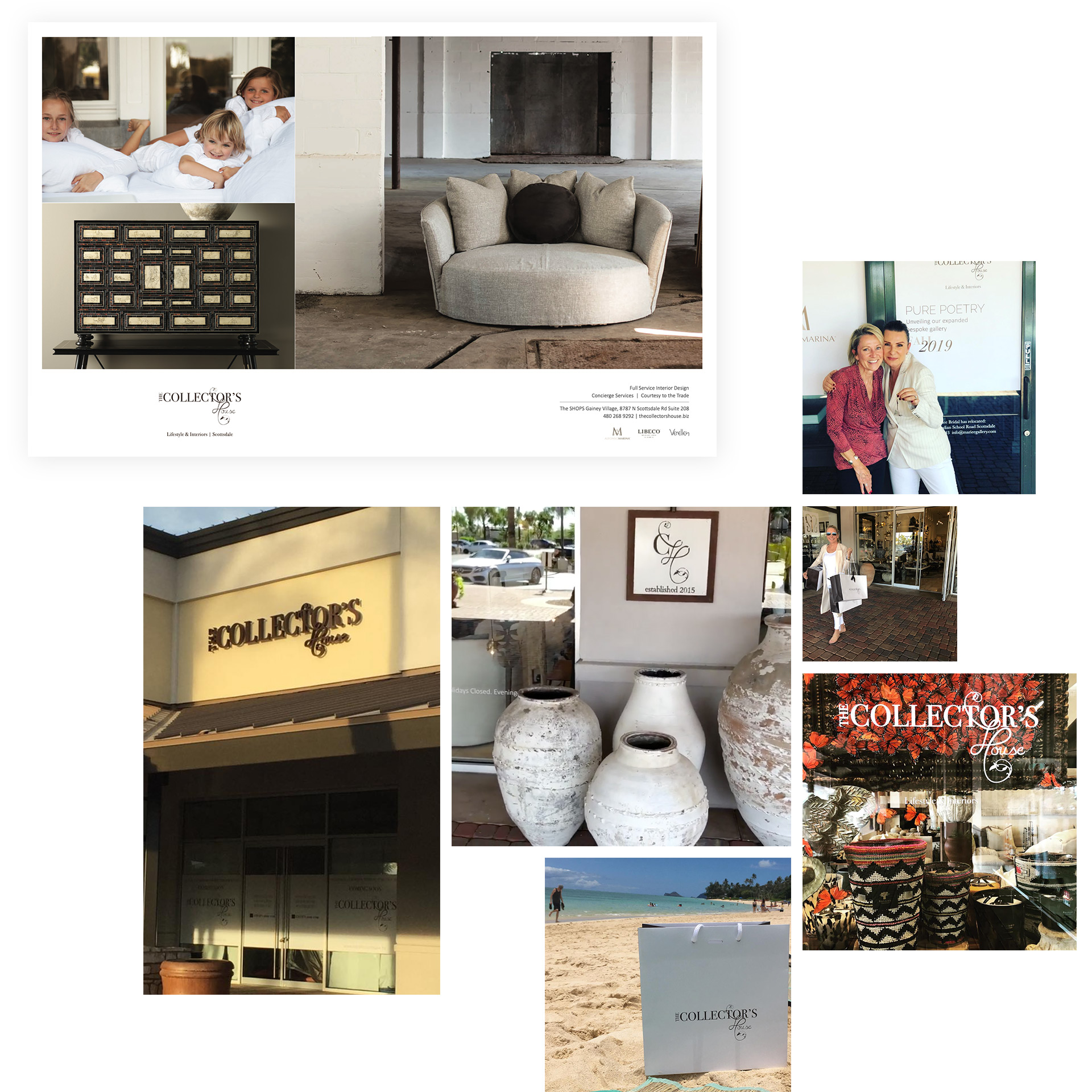
We applied the brand to print designs, from signage to ads, creating a unique identity.
