Role
Studio Corbeau hired me to design and build their gallery website.
Challenge
To compete in a crowded market and grow consultations, they needed a site showcasing their work with easy access to contact info.
Process
I collaborated with owners on vision, conducted research, and designed, built, and launched the site.
Goals
User: Create an engaging, simple site connecting customers to the studio's work.
Business: Increase web traffic and consultations.
Timeline
January 2019 - Present
"Dan was incredibly detailed and thorough in communicating ideas. It's so nice working with him and love our site."
David Corbin, Founder, Studio Corbeau
Discovery and Strategy
Purpose and Themes
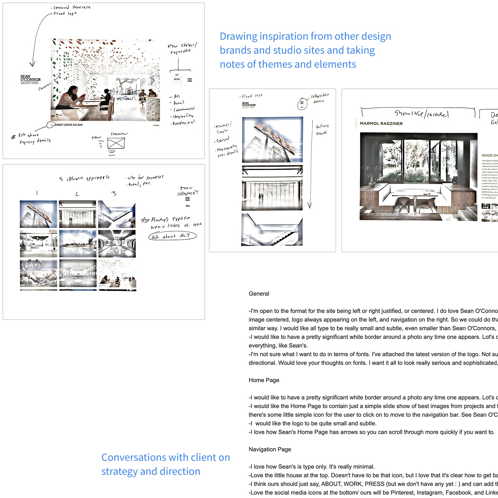
I defined the site's purpose: showcase projects and maximize visibility. Themes emerged from inspiration:
- Art gallery and slideshow look and feel
- Photography speaks and typography supports
- Structured and rigid layout; not a lot of variance
- Use white space as a framer
Site Strategy
I proposed two strategies:
- Wordpress/site building templates for client control.
- Custom framework for a tailored experience.
We chose the custom framework as updates would be infrequent.
Goals
User: Create an engaging, simple site connecting customers to the studio's work.
Business: Increase web traffic and consultations.
Form Hypothesis
Hypothesis:
A focused, simple web presence will drive customer engagement.
Understand the Customer
Persona
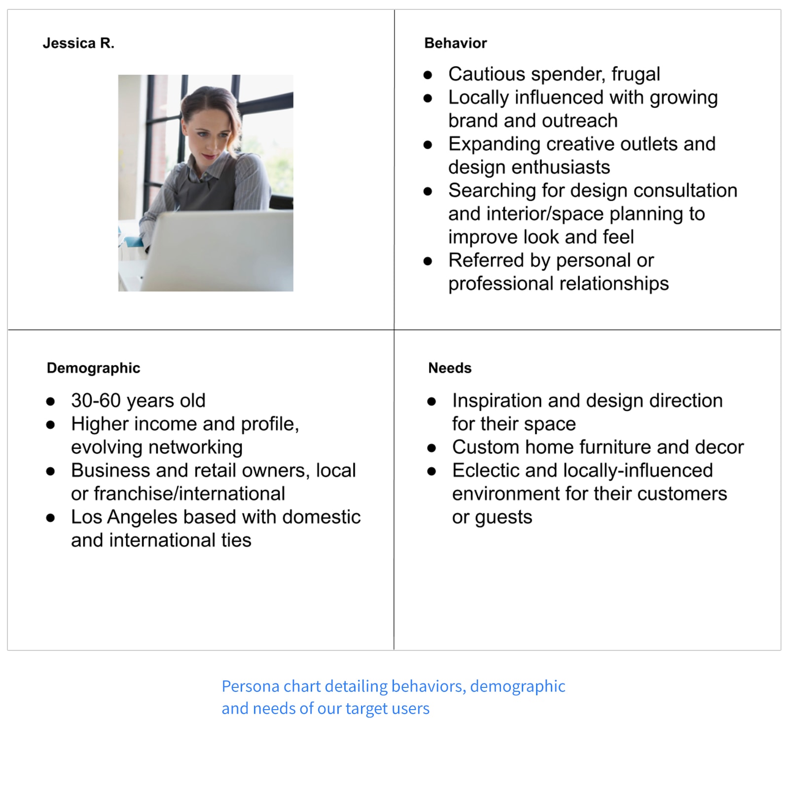
Interviews and portfolio analysis helped me define the persona:
Demographic
- 30-60 years old
- Based primarily in Los Angeles and some domestic/international cities
- Business/retail and home owners
- High income and profile
Needs
- Space and interior design consultation and planning
- Custom home furniture and decor
- Inspiration and direction
Behaviors
- Cautious spenders
- Local and community influenced
- Searches for design consultation, usually from personal or professional reference
- Expanding creative outlets
Come Up with Solutions and Prototype
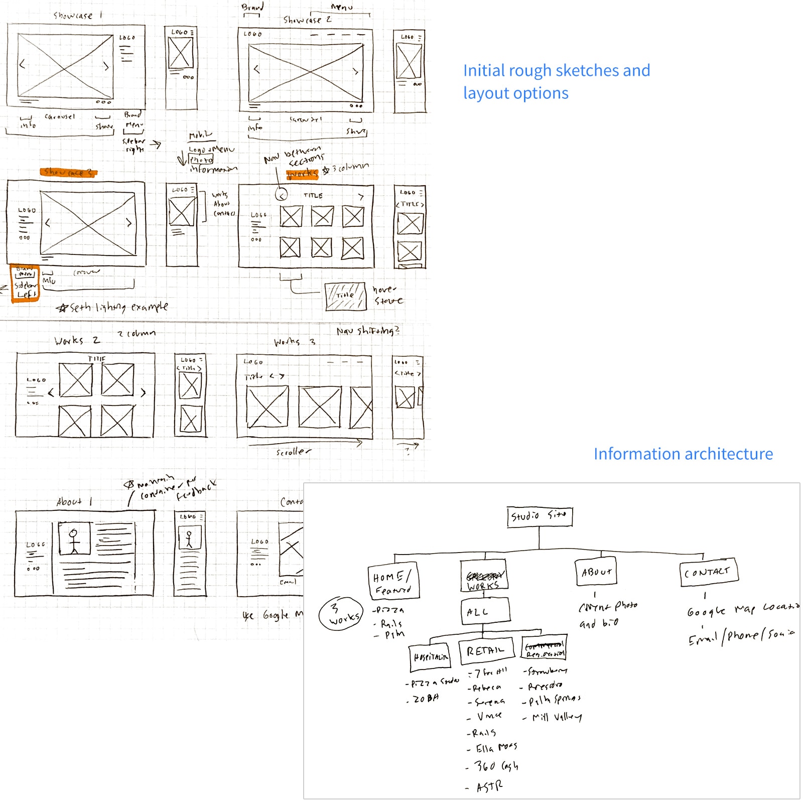
Information Architecture and Sketches
I sketched views based on the 15 initial projects, organizing the layout into sections.
High Fidelity Prototypes
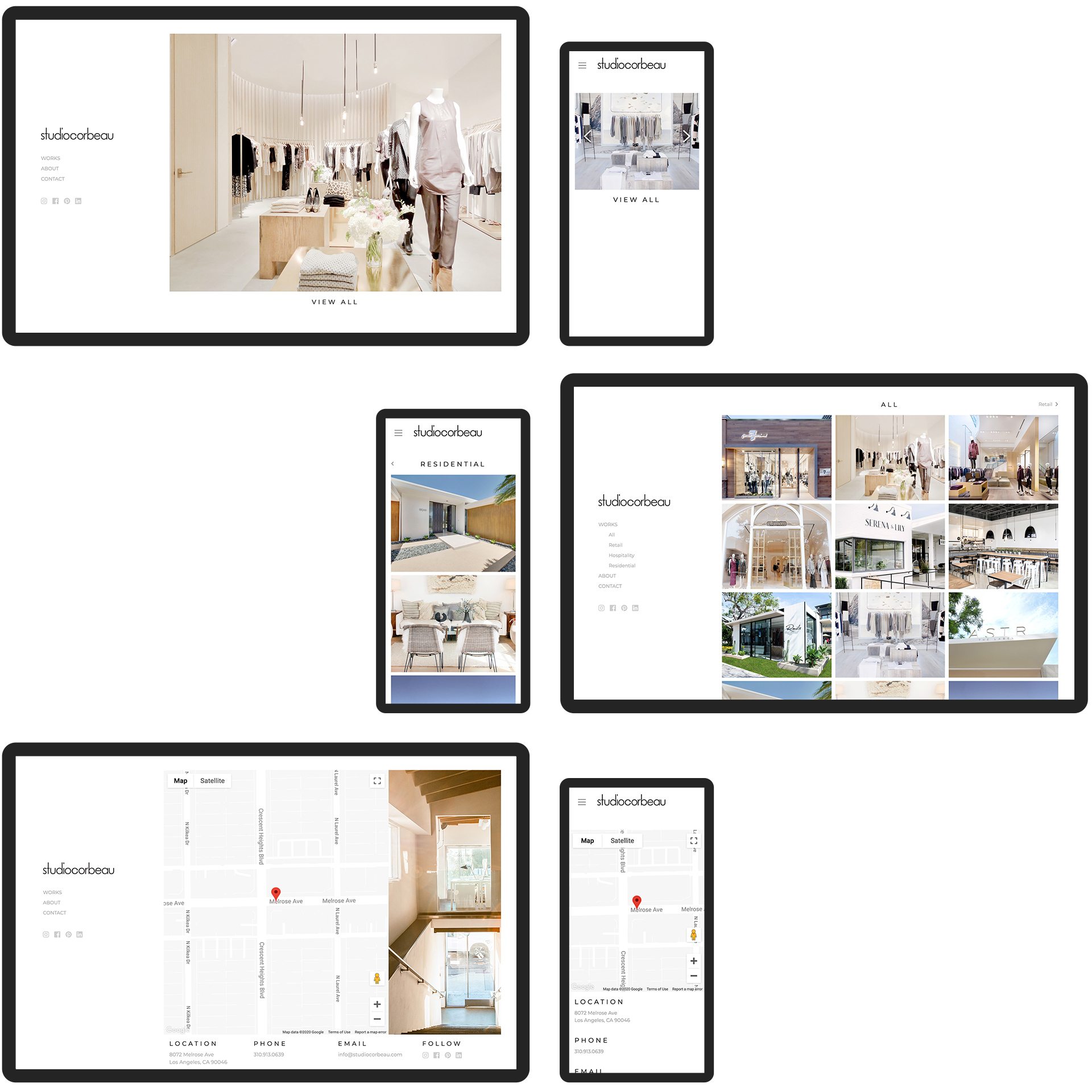
I created click-through prototypes in Adobe XD to demonstrate UX and interactions.
View Desktop PrototypeFeedback
Feedback on Version 1:
- Minimize the titles and iconography substantially
- Try out the left hand navigation instead of top
- Different font face, serif for the titles and sans-serif for the text
- Have all photography contained in a carousel and not in a gallery view
- Add a map to the contact page
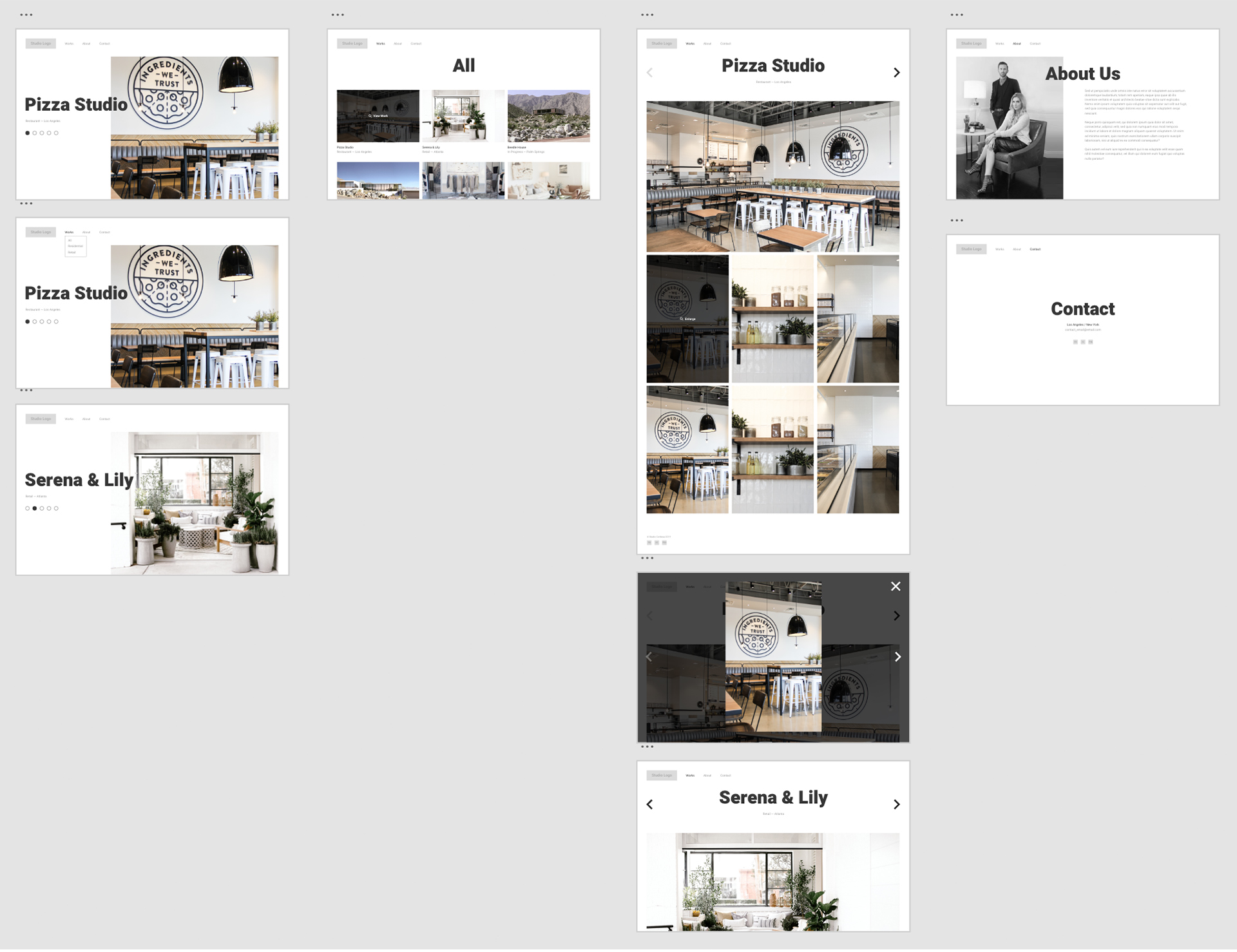
Version 1 of the site.
Develop the Site, Test, and Launch
Approach
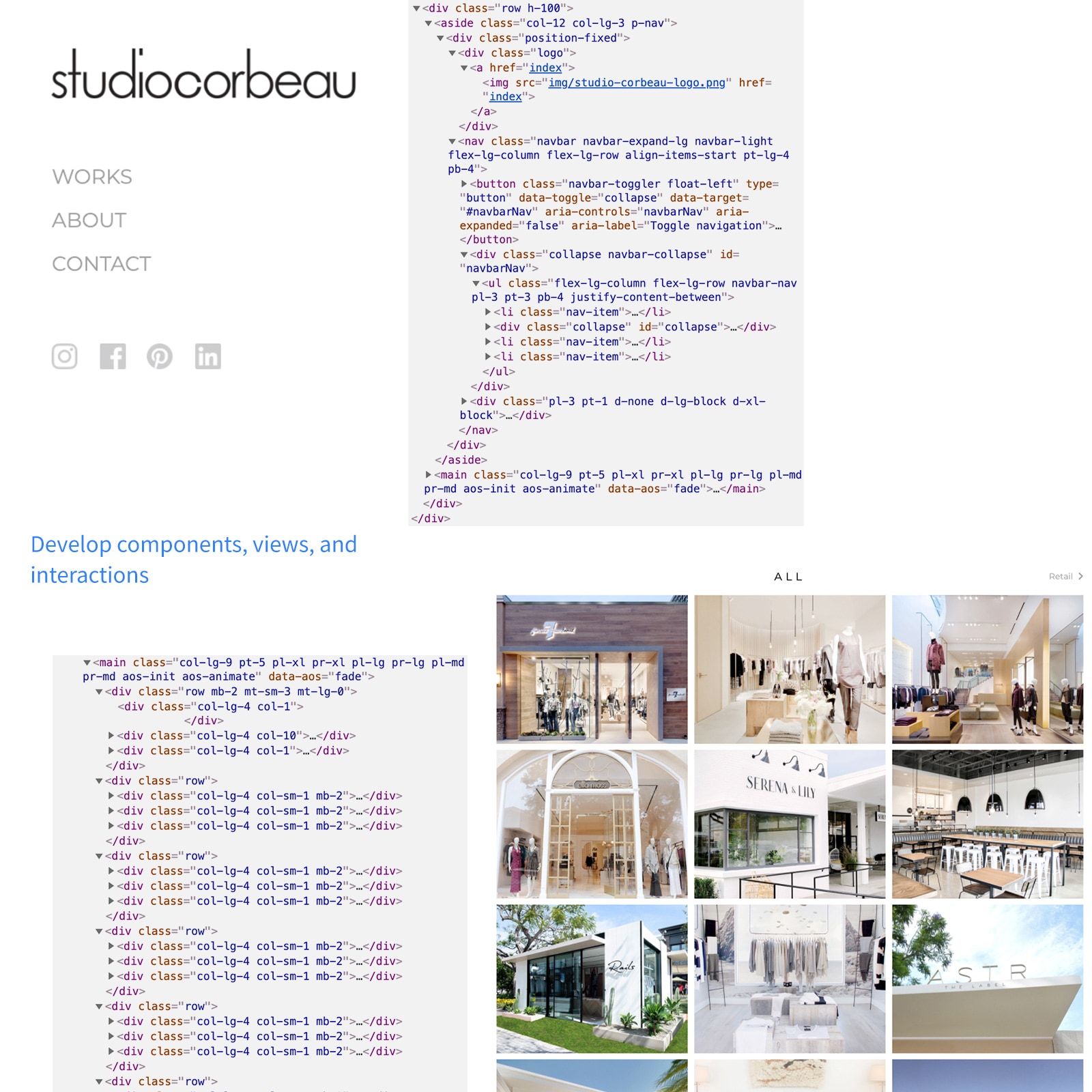
I used Bootstrap 4 to develop the site, focusing on:
- Left-hand navigation: Always exposed and collapsible on mobile
- Grid and gallery: 3-column
- Showcase: Large photography taking up most of the space
- Hover: Reveal more details on hover states
- Container: Activate whitespace while keeping the content focused
Build Elements
I broke views into element clusters:
- Navigation sidebar and mobile menu
- Gallery photography cells
- Carousels
- Google Map embed and location API
- Typography: titles and body/paragraph
- Section navigators/chevrons
Coming to Life
Component-based development ensured visual consistency and clean code.
The Outcome
We launched the site after testing. It successfully increased traffic and consultations.
View Site
