Role
Squad Harmonix hired me to design and build their website and brand to increase auditions and sign-ups.
Challenge
To compete in the LA market, Squad Harmonix needed a unique brand and an intuitive online presence for parents and kids.
Process
I defined goals and hypotheses, then prototyped solutions with stakeholder feedback. I built the site and brand in parallel.
Goals
User: Create an engaging site with a seamless audition and sign-up flow.
Business: Increase media consumption and auditions.
KPI's
- Auditions: increased
- Camp sign ups: increased
- Videos watched: increased
- Live performance attendance: increased
Timeline
July 2019 - September 2021
"Absolute fantastic guy to have work for you. His imagination has been perfect for our product and delivers in a super timely fashion. I have zero complaints about working with him and can only recommend him to anyone who wants professional, sleek, unique design work done."
Laura Saggers, Director, Squad Harmonix
Discovery
Conversations and Questions
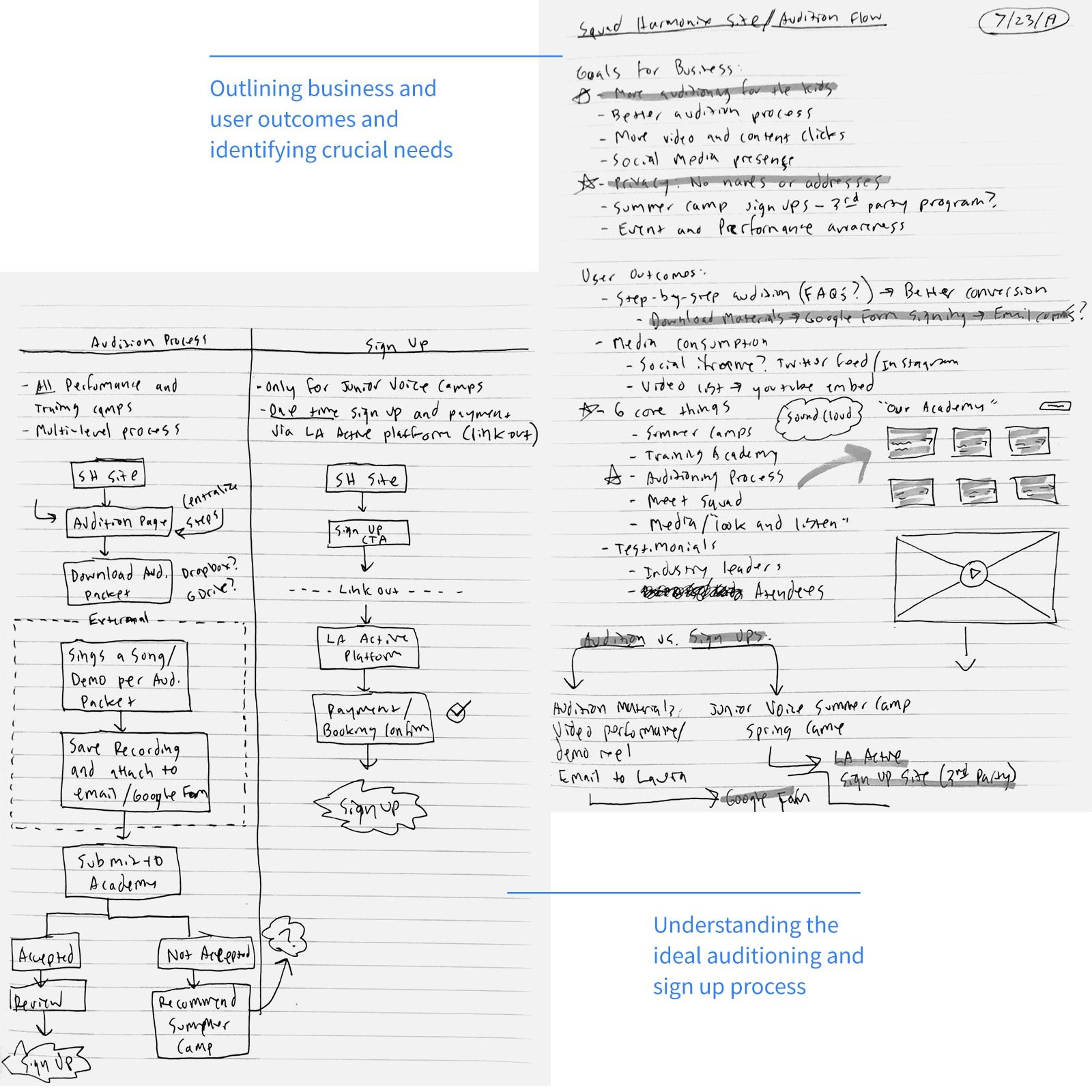
I collaborated with the Director to understand business goals and refine our vision.
Goals
User: Create an engaging site with a seamless audition and sign-up flow.
Business: Increase media consumption and auditions.
Form Hypothesis
My hypothesis:
Clear, educational steps on a mobile-first site will increase auditions and sign-ups.
Learn and Understand from Parents
Persona
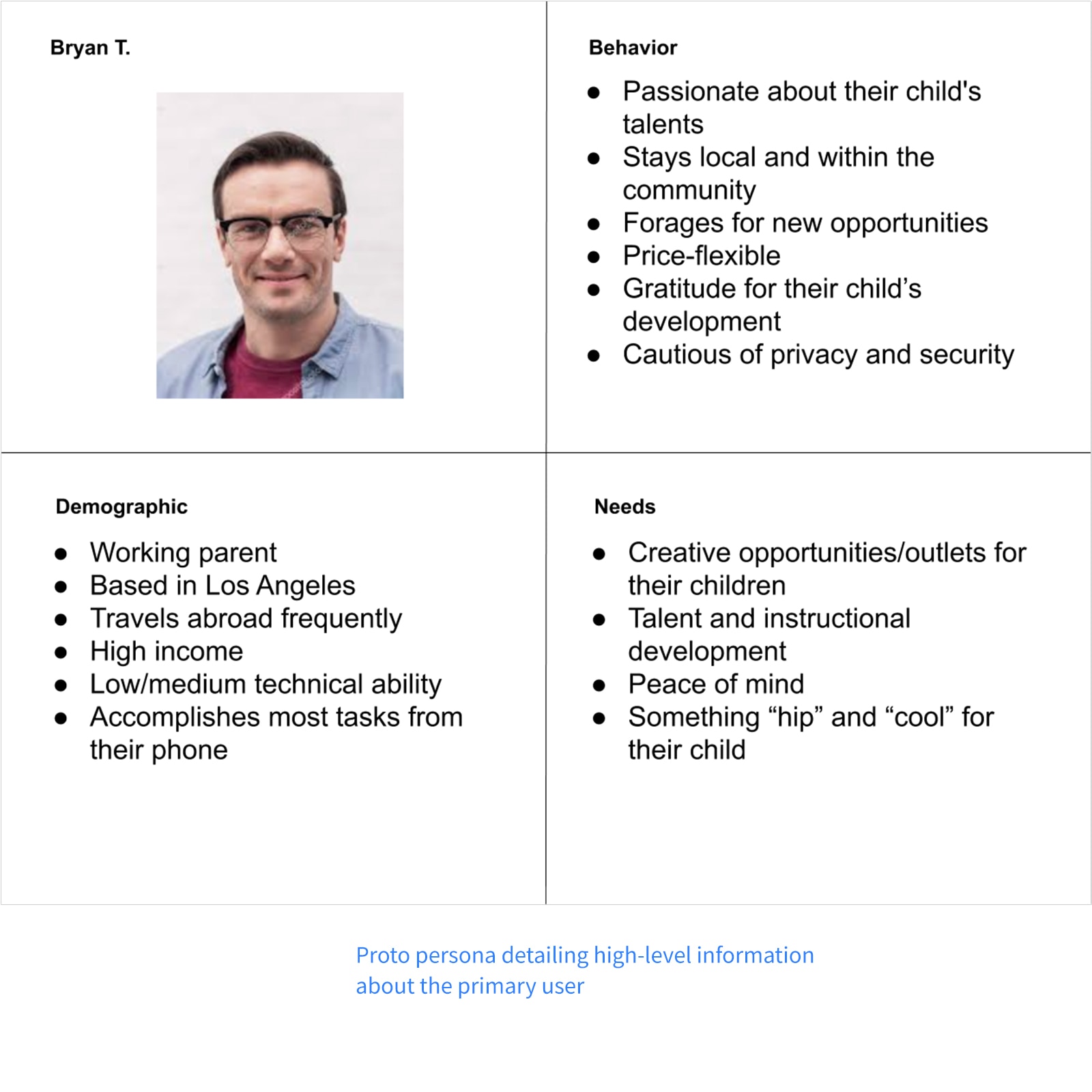
Interviews revealed parents were the primary decision-makers. I defined the persona:
Demographic
- Working parent
- Travels frequently
- Mobile-first
- Medium-high income
Needs
- Creative opportunities for their child
- Instructional training and focus practice
- Peace of mind
Behaviors
- Passionate about their child's talents
- Local and community influenced
- Looks for new opportunities
Come Up with Solutions
Key Aspects
I aligned user and business aspects:
- Have "Sign Up" and "Audition" links as prominent as possible
- Auditions should provide simple instructions, downloadable materials, and a one-click scheduler
- Display onboarding process for each camp/level clearly
- Draw users in with fun, kid-friendly design elements and language
Ideas
These ideas formed the site's building blocks:
- "Sign Up" and "Audition" call-to-actions in the navigation and above the fold
- Audition process as a one-click to schedule
- Breakdown auditioning process into bullets or numbered steps
- Emphasize video content
- Display a calendar of events
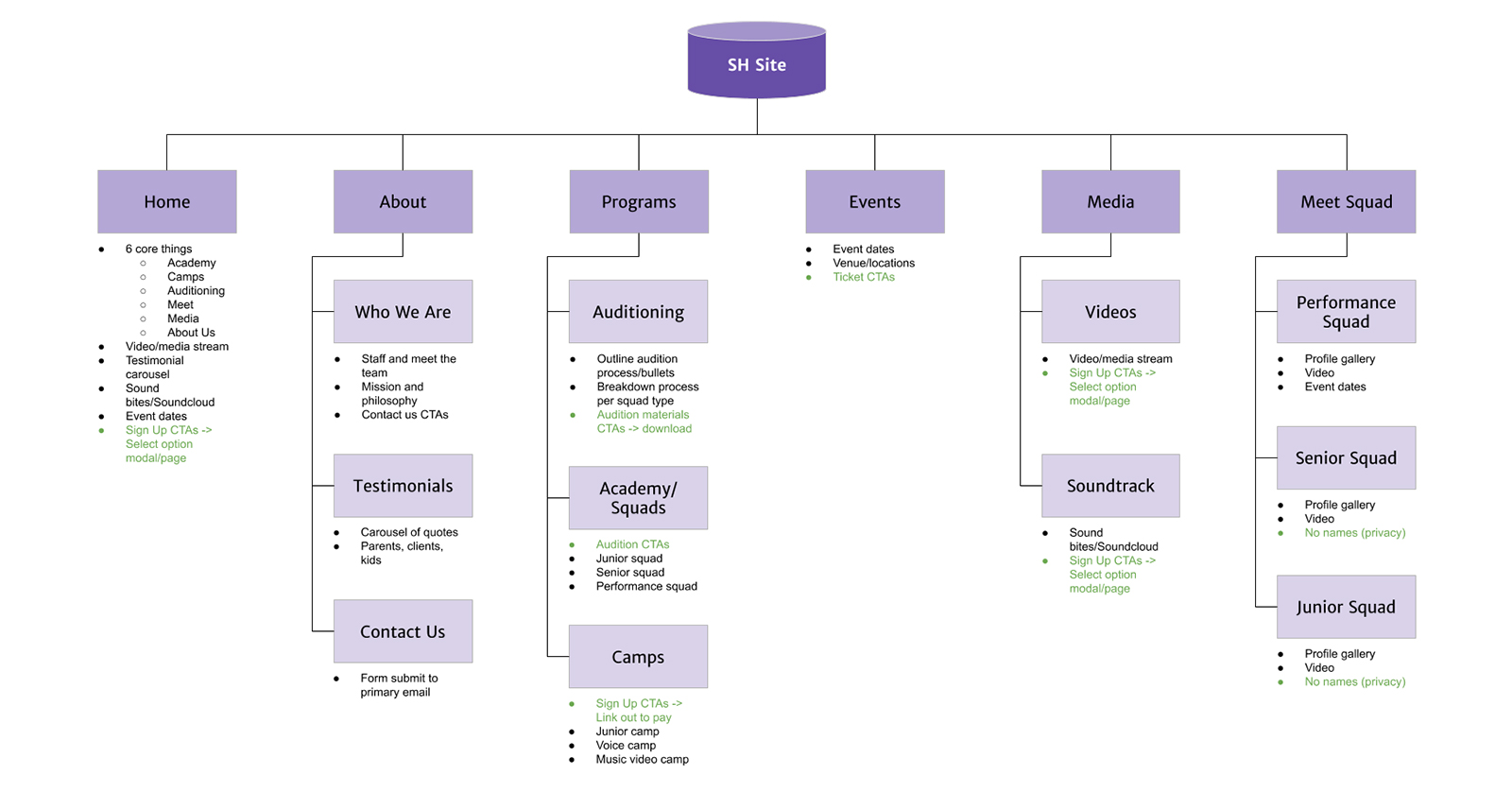
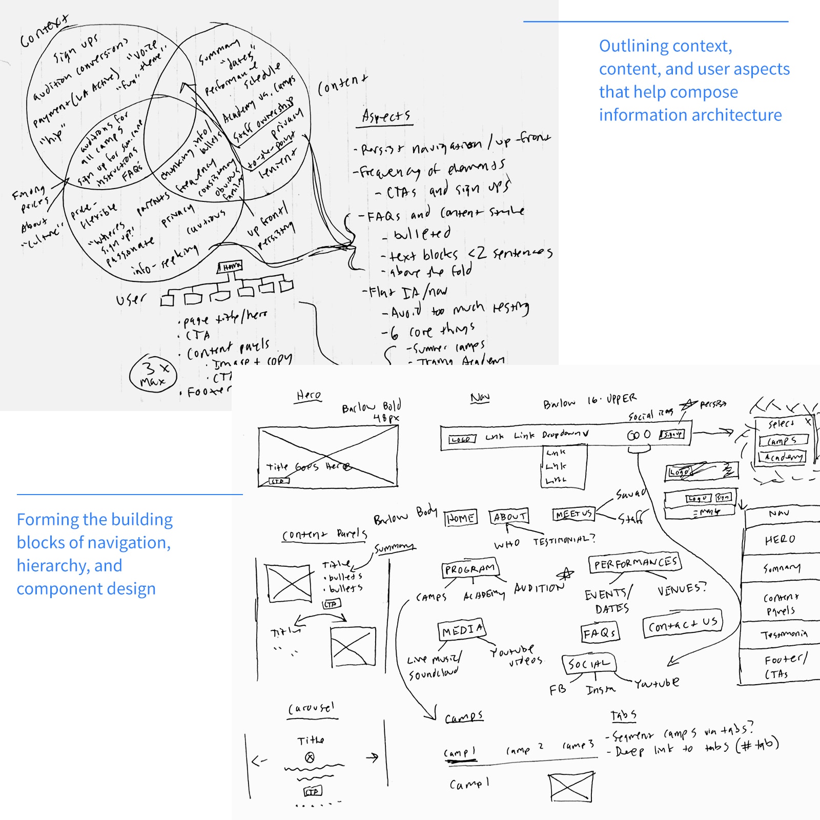
Information architecture is great way to blueprint your site's views, hierarchy, content and navigation.
Sketch, Wireframe, and Iterate
Hand Sketches
I sketched pages based on the information architecture to iterate quickly.
Refine Into Wireframes
I refined sketches into wireframes using Whimsical and Adobe XD to visualize the product.
View Wireframe
Incorporate Feedback and Iterate
Feedback on click-through wireframes shaped a user-centered design.
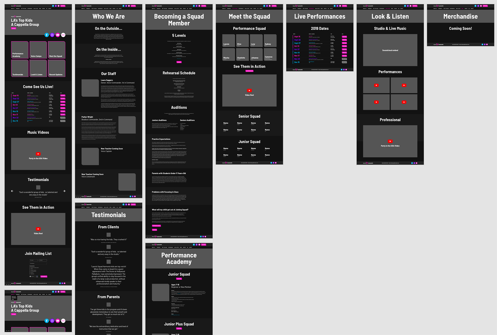
Version 2 higher fidelity wireframes.
Develop the Site
Approach
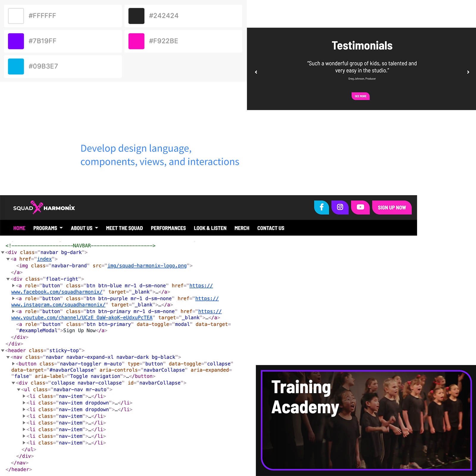
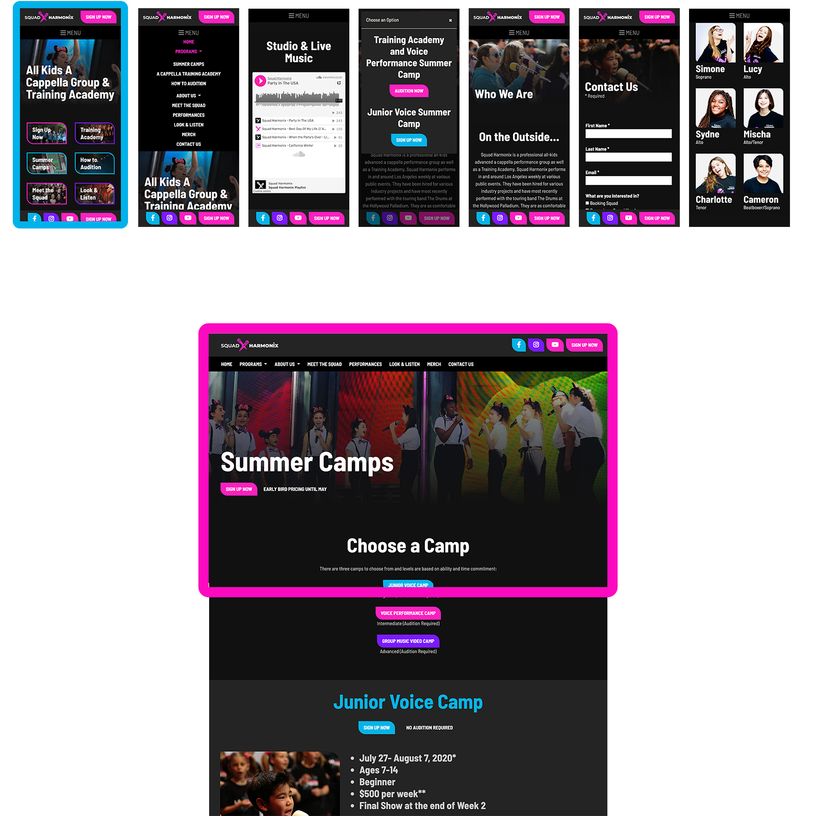
I used Bootstrap 4 to develop the site, focusing on:
- Top-level navigation: always exposed and accessible
- Content panels: engaging imagery coupled with informative bullets and content
- Hero: Bold title, clear value proposition, and a single call-to-action
Language and Components
I broke views into component clusters:
- Navigation and footer bars
- Hero banner
- Content panels
- Data tables
- Media columns
Putting it All Together
Component-based development with utility classes made the process efficient and consistent.
The Outcome
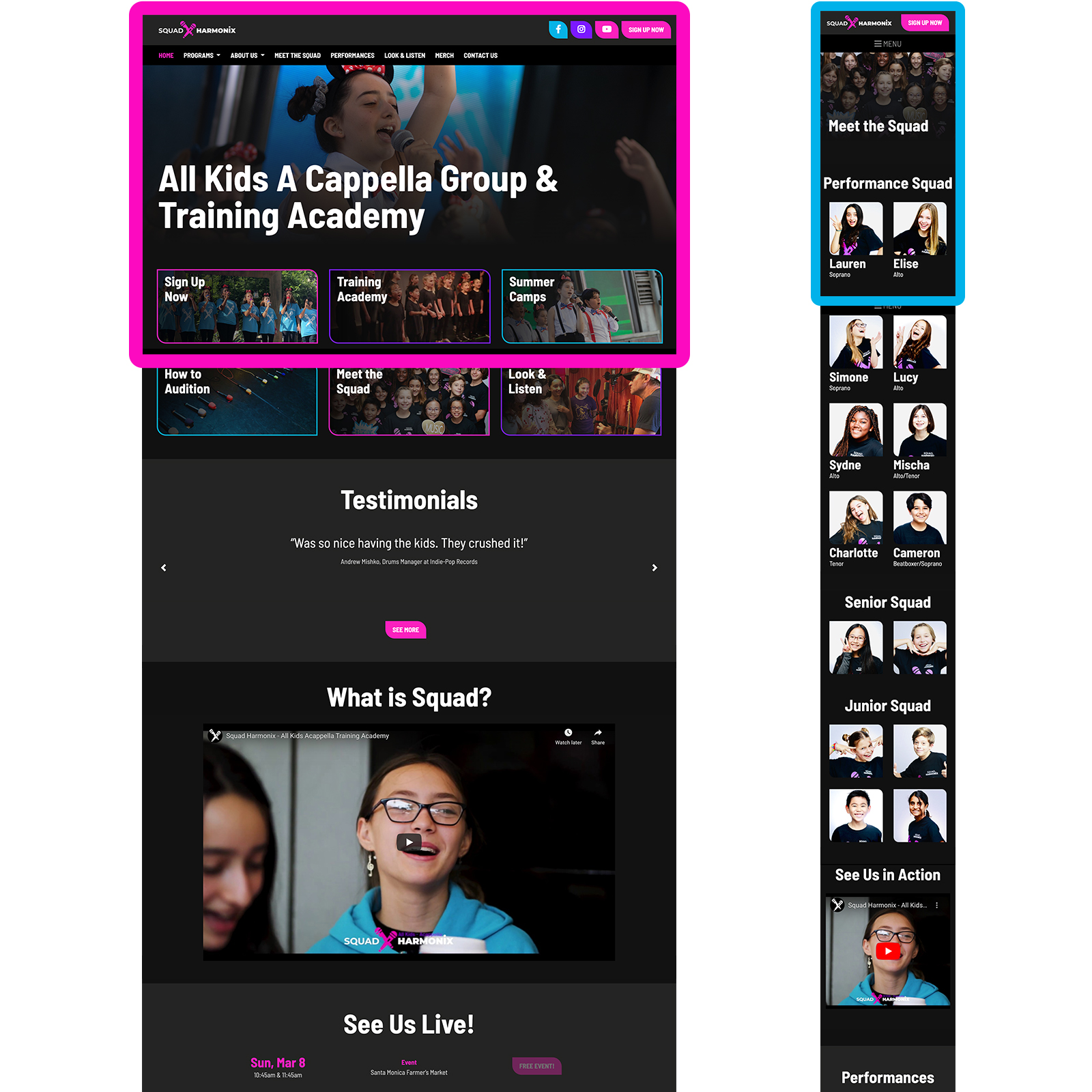
Post-launch, Squad Harmonix reported easier access to auditions and increased sign-ups, viewership, and attendance.
KPI's
- Auditions: increased
- Camp sign ups: increased
- Videos watched: increased
- Live performance attendance: increased
Inspiration
Initial Direction
I envisioned a fun, '80s-themed brand. Neon colors became the core of the design language.
Examples and Insight
I created an inspiration board with '80s pop culture references.
- Resonate with not only kids but their parents as well
- Strive for "hip", "modern", and "cool"
Form Hypothesis
Hypothesis:
A unique, modern, and fun brand will drive recognition and engagement.
Define Design Language
Theme
I defined thematic elements:
- Fun and spunky, not too serious
- Modern and unconventional
- Bright, heavy contrast
Building Blocks
I defined the design building blocks:
- Color palette: neon, complimentary
- Shapes: Round and flat, asymmetrical
- Typography: modern, sans-serif, condensed
- Metaphors: impact and overlay
Define Logo and Mark
Ideas
For the logo, we wanted to incorporate "Squad Harmonix" and the letter "X". Ideas:
- Since we perform in various venues, a constant is the microphone; projecting "voice"
- A mark that can be universally identified within the music community
- Modern and relatable; bold and in-your-face, "loud"
- Kids coming together to sing together
Sketches
I sketched concepts focusing on the "microphone" and "together" themes.
Digitize and Refine
We selected the "X" shape with microphone elements. I refined and digitized the final logo in Illustrator.
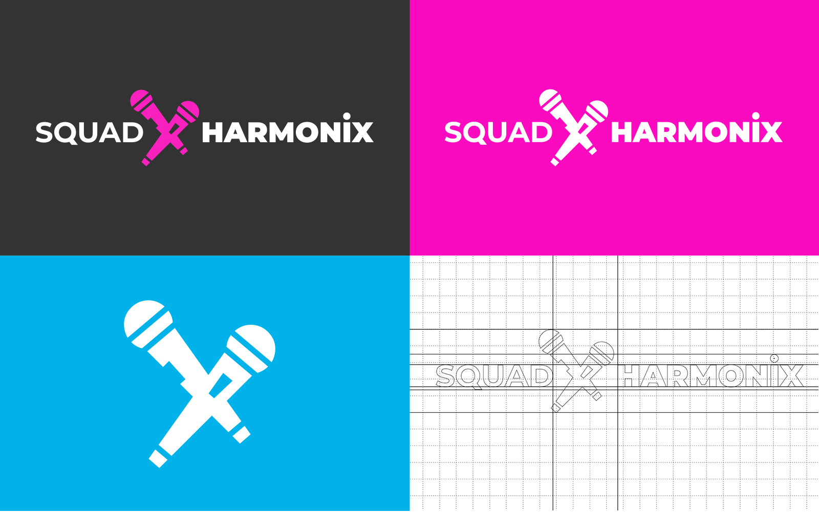
Final logo and mark variations.
The Outcome
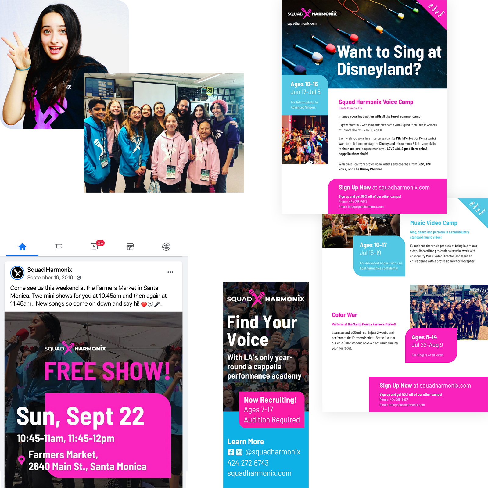
We applied the brand across web, graphic, and print designs, creating a unique identity.
