Role
For my first UX side project, a colleague and I designed an app to help small business owners track multiple parcels.
Challenge
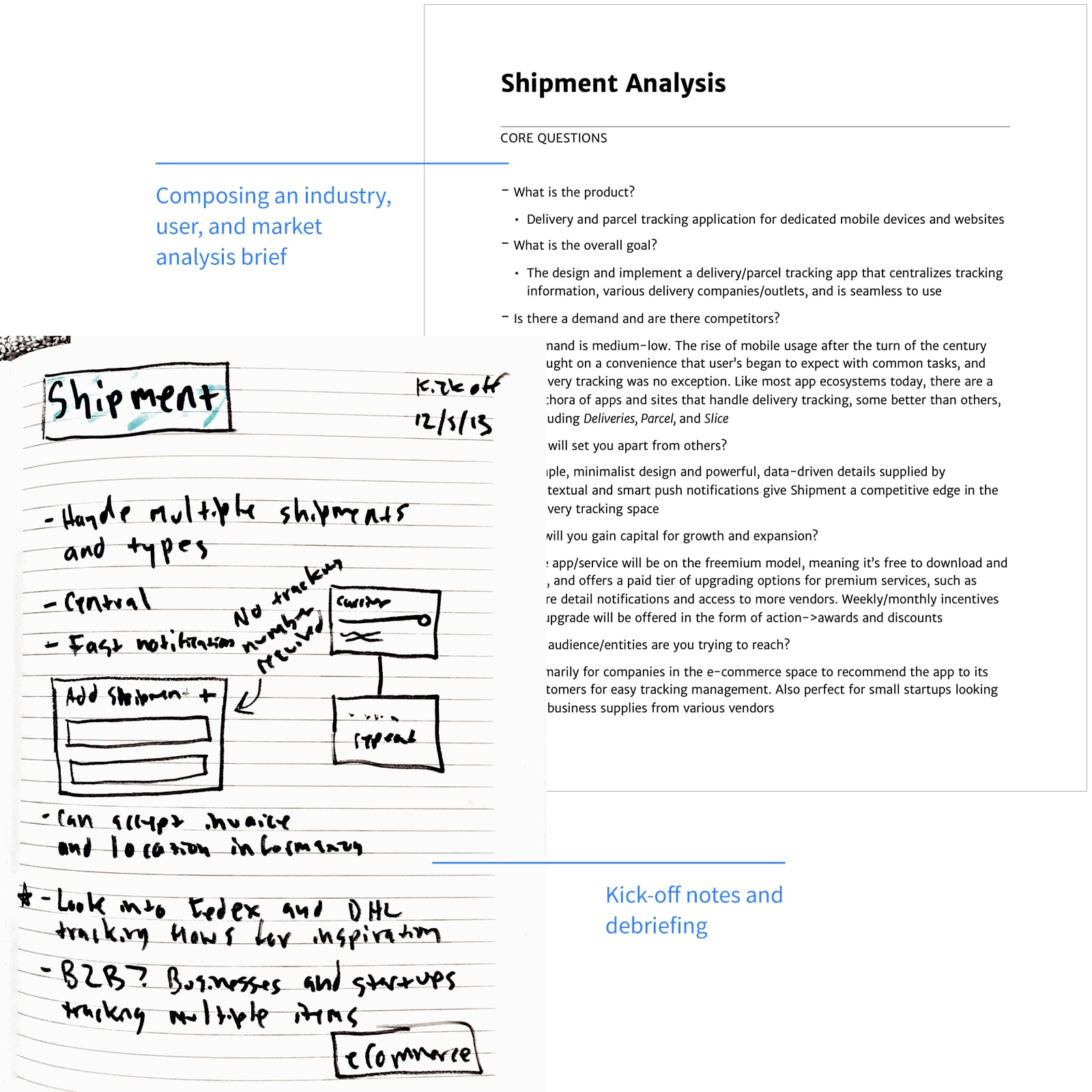
Interviews revealed business owners struggled to track multiple shipments. Relying on scattered 3rd-party sites caused delays and frustration.
Process
I mapped owner needs and behaviors, identified key problems, and prototyped solutions.
Goals
User: Centralize tracking and offer timely notifications to keep owners informed.
Business: Grow brand awareness, downloads, and premium subscriptions.
Timeline
3 Months, December 2013 - March 2014
Discovery
Identifying the Problem
Conversations with business owners and personal experience with tracking issues drove us to solve this problem.
Goals
User: Centralize tracking and offer timely notifications to keep owners informed.
Business: Grow brand awareness, downloads, and premium subscriptions.
Understand Business Owners and Their Problems
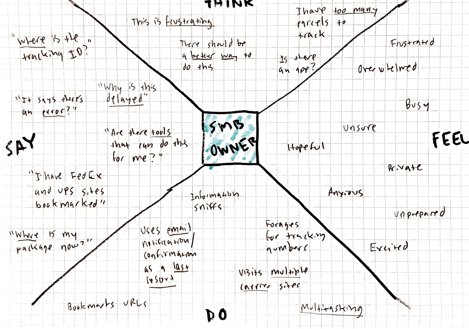
Persona
I defined the target audience as small businesses and startups, then created an empathy map:
Demographic
- Small business owner
- Price-conscious
- Wears multiple hats/"Jack of all trades"
- Multitasker
Needs
- Automated and real-time tools
- Reliable and low-maintanance/setup
- Up-to-minute notifications and updates
Behaviors
- Visits multiple carrier/vendor sites for shipping info
- Tries to track packages themselves, i.e. spreadsheets or by hand
- Relies heavily on tracking numbers
Define Problems and Solve for Them
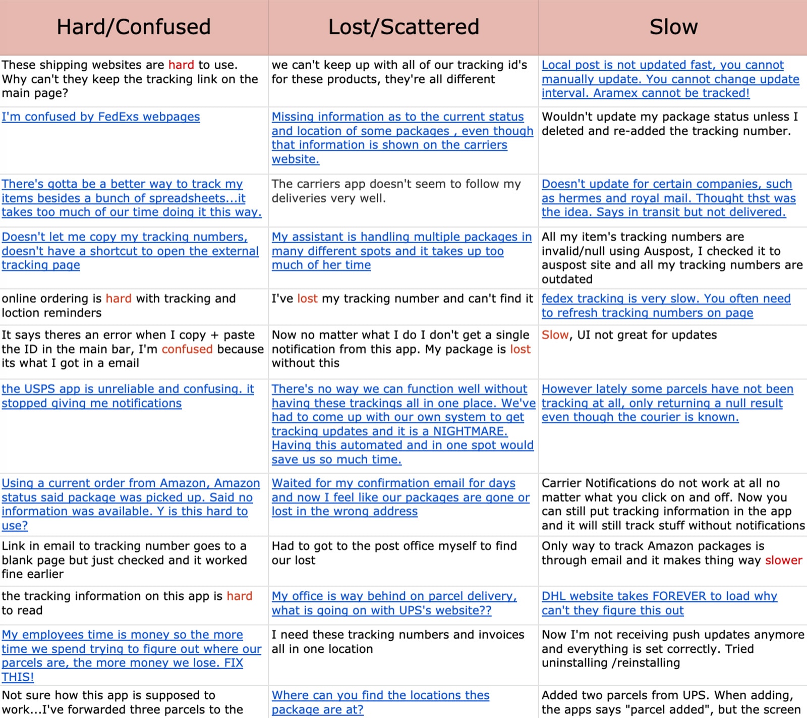
Existing Problems
I listed common problems based on research:
- Carrier sites make it hard to track existing parcels
- Manual tracking via spreadsheets is time-consuming
- Lack of notifications requires constant page refreshing
Ideas
I focused on key solution aspects:
- Support as many carriers/vendors as possible to cast a wide net
- All shipments in one place, across desktop and mobile apps
- Accept other forms of data besides just a tracking number
- Keep users informed as soon as activity changes
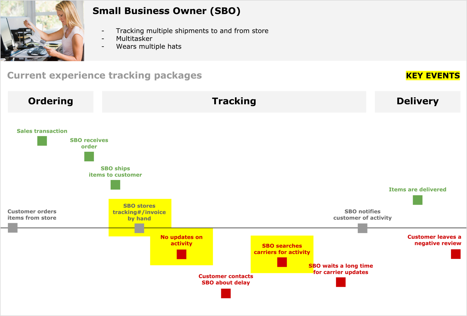
User journey mapping to plot pain points.
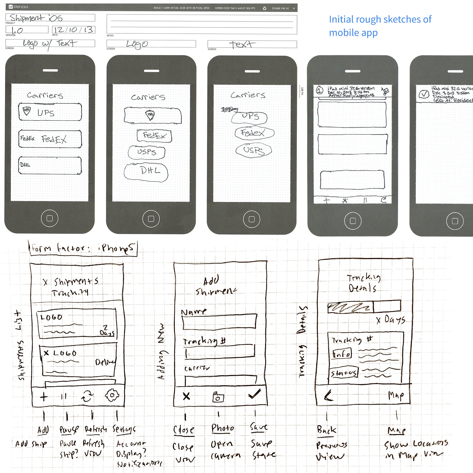
Sketch and Wireframe
Sketches
I sketched mobile and desktop concepts. Hand drawings facilitated quick iteration.
Elements and Components
Global components ensured visual consistency:
- Toolbars: Actions and icons change depending on the view
- Header: Title and subtitle
- Modules: Groups of relevant content
- Progress bars: Indication of activity
- Form fields: User input and submission
Wireframes
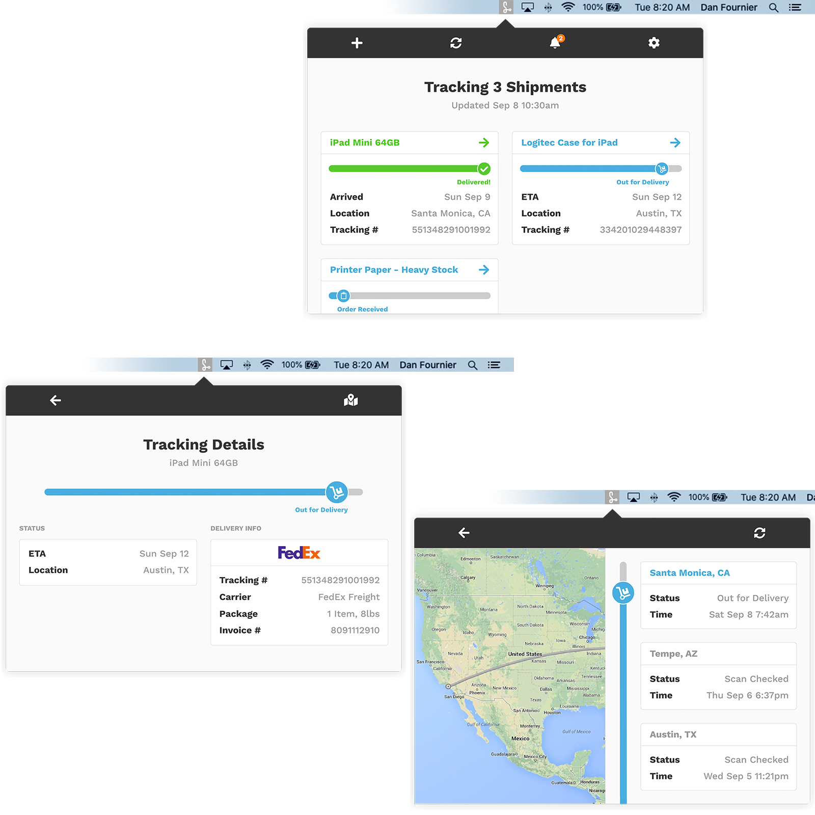
I refined sketches into high-fidelity wireframes in Photoshop to visualize the product.
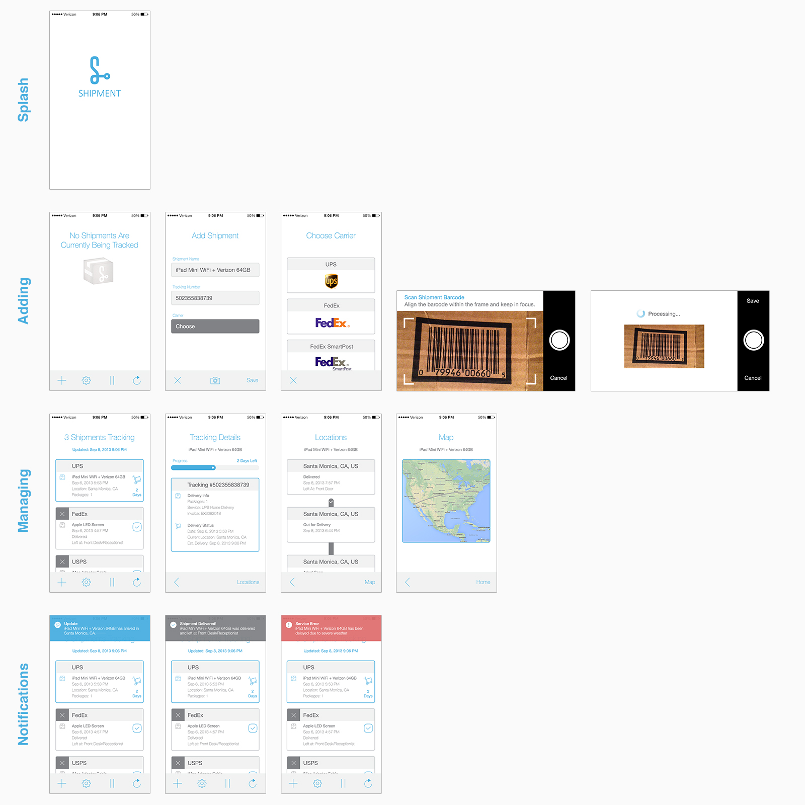
Version 1 high fidelity wireframes and flows.
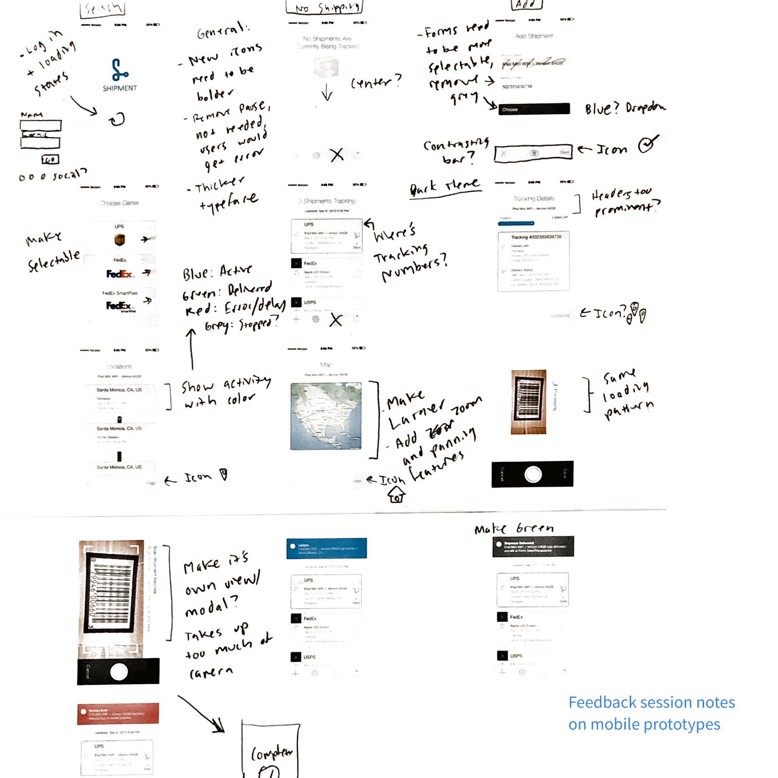
User Feedback and Iteration
Internal and User Reviews
I gathered feedback on the first prototype:
- Bolder/larger typography and iconography
- Make form fields and buttons more obvious that they're selectable
- Display tracking number up front and prominently
- Replace pausing shipment option with a notification center
- Include account creation and sign in process
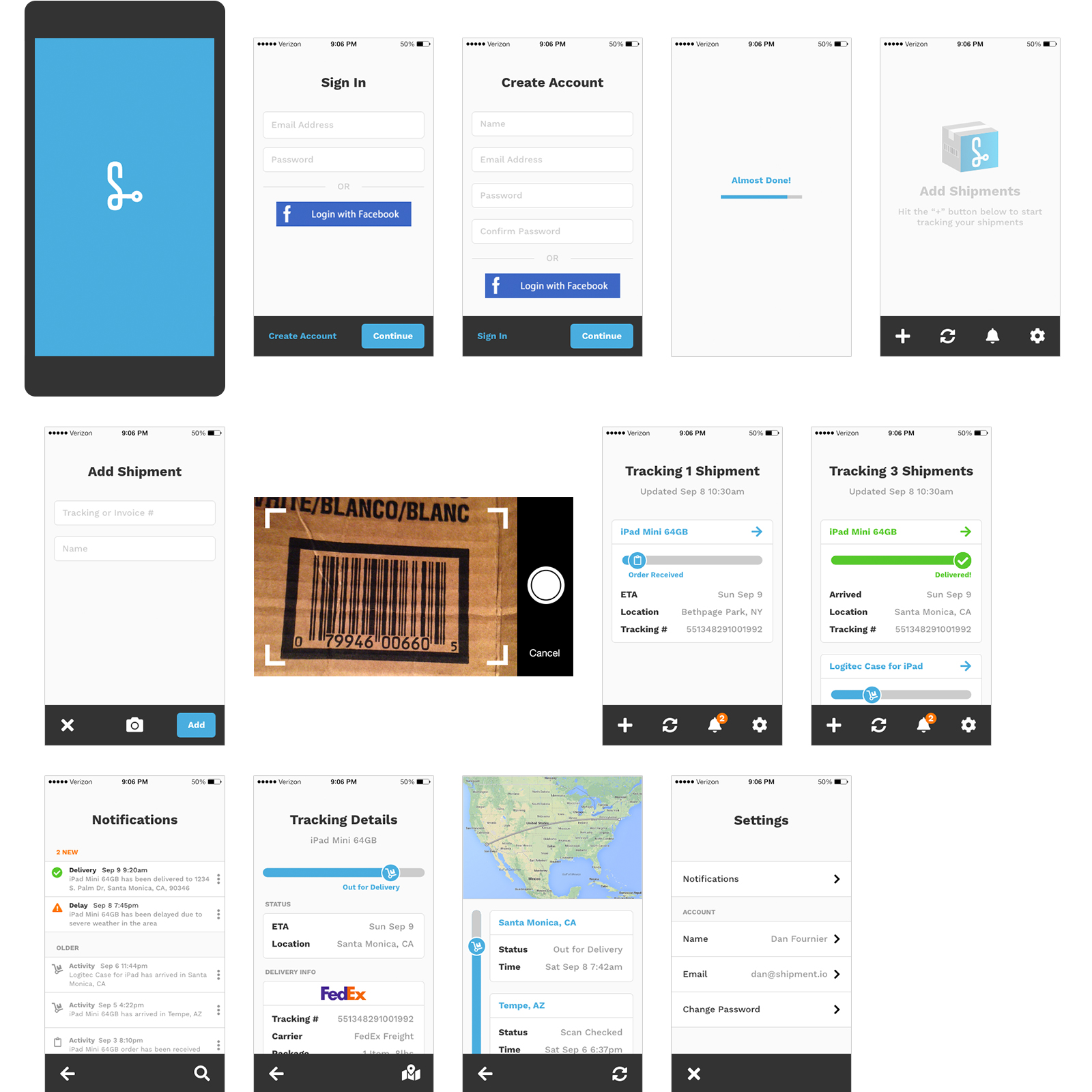
Rapid Prototyping
I applied mobile paradigms to the desktop app design.
The Outcome
Testing led to solid mobile and desktop prototypes.
Product Model and CLM
OKR and Goals
I outlined product goals for growth and acquisition:
- Freemium model to get cast a wide net for adoption and usage
- Premium incentives and discounts for downloading apps
- Convert free to paid users using simple incentives
Define CLM
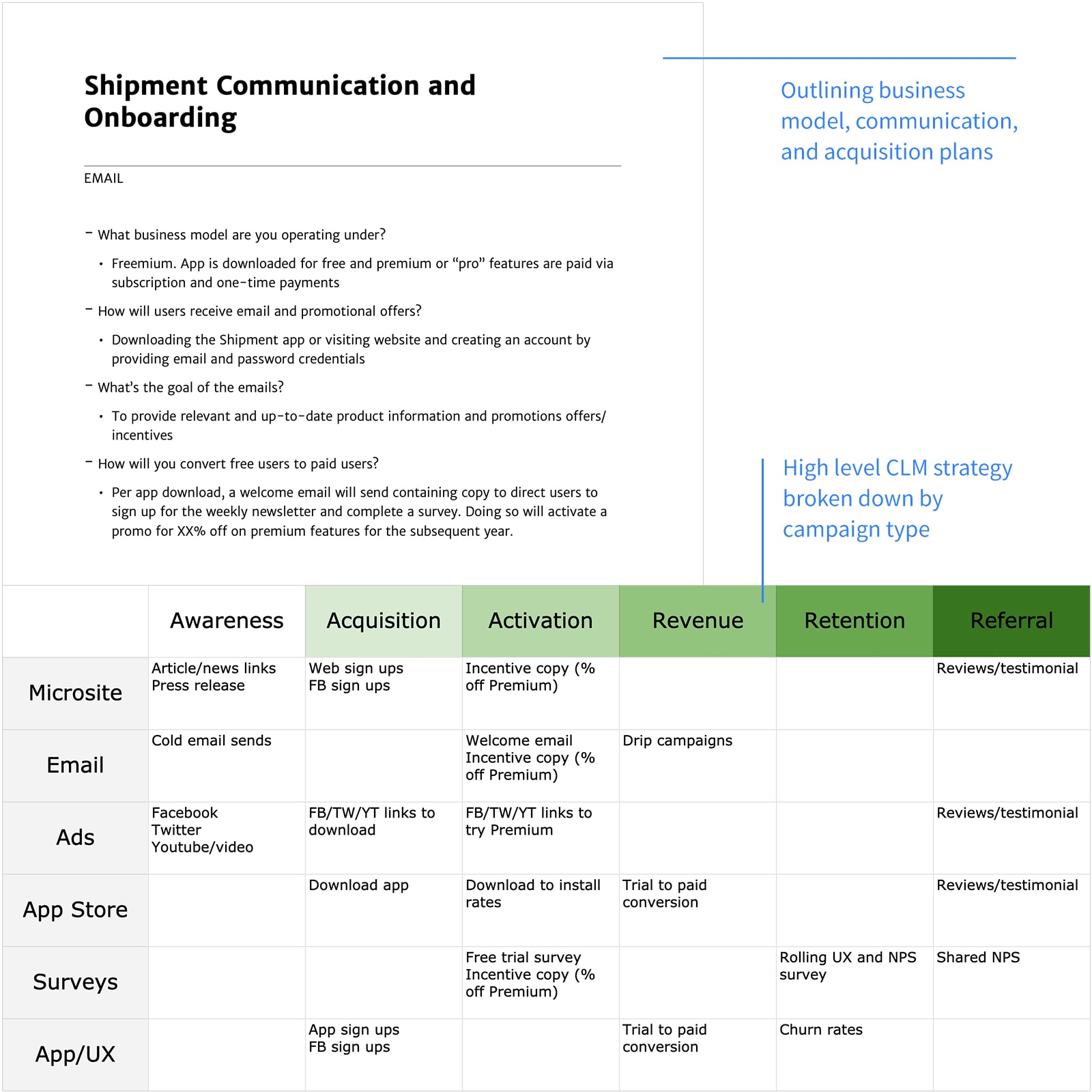
We built a customer lifecycle framework using the AAARRR model:
- Awareness: Links to microsite, social ads, and cold emails
- Acquisition: Microsite/app account creation and downloading
- Activation: Welcome email with incentives, i.e. complete survey for free trial or % off premium version
- Revenue: Trial to paid conversions
- Retention: Experience and NPS surveys, feedback loops, and user-driven improvements
- Referral: Shared NPS scores, open reviews and word-of-mouth
Understand Business Owners and Their Problems
Persona
I refined the persona based on app feedback:
Demographic
- Small business owner
- Price-conscious
- Wears multiple hats/"Jack of all trades"
- Multitasker
Needs
- Automated and real-time tools
- Reliable and low-maintanance/setup
- Up-to-minute notifications and updates
Behaviors
- Visits multiple carrier/vendor sites for shipping info
- Tries to track packages themselves, i.e. spreadsheets or by hand
- Relies heavily on tracking numbers
Come Up with Solutions
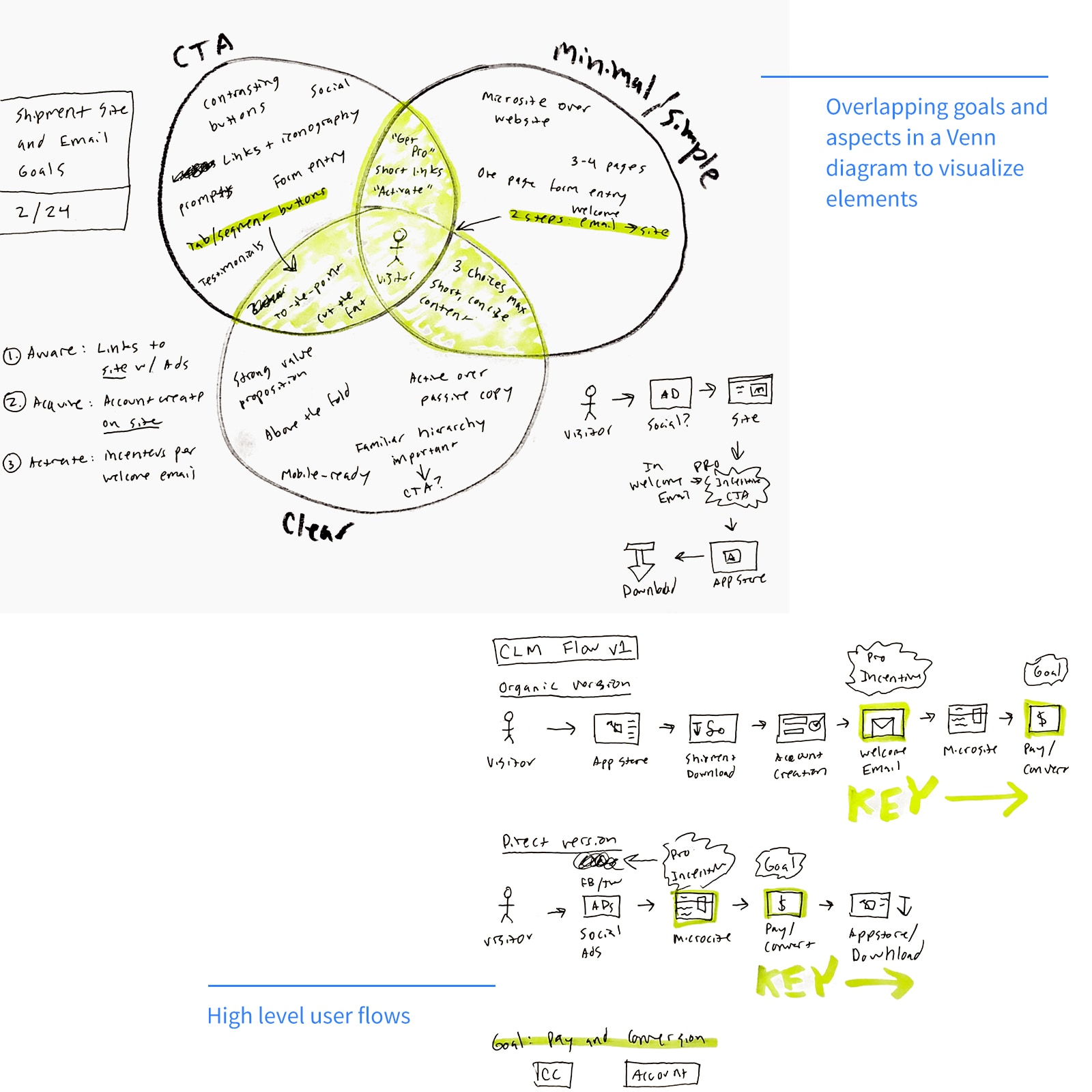
Key Aspects
I aligned solution aspects with conversion goals:
- Have "Get Pro" and "Activate" links as prominent and frequent as possible
- Create minimal barrier of entry during account creation
- Have the value proposition be short and clear
Ideas
- Visitors complete account creation and survey questions to get premium incentives
- Welcome email -> Microsite -> Download -> Convert
- Survey data should be leveraged for user understanding and product evolution
Sketch and Wireframe
Hand Sketches
I sketched the microsite and email designs, the core of the CLM flow.
Wireframes
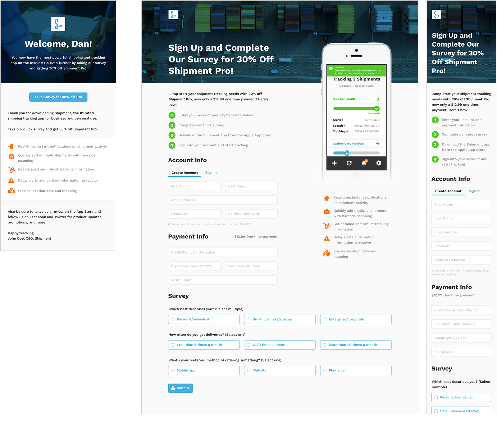
I refined sketches into wireframes in InDesign, selecting the best options based on user feedback.
Refinement
I created the version 1 design in Photoshop.
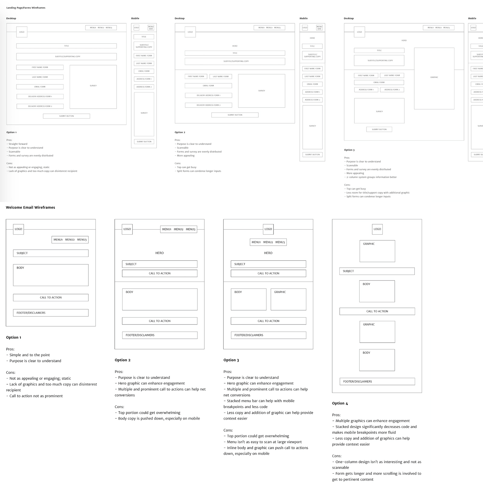
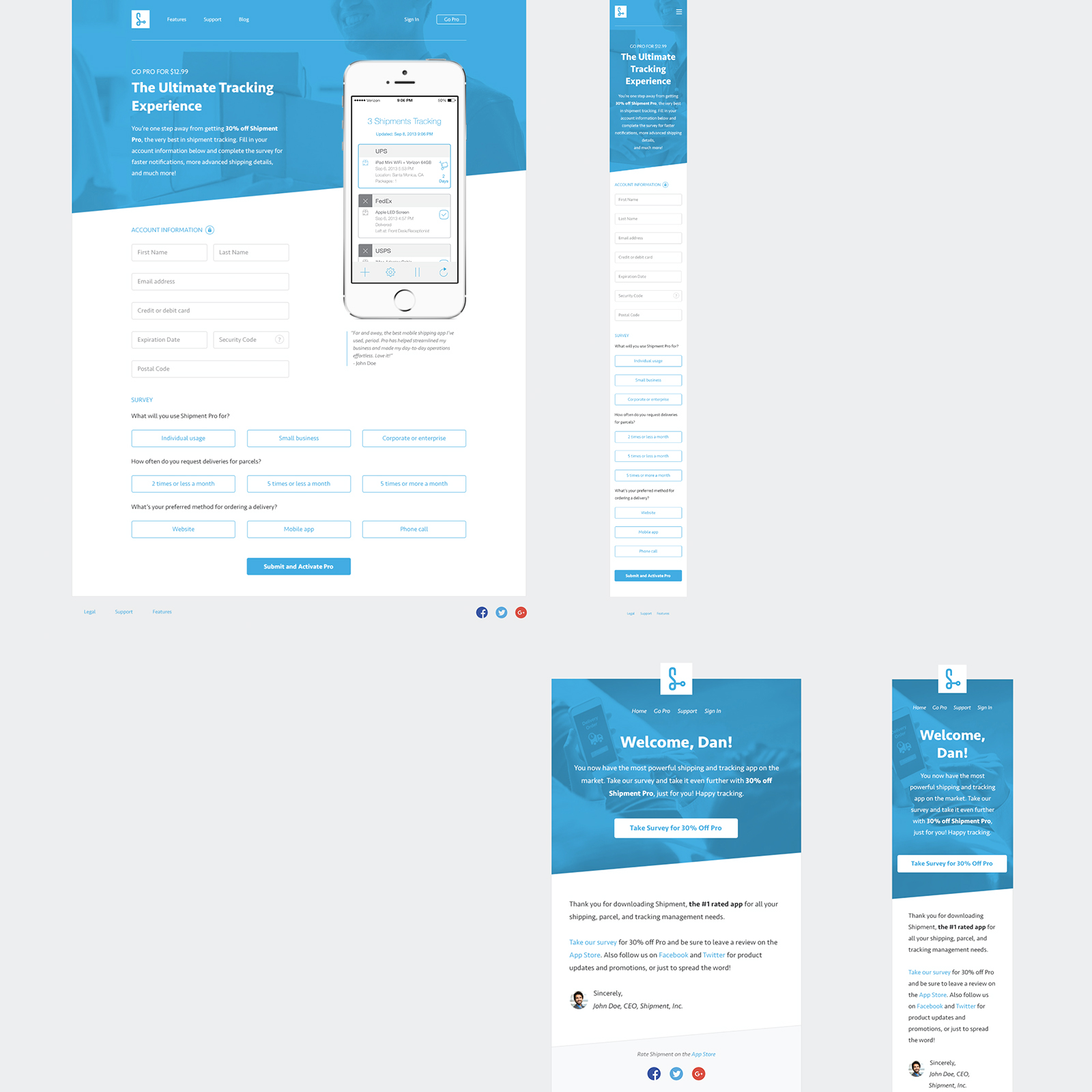
Version 1 of microsite and welcome email design.
User Feedback and Iteration
Internal and User Review
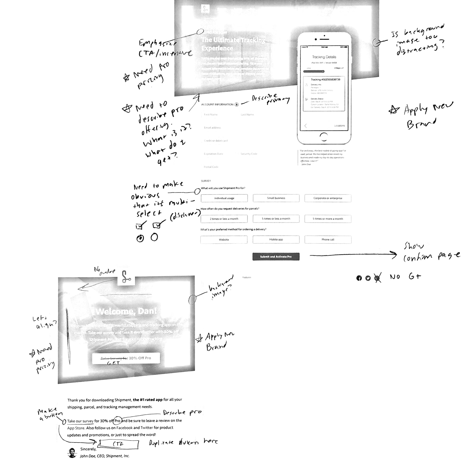
Feedback on version 1 highlighted key needs:
- Emphasize incentive CTA more
- Remove extra nav and footer links, drawing more focus on the account setup and survey sections
- Briefly describe what users get in the Pro offering and its price
- Make survey answers more obvious that they're single or multi select
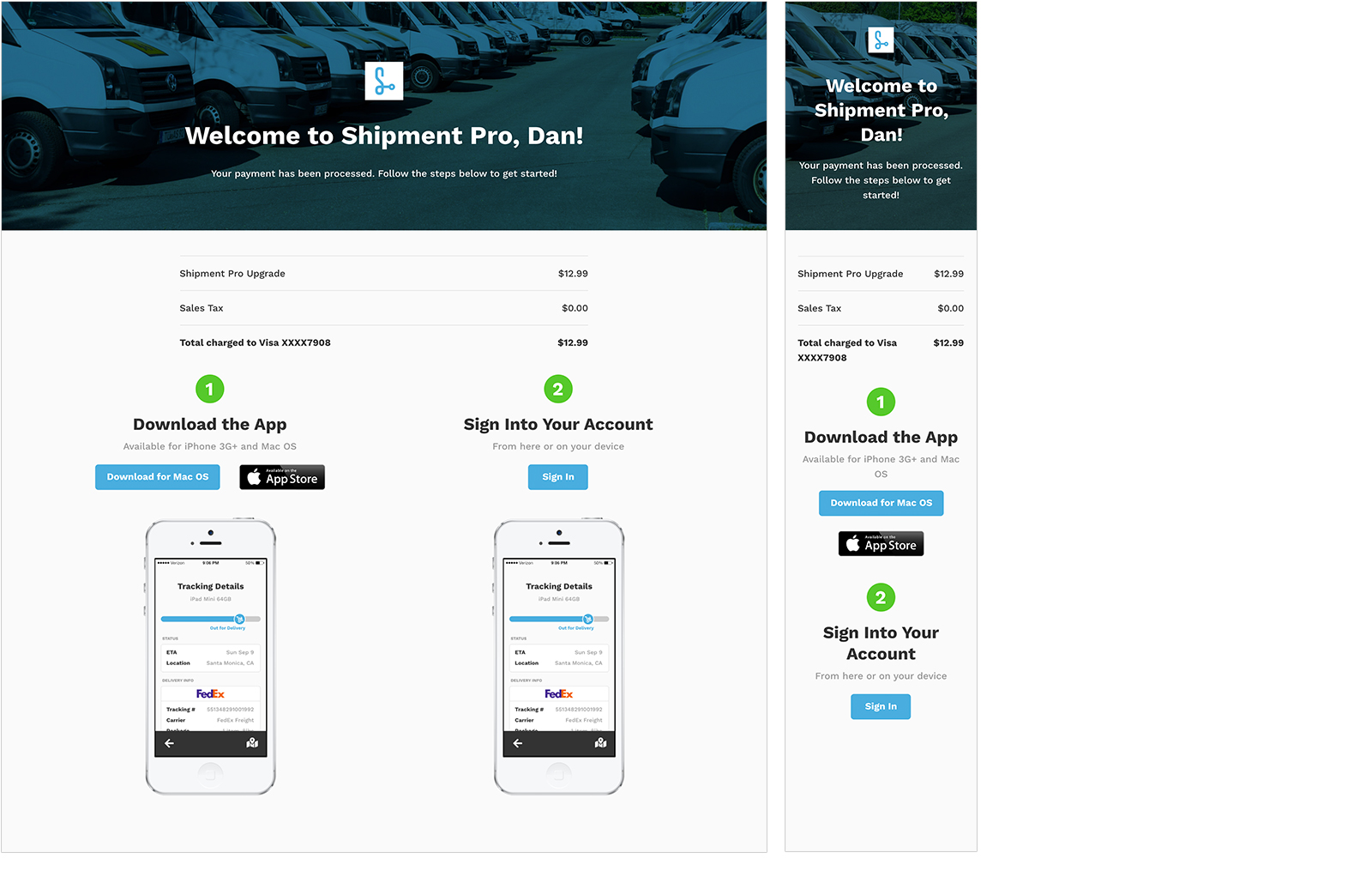
Rapid Prototyping and Finalizing
Rapid prototyping refined the microsite and welcome email.
The Outcome
Prototyping and reviews produced strong CLM candidates.
Inspiration
Initial Direction and Themes
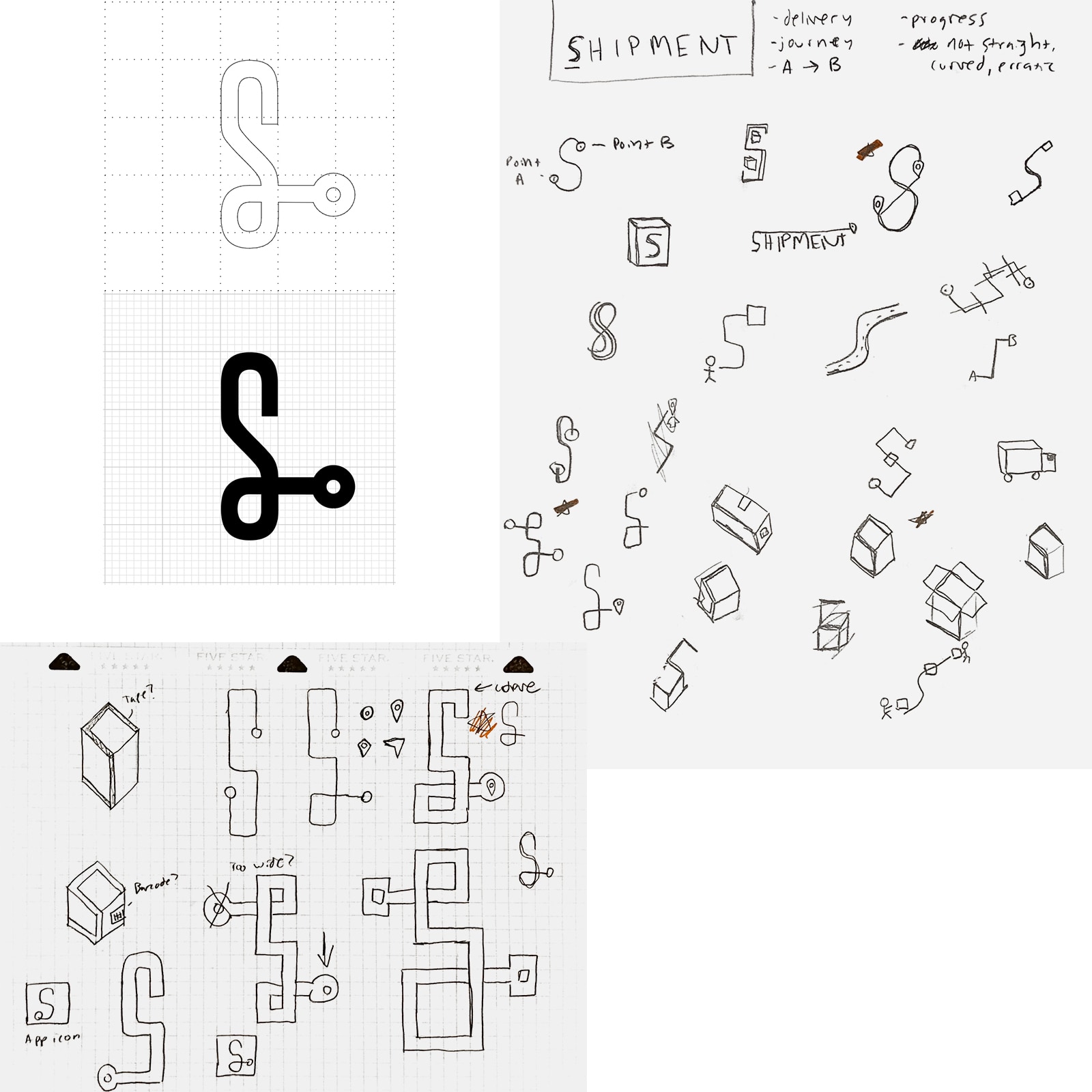
We wanted a brand that conveyed tracking. I explored themes:
- Shipping isn't just a straight line between point A and B
- Use the unique shape of the "S" to show direction and movement
- Trucks, loading docks, and mail carriers are synonymous with shipping
- Just about the journey as it is with the destination
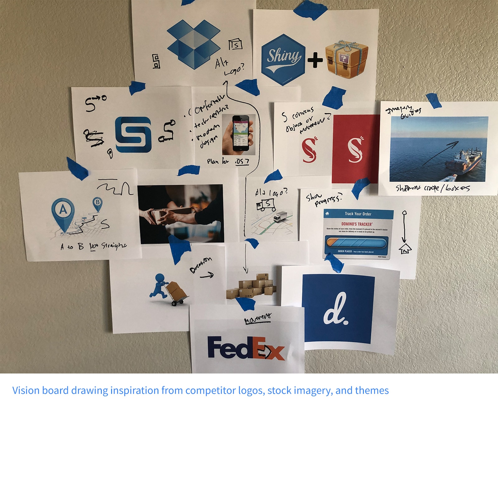
Examples and Insight
I created an inspiration board from competitors and delivery sources.
Define Design Language
Direction
In 2013, I explored the emerging "flat" design movement, moving away from skeuomorphism to simplified, bold visuals.
Themes
I defined the design themes:
- Forward movement and intention
- Minimalistic and stripped down
- Bright, heavy contrast
Building Blocks
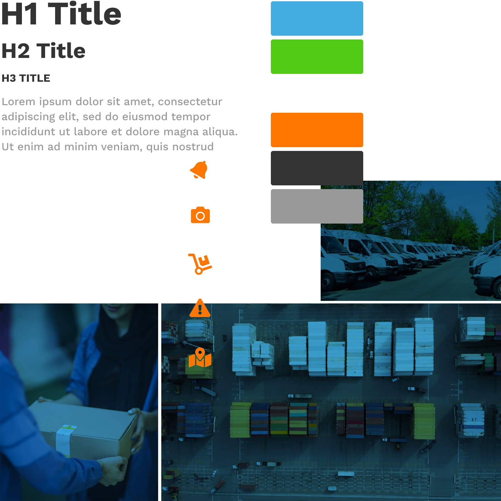
I defined the design building blocks:
- Color palette: primary blue and green for positivity, secondary orange for alert and attention and dark grey for starkness
- Shapes: Rectangle, subtle round borders, flat
- Typography: Modern, sans-serif, bolder
- Iconography: Simple, rounded, solid
- Imagery: Candid, delivery-focused
Define Logo and Mark
Ideas
We used the "S" shape to symbolize the non-linear shipping journey.
Sketches
I sketched "S" variations representing the start-journey-destination concept.
Digitize and Refine
I digitized the final logo in Illustrator, ensuring scalability across form factors.
Alternative Mark
We created an alternative mark symbolizing "delivery" for smaller contexts.
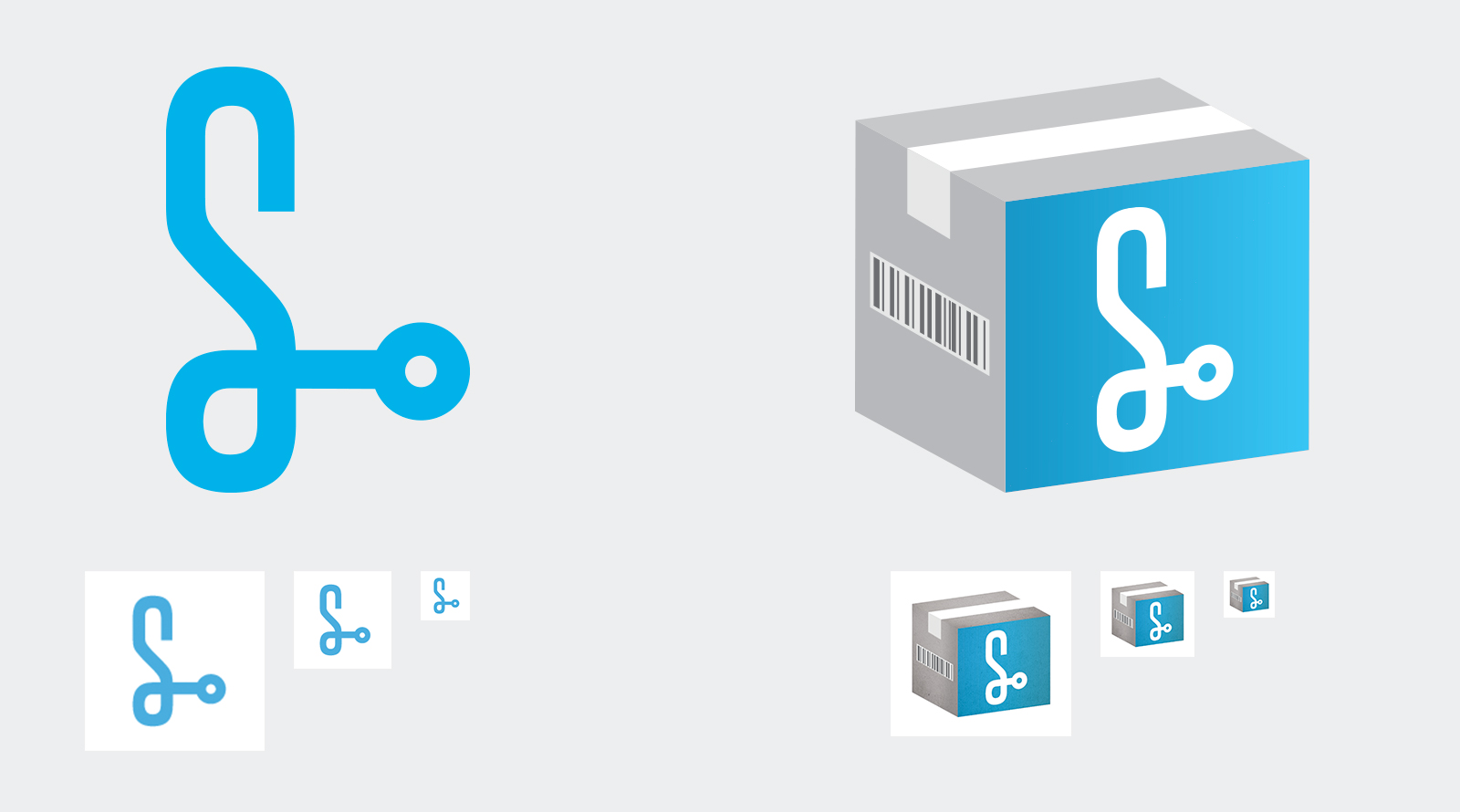
Final logo and mark variations.
The Outcome
This process resulted in a promising brand, brought to life across the app, microsite, and campaigns.