Role
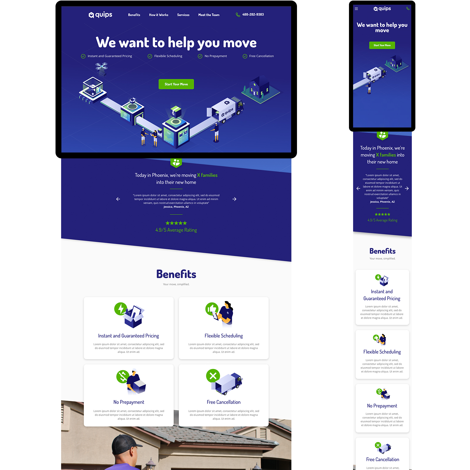
I consulted for a smart moving company to redesign their marketing site and improve the booking flow UX and conversion rate.
Challenge
The launch marketing page had low engagement. The booking flow caused confusion and drop-off due to unclear steps and missing elements.
Process
Phase 1: Define hypothesis and persona with stakeholders and users. Identify themes and solutions. Phase 2: Prototype solutions and build a design system for faster iteration.
Goals
User: Create a seamless, intuitive booking flow giving users control and flexibility.
Business: Increase engagement, start rates, and booking conversions.
KPI's
- Abandon rates: decreased
- Conversion rates: increased
- Start rates: increased
- Schedule select: increased
- Profile form entry: increased
Timeline
4 Months, November 2019 – February 2020
"Process to book online from start to finish was seamless and couldn’t be more satisfied with my move! Very professional, polite, and fast moving company."
User review
Discovery and Roadmap
Conversations and Questions
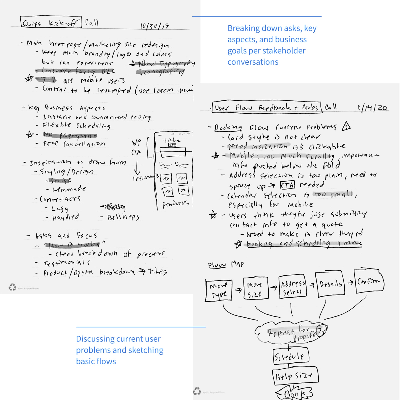
I interviewed stakeholders to define user demographics, issues, and goals.
Compile and Strategize
We established a two-phase roadmap:
Phase 1
- Identify, note, and solve for existing user problems
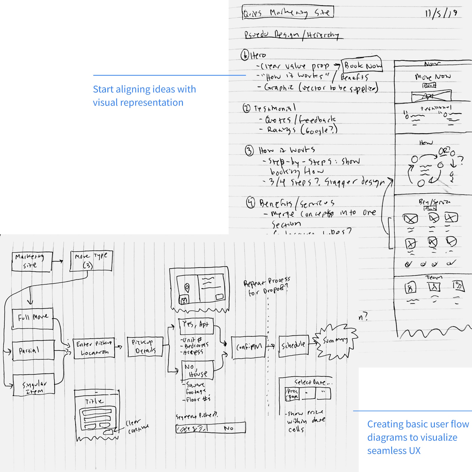
- Compose empathy maps, user journeys, and wireframes
Phase 2
- Audit and compose a new design system/component library
- Apply new components and styles across the site and iterate with users
Goals
User: Create a seamless, intuitive booking flow giving users control and flexibility.
Business: Increase engagement, start rates, and booking conversions.
Form Hypothesis
My hypothesis:
In parallel, we explored new ways to visualize conversation threads.
Clearer steps and progress indication will improve booking conversion rates. View Final BriefPhase 1
Understand Movers and Their Problems
Persona
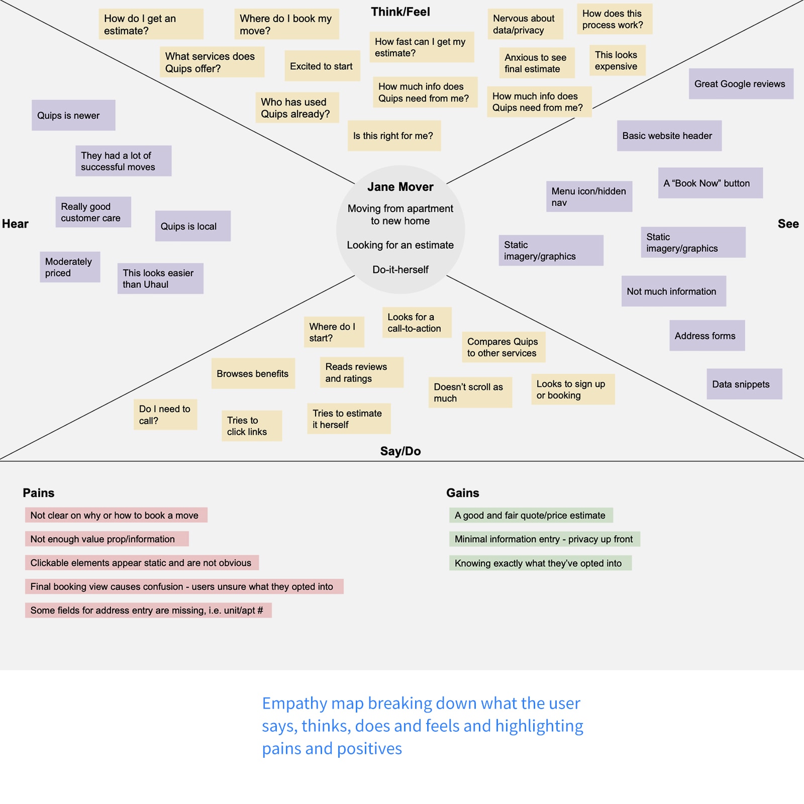
Based on feedback and empathy mapping, I defined the persona:
Demographic
- People moving into small/mid-size apartments and homes
- Do-it-yourself mindset
Needs
- A free moving quote and price calculation
- Moving time estimate
Behaviors
- Use multiple online quote calculators
- Search and call conventional moving companies for support
Problems
I mapped the user journey to highlight core problems:
- Initial marketing page is static and uninviting
- No confirmation or pricing details
- Active design elements and links don't look selectable
- Difficult to schedule a date on mobile
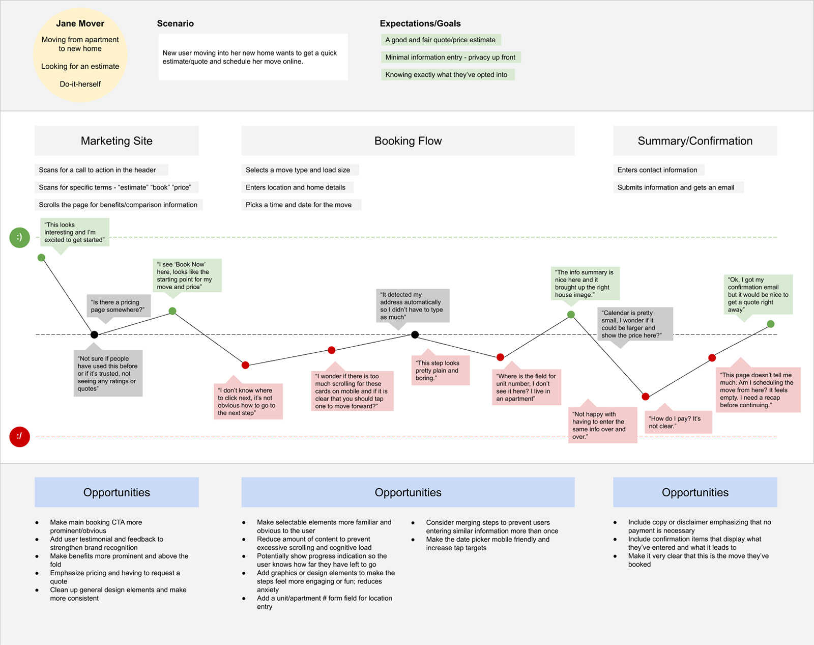
User journey maps help visualize problems within a flow.
Come Up with Solutions
Key Aspects
I aligned design aspects with our goals:
- Emphasize primary call-to-actions
- Keep each step in the booking flow to-the-point and in view
- Design elements should appear selectable and familiar
Ideas
- Keep call-to-action and value proposition high in the fold
- Make elements look selectable and in view
- Keep messages short and to the point
Design Goals
I defined design goals to guide the site map:
- Strive for familiar visual hierarchy
- Place design elements logically and consistently to avoid cognitive dissonance and excess scanning
- Expose small snippets of information to describe each step
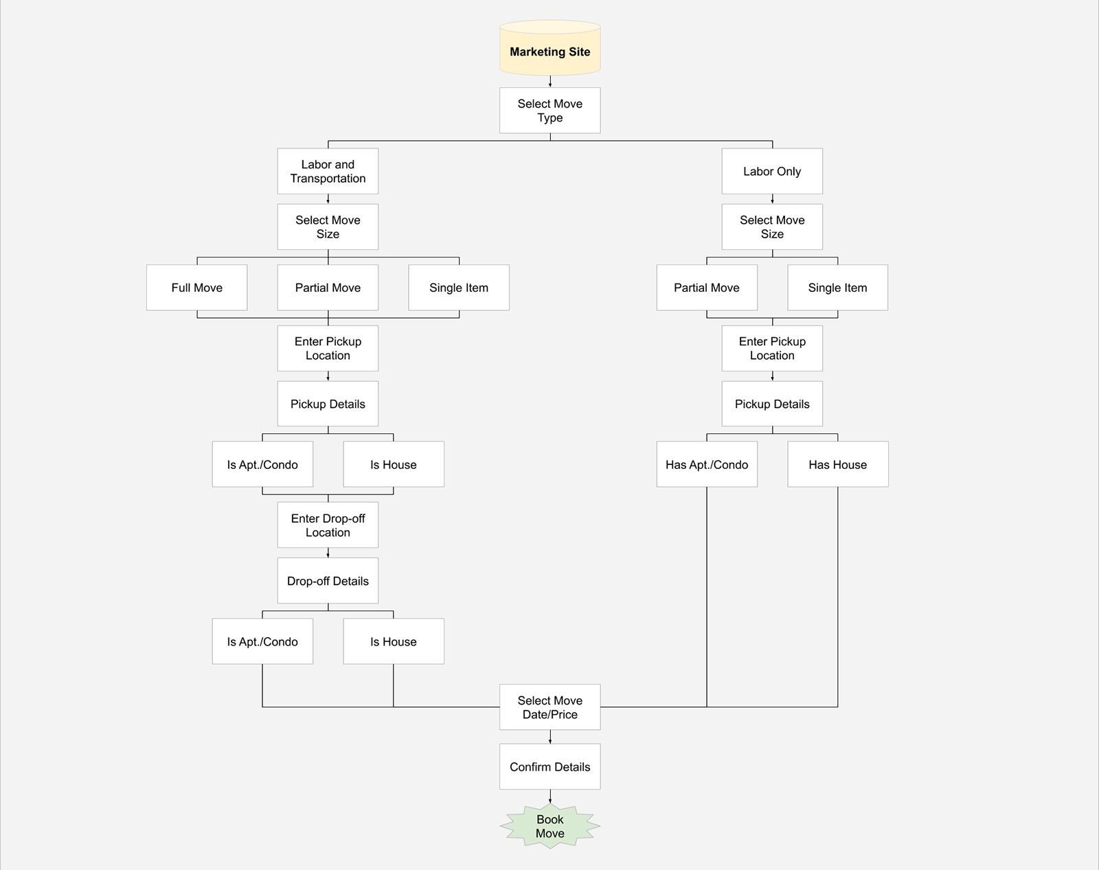
Site maps for plotting new navigation and views.
Sketch, Wireframe, and Iterate
Hand Sketches
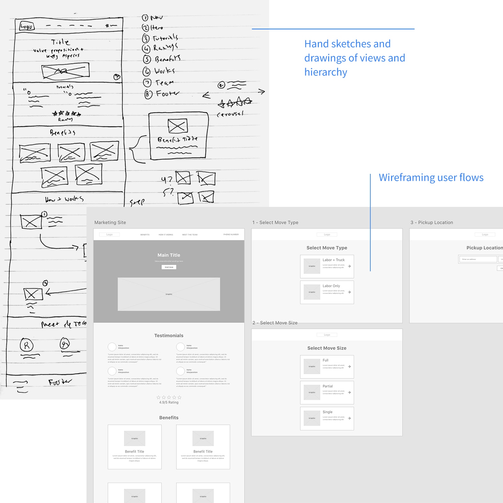
I sketched views on paper to iterate quickly with the team.
Refine Into Wireframes
I refined sketches into wireframes using Whimsical and Adobe XD to visualize the product.
Incorporate Feedback and Iterate
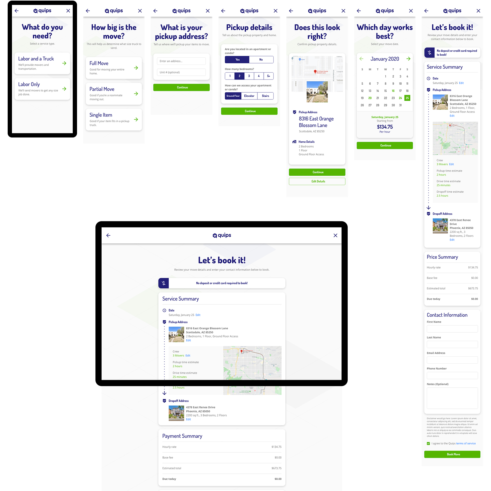
We finalized desktop and mobile wireframes, ready for the new design system.
Phase 2
Build Design System
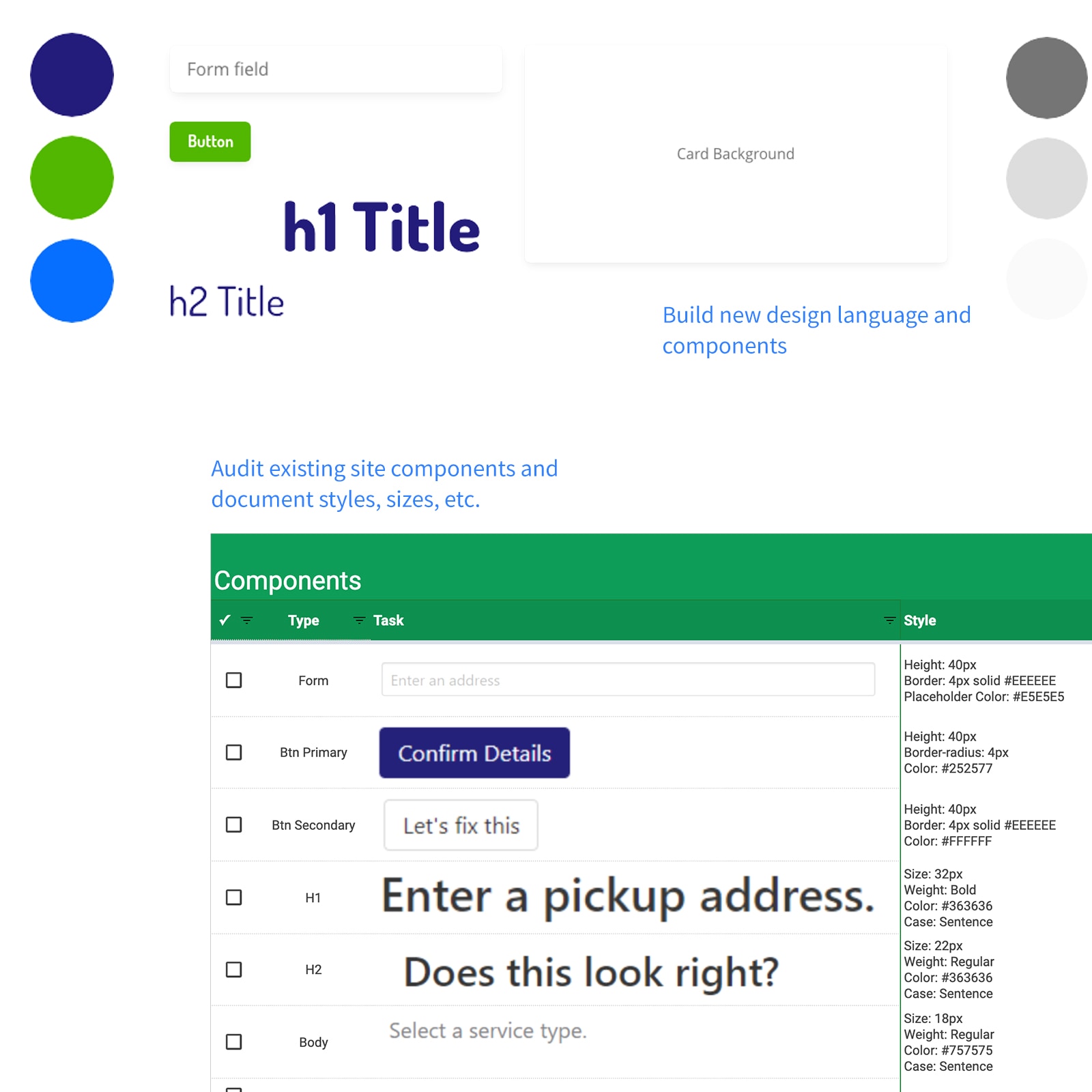
Audit Existing Design
I audited the legacy product to identify redundancies and inconsistencies.
Craft Design Language
I created a design language from existing brand elements, defining typography, colors, and spacing.
Design New Components
I applied this language to create consistent components:
- Buttons
- Form fields
- Sections and cards
- Navigation and footer bars
Apply and Document Components
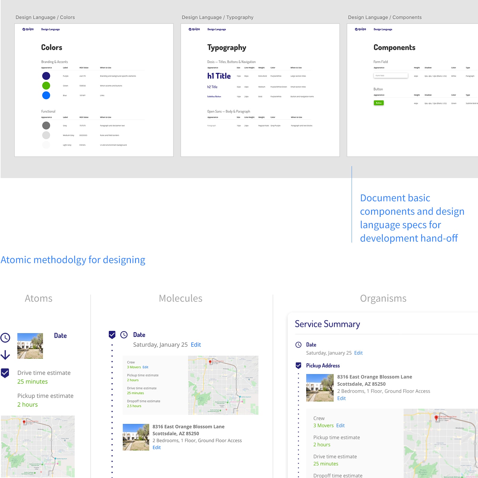
Atomic Methodology
I redesigned views using Atomic Methodology:
- Atoms: Buttons, forms, form labels, dropdowns, text and image blocks
- Molecules: Form and button groups and title bars
- Organisms: Cards, navigations bars, and content sections
- Templates: Detail and location entry and summary view
Document and Compile Guide
I documented components and usage guidelines in a design guide.
View Design GuideThe Outcome
We launched the new designs. Post-launch analysis showed all KPIs were met and the user experience significantly improved.
KPI's
- Abandon rates: decreased
- Conversion rates: increased
- Value proposition: "Chat with your team."
- Start rates: increased
- Schedule select: increased
- Profile form entry: increased
View Mobile Prototype
View Desktop Prototype
