Role
Offerpad hired me to redesign their seller price calculation page.
Challenge
The legacy page's static pricing caused high bounce rates. Users couldn't input their own prices and were confused by real estate terminology.
Process
I defined user and business needs through customer and stakeholder interviews, then brainstormed, prototyped, and tested solutions.
Goals
User: Create a clear, interactive experience for users to set their price and compare results.
Business: Increase engagement, generate custom pricing inputs, and create sales leads.
Timeline
1 Month, March 2019
"Excellent way to sell a house. It was hassle-free and easy to arrange with no showings. Thanks for the great service and support."
User review
Discovery
Conversations and Questions
I interviewed stakeholders to understand the need, metrics, and expected outcomes.
Compile Feedback
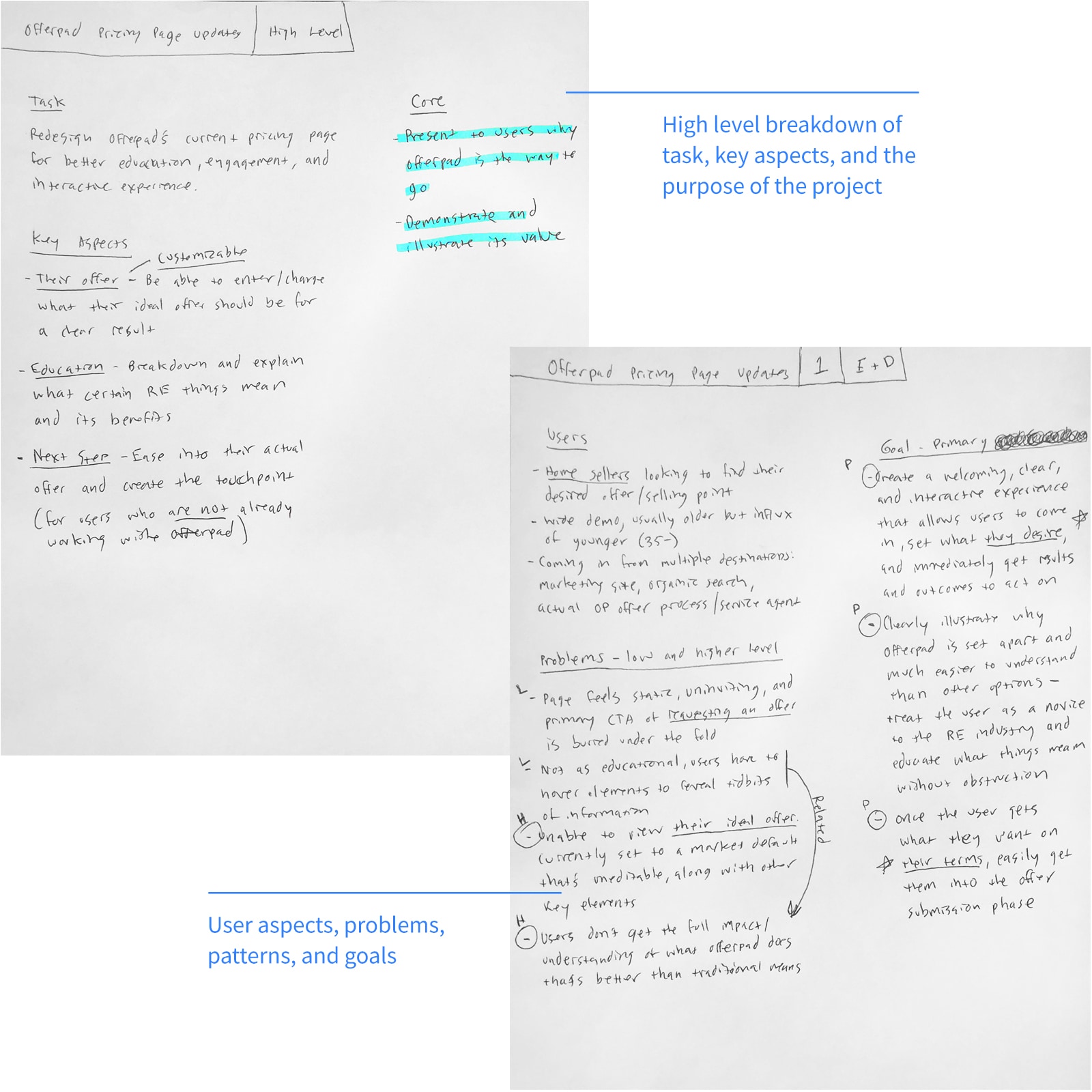
I compiled feedback into a lean design brief to keep users at the center of the process.
Goals
User: Create a clear, interactive experience for users to set their price and compare results.
Business: Increase engagement, generate custom pricing inputs, and create sales leads.
Form Hypothesis
My hypothesis:
Allowing prospective home sellers to input and customize values in clear steps will increase engagement
and sales requests.
Understand Home Sellers and Their Problems
Persona
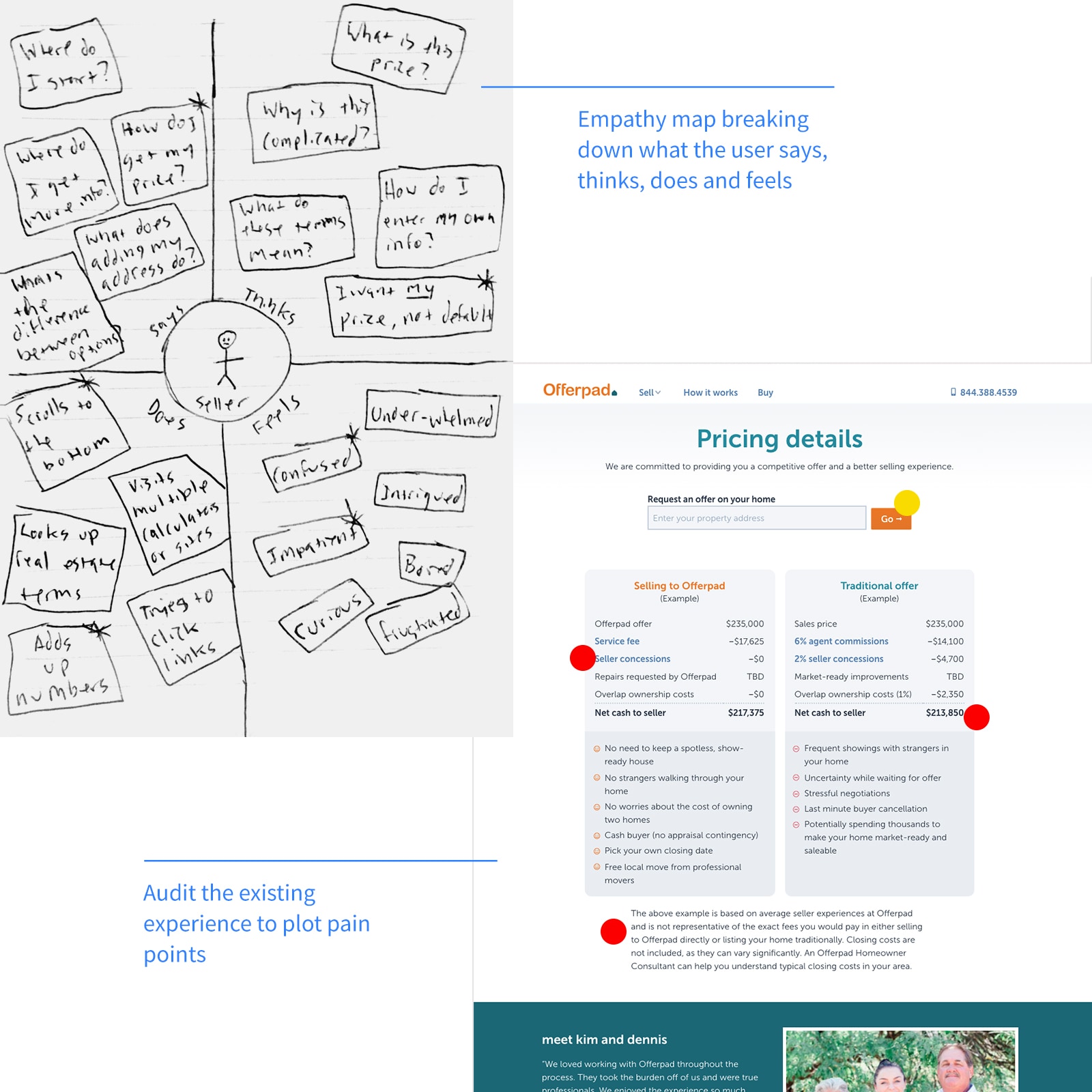
Based on research and empathy mapping, I defined the persona:
Demographic
- People actively looking to sell their home
- 60% were mobile
- Older audience with an influx of younger
- Do-it-yourself mindset
- Value proposition: "Get a strong cash offer."
Needs
- See how much their home is worth today
- Sell their home at a reasonable price
- How much they can profit or lose from a sale
Behaviors
- Use multiple online price calculators
- Search and call agents for consultation
Problems
I identified key pain points:
- Page is static and uninviting
- Main call-to-actions are buried further down the page
- Not enough differentiation between Offerpad vs. traditional method
- Users need a way to enter their own values
Come Up with Solutions
Key Aspects
I outlined key aspects aligned with business goals:
- Users enter and change their own home values
- Explain real estate terms directly and plainly
- Ease them into an offer and create the sales lead
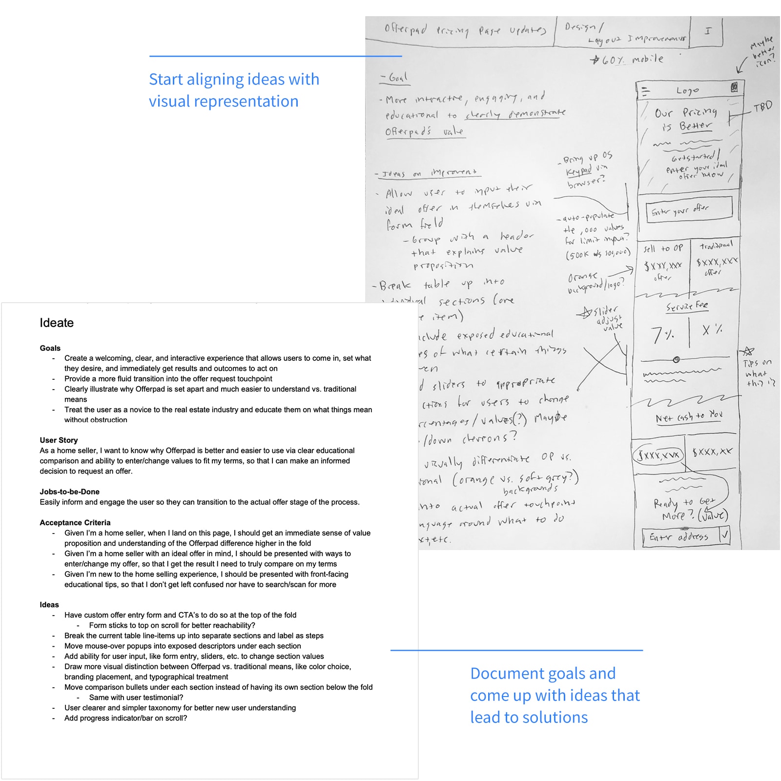
Ideas
- Have offer entry form with value proposition highest in the page
- Break the current static table into separate sections/steps
- Allow for user input and customization, i.e. forms, sliders, steppers, etc.
- Expose educational snippets or click/hover popovers to show simpler real estate info to the user
- Show progress indication
These aspects drove my sketches and prototypes, allowing for quick iteration.
Sketch, Wireframe, and Iterate
Hand Sketches
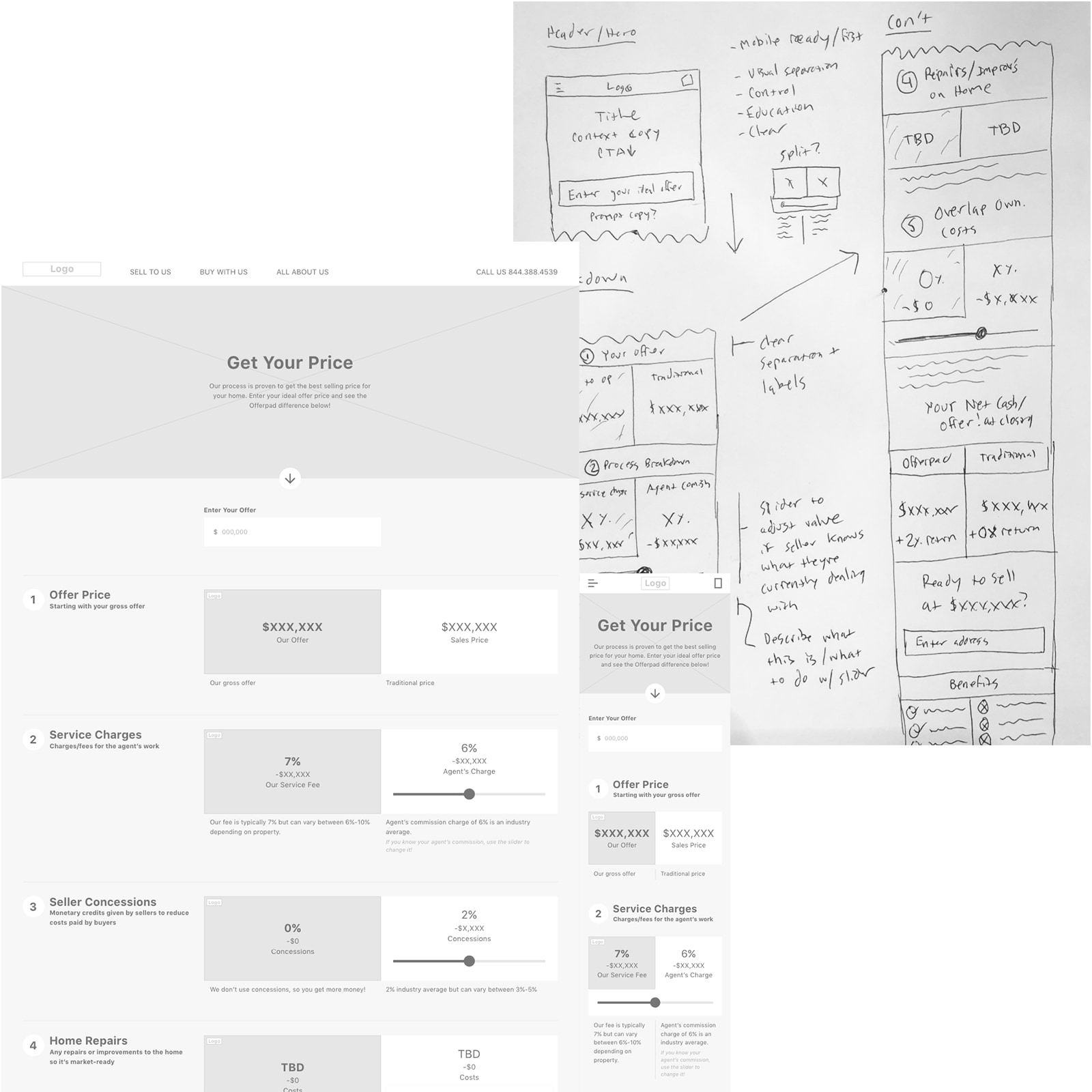
I sketched concepts on paper, keeping design goals and key aspects in focus.
Refine Into Wireframes
I refined sketches into wireframes using Whimsical and Adobe XD to help stakeholders visualize the product.
View Mobile Wireframe
View Desktop Wireframe
Incorporate Feedback and Iterate
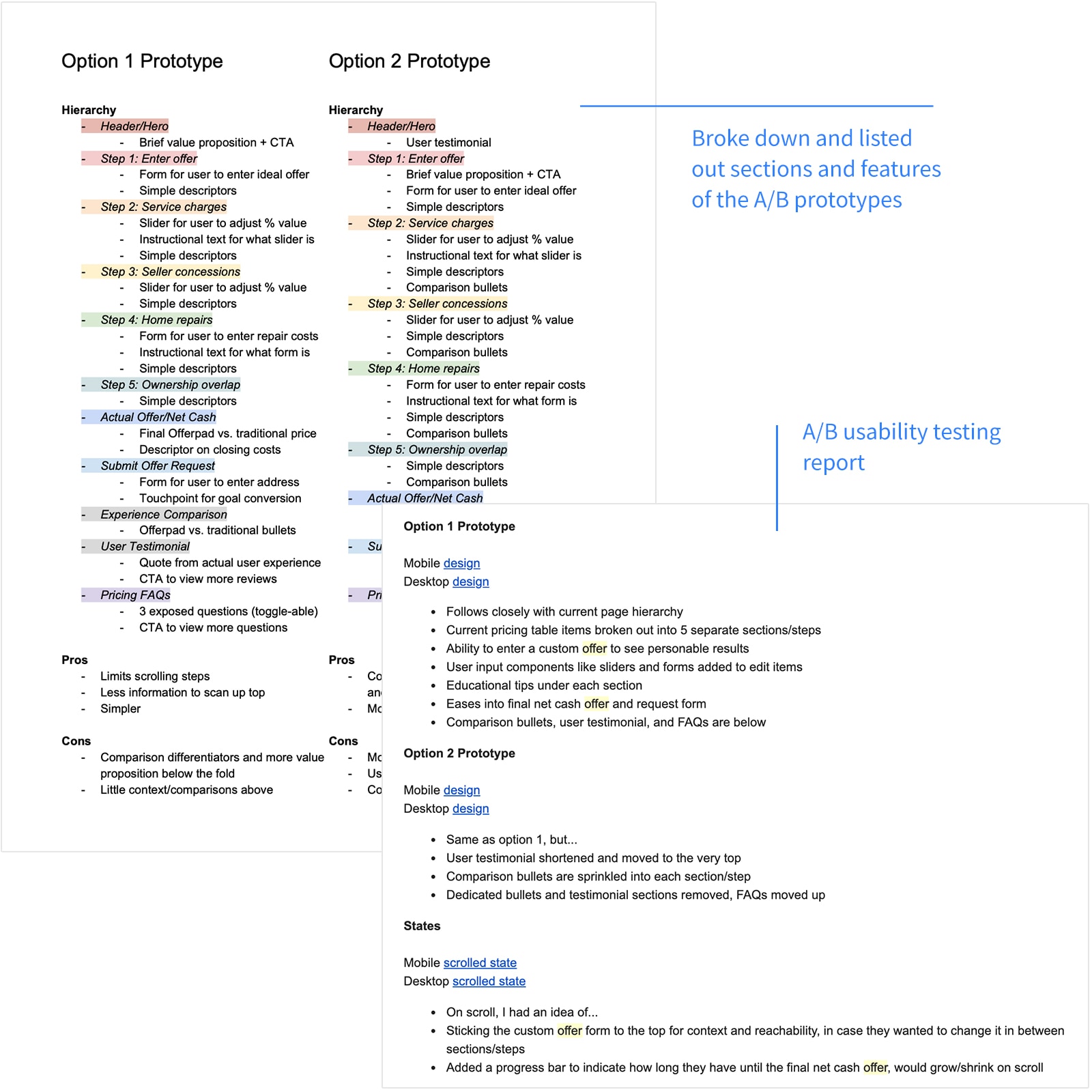
After stakeholder feedback, I decided to A/B test to finalize the prototype.
View Final Brief
User Testing and Refinement
A/B Testing
We A/B tested two prototypes: one with testimonials, one with a stronger value proposition. Findings:
- Most gravitated toward version B, with less user testimonials and sections
- The mobile version felt easier to use since sections were more compact
- Some mentioned it felt too long to scroll and get to the final offer
- Disclaimers were hard to read
- The visual separation between Offerpad and traditional was clear
I applied this feedback and modified version B.
The Outcome
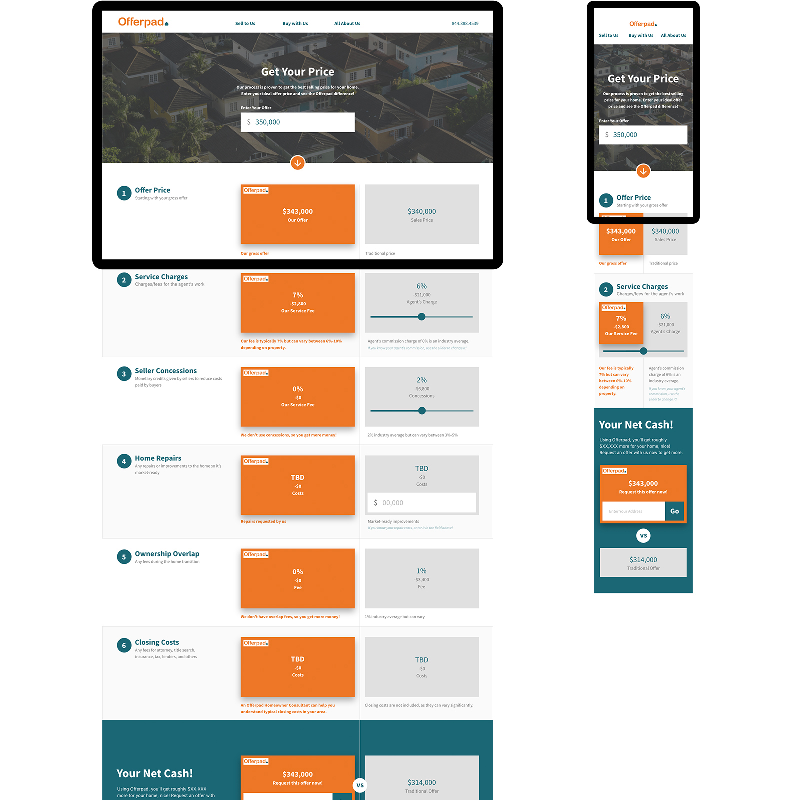
With user and stakeholder approval, I delivered desktop and mobile click-through prototypes for development.
View Mobile Prototype
View Desktop Prototype
