Background
A previous co-worker reached out to me to design their logo and brand elements for a finance startup. Based in the West Loop neighborhood of Chicago's downtown, we wanted a fresh brand that reflected and portrayed elements of its surrounding environment.
Opportunity
With the recession winding down in the city, more and more small businesses and startups were emerging, especially in this neighborhood. Chicago in general however, had a very competitive scene in the financial industry, which made this brand effort critical to gaining new clients for West Loop.
Timeline
2 Months, October - December 2016
Discovery
Initial Direction
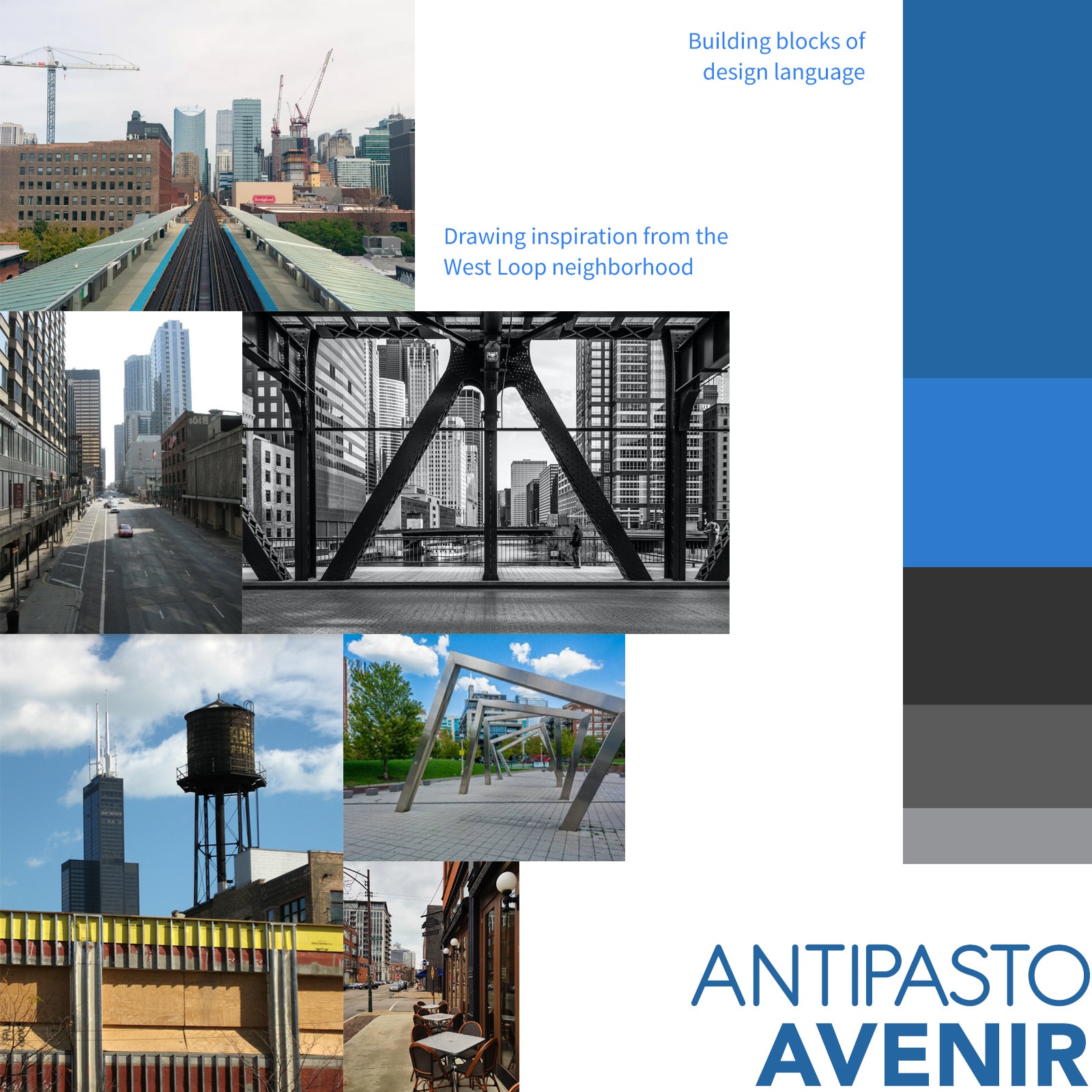
My client wanted a brand that drew elements and themes from the West Loop neighborhood:
- Elevated trains
- Hip and trendy
- Metal framework and bridges
- Water towers
- Confident and stable
- Concrete and solid
Examples and Insight
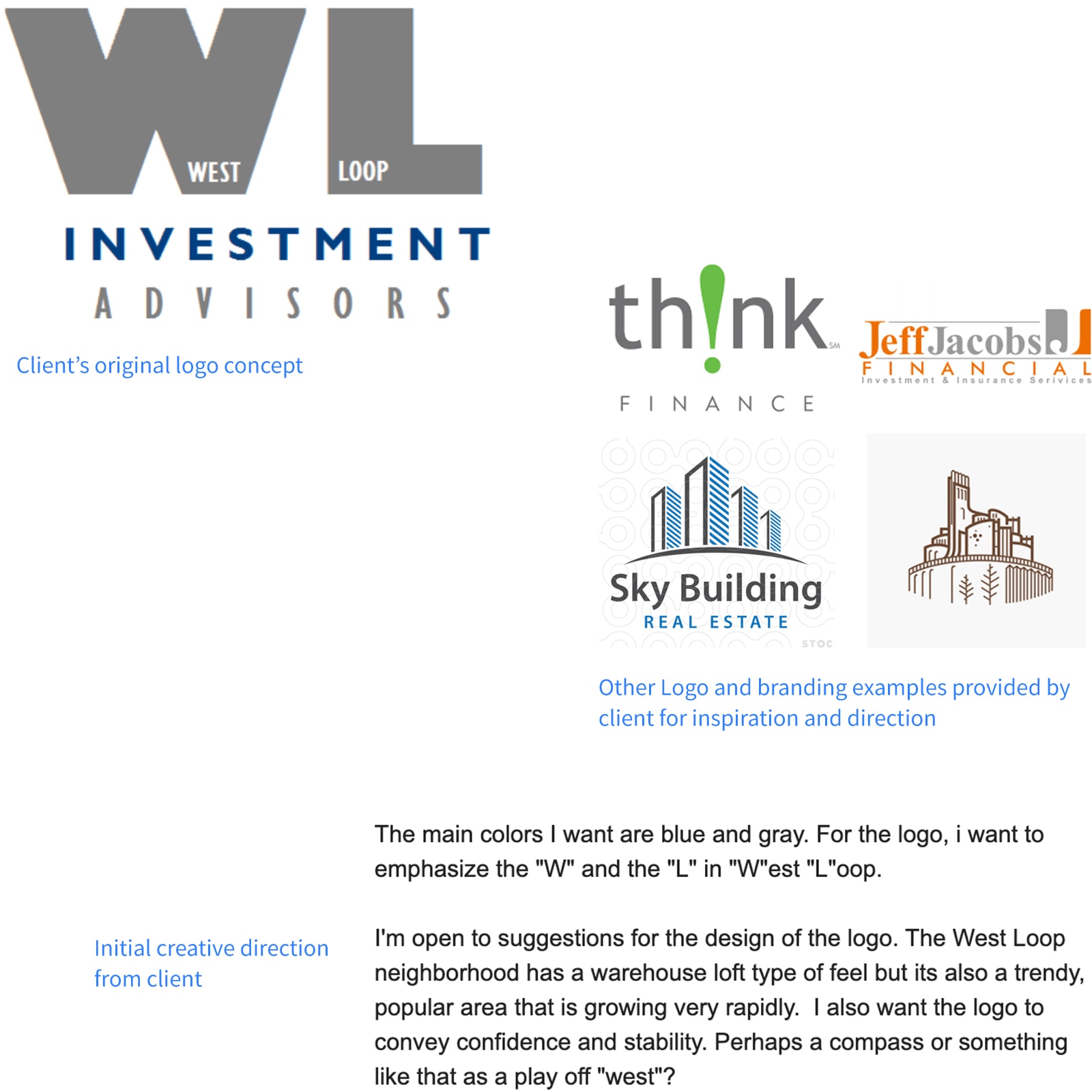
My client had already put together a logo concept and provided other logo examples for me to pull from. They wanted heavy emphasis on the "W" and "L" acronym for better mark recognition and reach through a variety of mediums.
Inspiration and Definition
Research and Themes
From this, I pulled together past photos and image searches of the area to get a sense of its culture, energy, and feel. Having lived in the West Loop area during college, I already had a good foundation to work with and used this to piece together the brand's theme — a collection of its meaning, feeling, and purpose:
- Metaphorical: Stable, confident, trendy, fresh, directional, clear path
- Physical: Concrete, hand-made, strong, forged, urban materials
Building Blocks
Using themes to drive design language decisions, I broke it down into building blocks:
- Color palette: Blue, black, white, grey
- Shapes: Rectangular, hard-edged
- Typography: Sans-serif with personality and uniqueness
Logo and Mark Sketches
Ideas
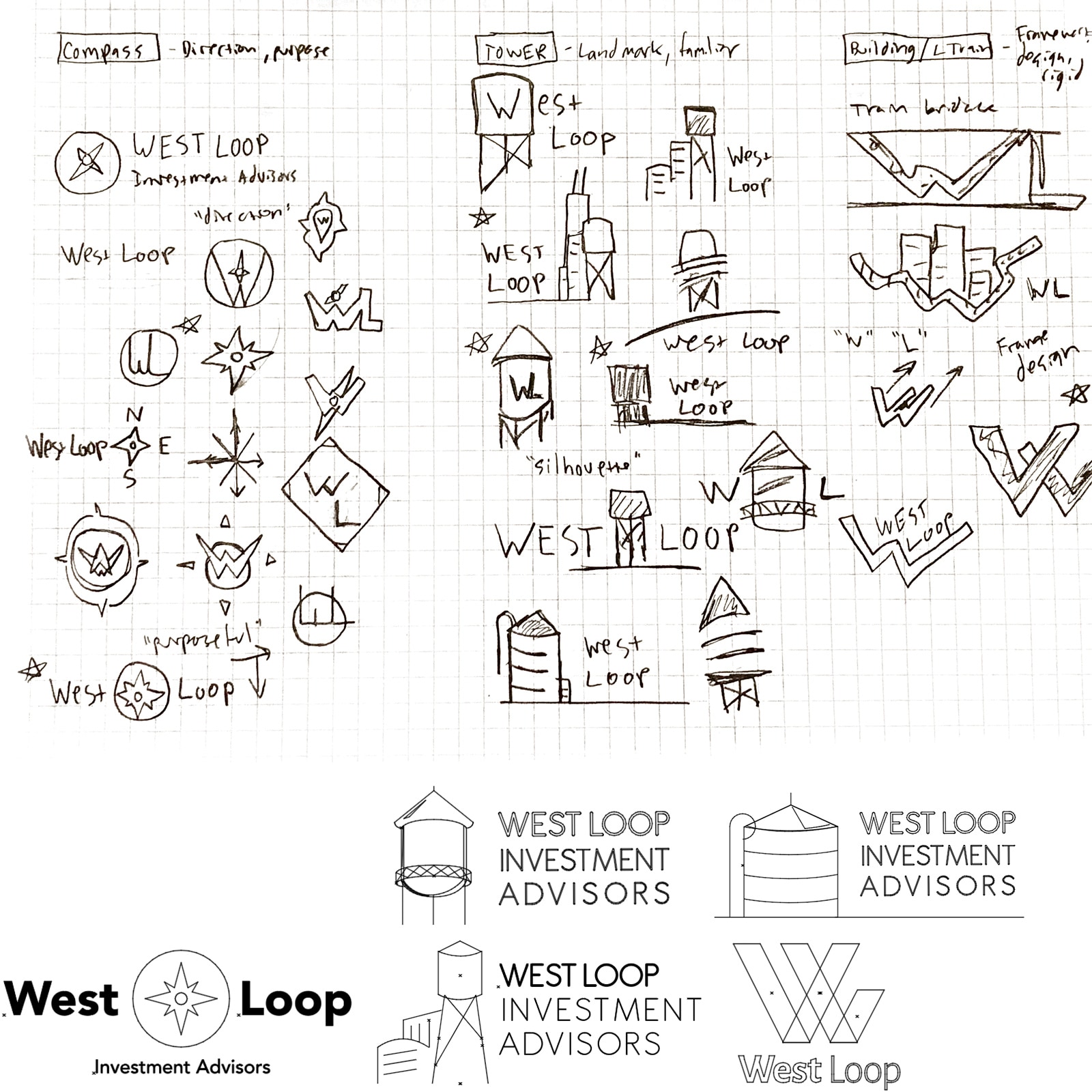
After a general direction with the branding and theme were established, I worked closely with my client trying to visually represent the West Loop brand and meaning. Ideas:
- Tie in physical landmarks of the area: watertowers, bridges, framework
- Use a compass mark for "direction" and "purpose" meaning
- "Suit and tie" with a creative twist
Sketches and Digital Versions
I started with the physical representations, particularly the watertower. My client liked these landmarks placed on buildings in the West Loop neighborhood and was a nod to the area. I was also fascinated with the elevated train and bridge framework design, having intricate patterns and hard lines that fit the vibe of area well. Taking to my sketch pad and grid paper, I sketched out ideas and concepts and after reviewing several versions, we chose a few for digitizing in Illustrator.
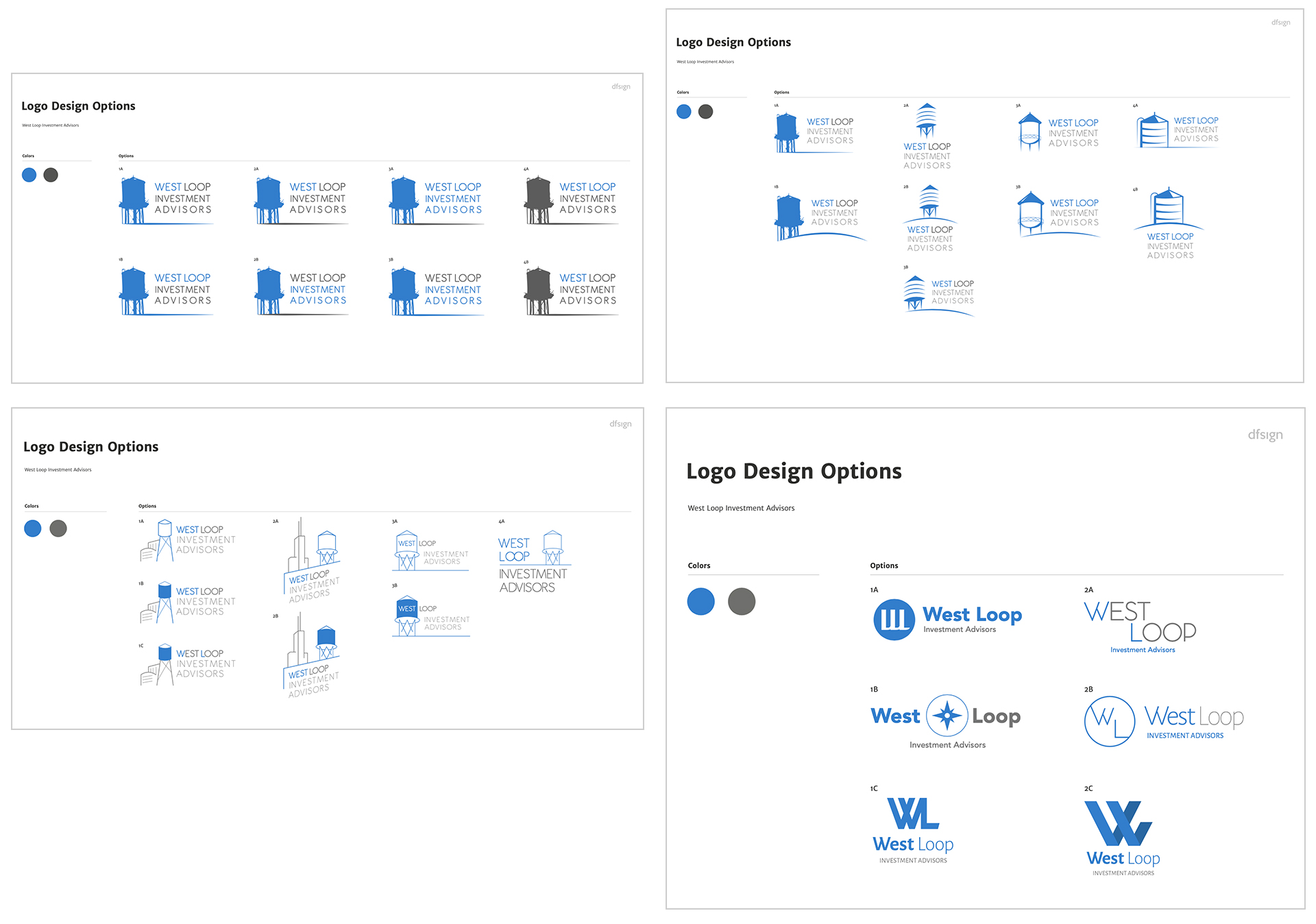
Four version batches reviewed with client.
Project Changes
Discontinued
Unfortunately, my client decided to stop the design project and startup efforts because of another career opportunity. It was tough to see a lot of good work and collaboration ultimately end, but I didn't let that stop me from pursuing the project further as a hypothetical case study.
Revival
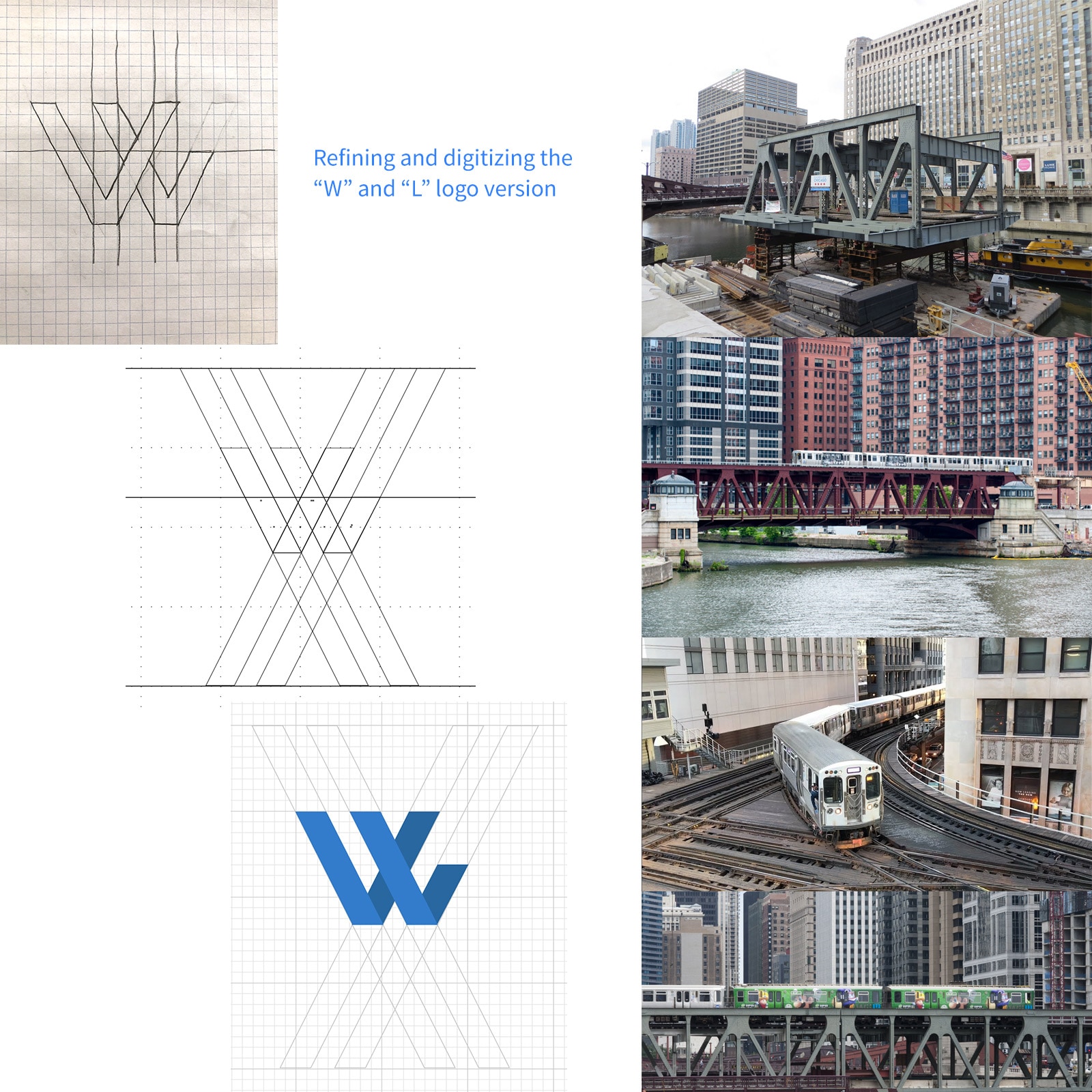
A month after the project ended, I went back and focused on one aspect of the logo, brand direction, and meaning that fascinated me from the get-go: the train and bridge framework. The angles, direction, and "rigid" look of the bridges encapsulated our initial theme of the brand well.
Finalizing
While thinking about these aspects, I redrew some of the initial versions that followed this idea and fine tuned one logo and mark in particular. The "W" and "L" initials represented the design of the bridge framework, and the movement and perspective represented a changing direction.
The Outcome
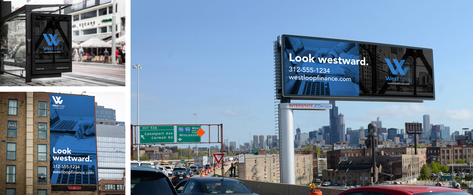
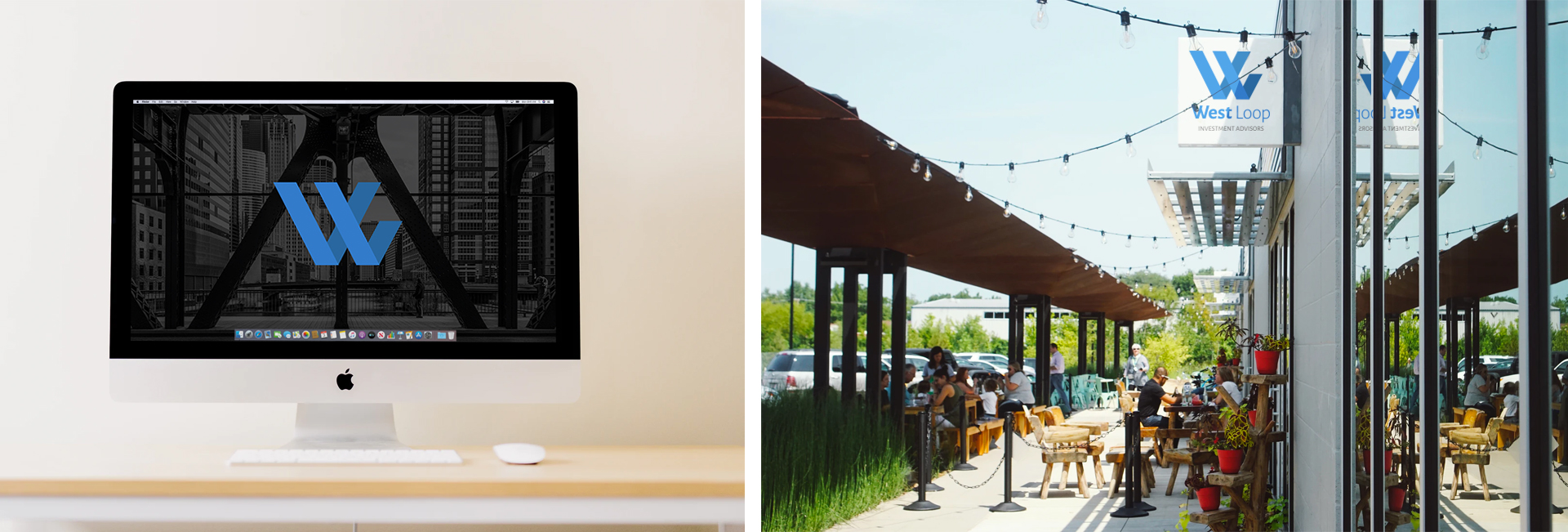
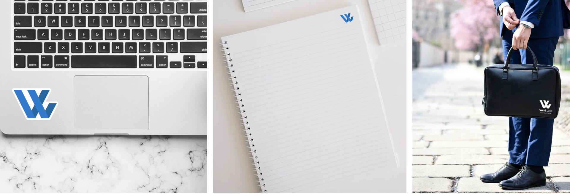
With a logo and mark established, I placed them on various mediums to see how well it scaled and portrayed.
